 |
Buildings
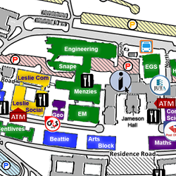
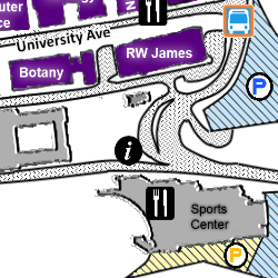
The buildings are the main focus of the visualisation and as such we wanted to ensure that they would be easy to identify. The buildings have been colour coded according to the faculty which uses it the most, this will allow ‘users’ to easily cut out irrelevant buildings as most students know which faculty a building belongs to.
The name of the building is written in white or purple (in the case of commerce) as these are the colours which contrasted the best with the underlying colour of the building. A glow (blurred edge) effect was also added to the test to allow it to be even more noticeable but not be in the way when performing other visual queries.
|
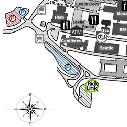
Parking Areas
Parking areas come in a range of sizes in terms of space on the map and are also colour coded by the university in terms of who may park there. The challenge here was to ensure that we were able to make all parking the same in one way in order for the ‘user’ to quickly narrow in on it and then to use another method for them to easily assess which parking they may use.
To accomplish this, all parking areas were textured in the same way and then shaded depending on the parking disk associated with it. All parking areas were also indicated with a commonly used parking symbol and this too was colour coded based on the parking disks
|
 |
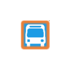 |
Jammie Shuttle Stops
There are only four Jammie Shuttle stops which needed to be indicated and since they have a very distinctive blue colour it was essential that we use this colour to indicate them on the map. The problem however was that this made it difficult when they were close to the blue parking and the specific blue was also difficult to see on the white background of the map.
To address these issues we decided to use a blue bus icon, where the blue is similar to the Jammie Shuttle colour but also outline it with a shade of orange. The orange was chosen because it contrasted well with the blue and also meant that the icon was easier to identify on the white background as it now had a clear border.
|
Roads
Roads needed to be easily recognisable when the ‘user’ is specifically looking for them and almost unnoticeable at other times. To accomplish this we textured them with a light shade of grey. This meant that they were easy to distinguish from the other elements of the map but remained unobtrusive.
The names of the roads were written in black in a different font to that used for the buildings. They were also positioned in such a way that it is clear to which road they belong.
|
 |
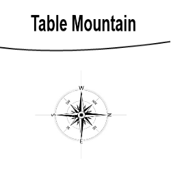 |
Direction
A compass was added to the map to clarify the fact that the North side of upper campus is in fact were most would expect East to be when looking at the map.
This was added to aid the user in orienting themselves when using the map. The mountain was chosen as it is easily recognisable and something the most ‘users’ would be familiar with.
|
Unique Icon
Services such as, the ICTS main office or CPS which only have one point of access on upper campus where all indicated with an icon with the same effect. The icon itself is symbolic of the service but all were edited to have some depth and look like a pin on the map. This allows the user to easily filter them when looking at the map i.e. the user would first look for all icons which look like pins and then look for the specific icon of the service.
|
 |
 |
Places to Purchase Food
These were all indicated with a filled black square with a white fork and knife on it. The filled black square makes it easy for users to filter them from the other symbols and then the fork and knife makes it clear what the icon is indicating.
|
Information Centre
The information centre is indicated as an italic white ‘i’ in a filled black circle. The symbol is similar to the commonly recognised symbol for information which makes it easy for the user to filter it from the rest of the icons.
|
 |
 |
ATMS
The ATMs are indicated using a dark red rectangle surrounded by a darker border. The abbreviation is written on this shape making it clear what it is indicating but the shape and colour is unique on the map, which makes it easy for the user to identify.
|