
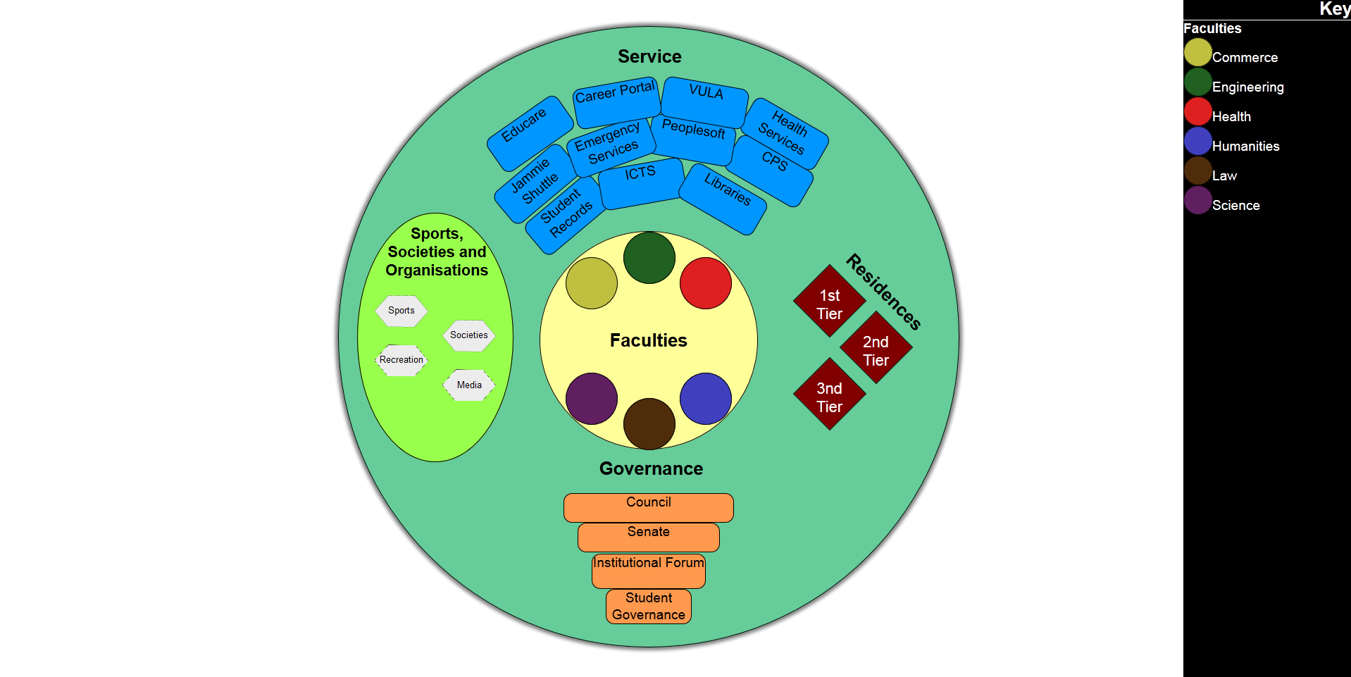
UCT Structure Visualization
Hover here
Group Members
James Lewis
Halatedzi Kevin Matidza
Sven Siedentopf
Introduction
Problem Description
The University of Cape Town organism is complex and consists of many bodies and structures, some of which are not always easily understood or known to, students, UCT staff and outsiders alike. These people often have very simple and specific queries about what exists, what is available and who to contact, but answering these queries can take an unnecessary amount of time as this information is not always easily or readily available and is often provided as text descriptions, which can make interpreting and understanding this information difficult and wastes valuable time in the process. A visual interface is needed that can allow users to answer visual queries about structures and bodies within UCT quicker and easier as well as to help users to gain a better understanding of the complex nature of the UCT organism.
Input and Output
Input The input consists of the main bodies and structures that exist within UCT (faculties, residences, governance, services and sports, societies and recreation) with information relating to these main categories organised and placed hierarchically underneath each category. This information came partly from the department of institutional planning and partly from the UCT website. For more specific information about the input data used, a document with the input data can be downloaded here. Output The output is an interactive visualisation of the UCT in the form of a cell, containing different shapes and colours to represent various structures and bodies. For more information about the output, please refer to the design section.
User Profile
The visualisation is aimed at anyone with a vested interest in UCT. This can be current or prospective students, parents of students, academic staff or just generally anyone who wishes to know about what exists within the University of Cape Town.
Related Work
University of Manchester Campus Visualisation
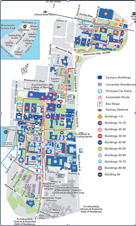
a. Reference: University of Manchester Campus map, retrieved from: http://www.manchester.ac.uk/aboutus/travel/maps/numerical/, Date Accessed: 21/04/2013
b. Explanation of Visualisation - Overview
This Map shows what is available at the university of Manchester in terms of campus buildings(in blue), university residences(purple),accessible routes through the university(red pathways) and car parks(light blue outline).The numbering of the buildings corresponds to numbering of buildings used within the actual buildings on the campus.
c. Critical Analysis
This this map visualisation effectively answers the question of where things are located in the university. While it is quite effective in showing what area of the estate the university buildings, routes and parking lots take up and where buildings and structures are located within the university, it is limited to only showing university bodies and structures that have a structural representation, thus important queries related to the university that aren’t structurally represented such as, what activities, sports or clubs are available and staff related questions (who is the dean of a particular faculty etc) are not catered for. While the main point of this map visualisation is to show location, this visualisation could have been improved by using colour to distinguish between buildings that belong to different faculties, and extended to include sports and recreational facilities (this map shows an aquatics centre that isn’t highlighted or distinguished from other buildings). While a bright blue is used to show campus buildings, a dull purple colour is used to represent residences which fades into the background and makes it difficult to locate residence buildings.
Government Structure Map
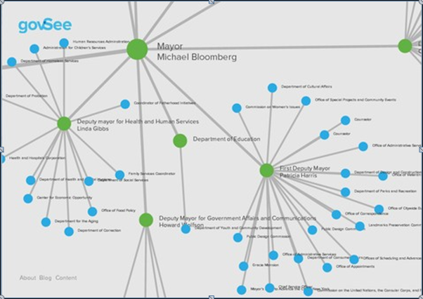
a. Reference: J.Lippincott, A Company Organization Chart You Can Believe In, retrieved from: http://www.metaltoad.com/blog/company-organization-chart-you-can-believe, Date Accessed: 17/05/2013.
b. Explanation of Visualisation - Overview
This visualisation uses node hierarchy diagram to represent various bodies in a government, people that work within or underneath these bodies and relationships between them. Green nodes represent nodes that have leaves or bodies/people that have people or other bodies work for them. Blue nodes represent leaves, which are essentially people who are influenced by and who work for various bodies but have no influence or no-one else working underneath them. Lines between nodes and leaves show which people or child leaves are related to parent nodes/bodies/ people with power or influence over them. Larger circles also represent people or bodies with greater power or influence.
c. Critical Analysis of Visualisation
A node diagram used for showing bodies and structures is very effective in showing the relationships between various bodies and people (who works for whom and what bodies are related). This diagram also shows the power or influence quite effectively, as more powerful bodies or entities tend to be closer to the middle and have larger circles (the Mayor has the most power and is also the largest circle and is at the centre) and colour is used well to distinguish between children leaves who simply work under another entity (blue) and entities that have people working underneath them or have power over other people or entities (green nodes). However using the same colours for every node and leaf can fail to distinguish between different bodies, as a person who wanted to find out who works under Deputy Mayor Linda Gibbs for example, would have to look through every green node before finding the deputy mayor. Colour could also be used to distinguish between different types of entities (deputy mayor could be green, departments could be red etc) or shapes could be used for representation of people (circles are people, triangles are bodies). A picture could also be included within the node which could also help quicken the search process and answer the query of who the deputy mayor is by visually identifying who they are. Different patterns for different lines could also be used to represent different relationships between different entities, for example, dotted lines represent indirectly related or not as influenced by a node, compared to a node with a solid line. This diagram would also struggle to show supporting services that have no direct relationship to an entity, but support multiple entities when needed. For example a media or research support team might exist to help various deputy mayors or departments when called upon, but are not directly controlled or influenced by any of them.
Company Organisational Venn Visualisation
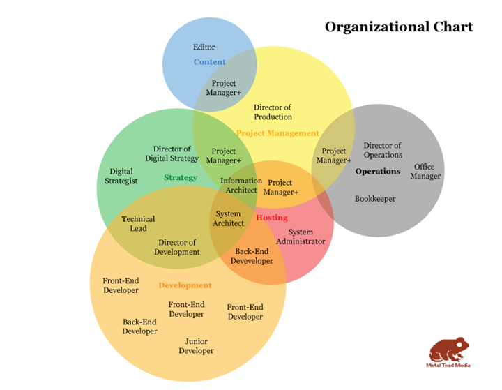
a. Reference: J.Lippincott, A Company Organization Chart You Can Believe In, retrieved from: http://www.metaltoad.com/blog/company-organization-chart-you-can-believe, Date Accessed: 17/05/2013.
b. Explanation of Visualisation - Overview
This organisational chart makes use of a Venn diagram to represent different departments and bodies and shows the company roles that are involved in more than one department. Different departments are represented by different colours while sizes of departments are represented by sizes of circles and overlapping regions are used to show the relationships between different departments. The larger the overlapping regions, the more closely related two departments are and the more company roles involved in more than one department at a time.
c. Critical Analysis of Visualisation
This visualisation answers the question of what departments exist in a company, what roles exist within each department, which roles have more responsibility and which departments are the largest. Colour is used well to group departments within the organisation and the use of transparency of colour shows areas of overlapping regions or relationships between departments. This Venn diagram works well for small companies with few departments but for large companies, colours would have to be re-used for different departments and circles would have to be larger to accommodate many different roles. There is also a lack of ways to abstract data, as there is only 1 level to show departments and roles and no other levels to show hierarchy of power between different roles and multiple people working under the same role. There might also be some confusion with relation to the size of circles. Circle size can be interpreted in many different ways, it can be interpreted as the importance of a department, the amount of influence a department has, the size of a department or the number of roles in the department. In some cases a department may have many members, but have fewer roles than a department that has many roles but fewer members. Different shapes could be used that have different meanings in terms of power and influence, but this would break the relationship representation/convention used by overlapping circles associated with Venn diagrams. Thus, the use of Venn diagrams can limit the design decision that can be made.
Visual Queries
The following visual queries are split into 2 parts:
The query or question asked by a person using our system and the Answer or Way in which the query is solved, ranked in order of importance. Note that some design aspects are included to answer specific queries.
1. Query:
Current/prospective students, concerned parents or university staff might at some point want to know: What does UCT comprise of? In other words, what are the main structures and bodies that make up UCT?
Answer:
The various structures and bodies that make up UCT are immediately visible when viewing the UCT Cell visualisation, represented by different shapes, colours and groupings.
2. Query:
A prospective student would like to investigate what areas of research or academic departments each faculty in UCT has to offer.
Answer:
By clicking on each faculty in the centre of the visualisation, the faculty circle is expanded revealing, smaller circles representing different department that specialise in areas within that faculty.
3. Query:
A faculty staff member or student needs to contact the dean or a head of department regarding some academic matter, but does not know who that is.
Answer:
By opening the faculty, the dean of the faculty is present at the centre of the circle, along with a link to find our more information about him/her.
4. Query:
A Prospective or new student would like to know what sports, societies and recreational activities UCT has to offer.
Answer:
By selecting the sport, society or recreation body, a list of sports, societies and recreational activities are displayed on the body.
5. Query:
A student or staff member has an issue, and needs to know if UCT offers any services that can assist them, as well as contact information for that service (for example a student has a problem accessing the UCT network and needs to find out who to contact).
Answer:
A list of all the services offered by UCT are present as bodies, grouped together on the visualisation, by scrolling over each one, a label containing contact information is displayed.
6. Query:
A student from outside of Cape Town needs to stay in a residence, but is unsure of the residences in UCT, whether they are of good standard and which ones he/she can apply for.
Answer:
By going to the residences body, the different tiers are evident which applies to students of different ages or academic standing. Students can then select the right tier and scroll over the residence to see a picture of it.
7. Query:
A staff member has to attend a senate meeting but is unsure of what the senate is, ie. who is in the senate and who holds what position within the senate.
Answer:
By scrolling over the different governance levels, the staff member is able to see a hierarchy of people involved in the different governance bodies such as the senate.
8. Query:
A staff member involved in institutional planning or prospective student or parent might want to know the respective size of faculties within UCT.
Answer:
Clicking on the faculties body expands the faculties circles and all the faculties to their size with respect to each other.
Design
a. Design Description
Our visualisation aims to model UCT as a metaphoric cell in a fun and interesting way, making use of design aspects such as different shapes, colours and visual spacing typically seen in a cell diagram to distinguish the different bodies of cell and to help easily identify the different structures and bodies that exist within UCT from one another. As these bodies and structures often have many levels and hierarchies related to them, our design is interactive, which allows for abstraction of this data and ultimately for queries to be answered quicker and easier.
b. Initial Sketches
Each group member had initial sketches of their own
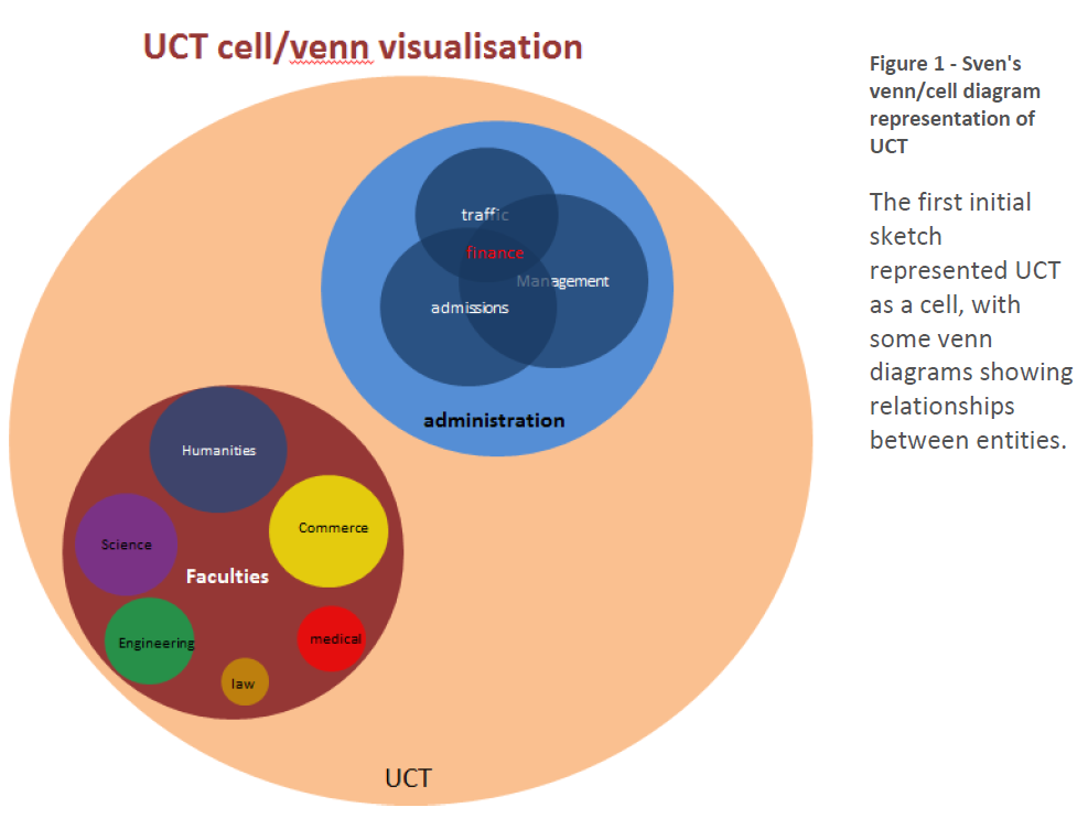
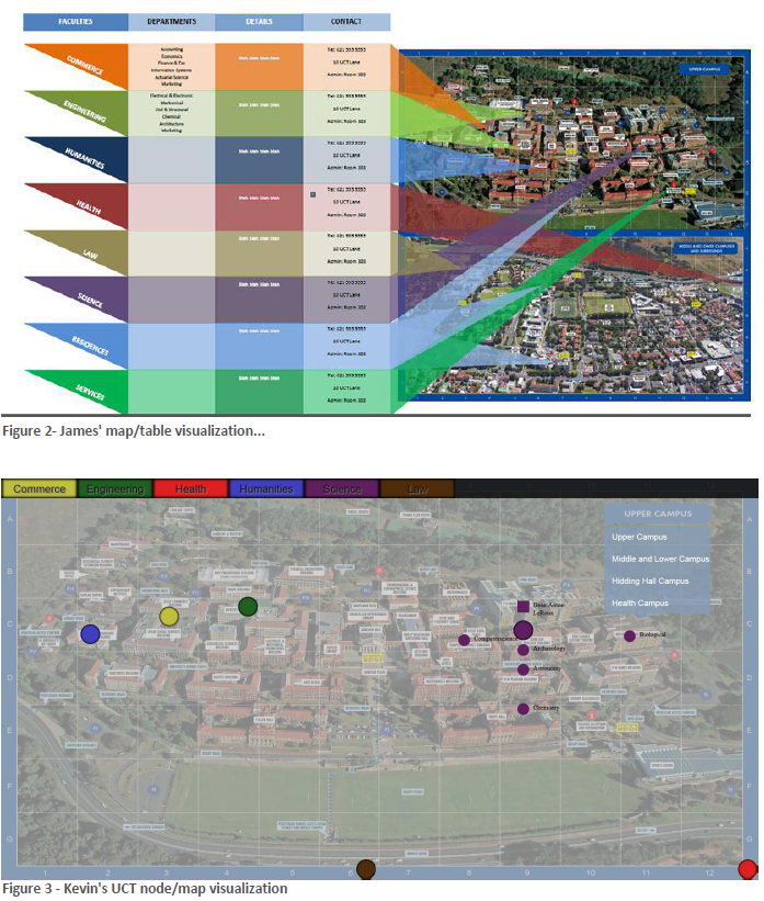
The third visualization is in interactive interface of UCT. This visualization was chosen to be the main prototype due to its interactivity and ability to satisfy more queries than static visualizations. However, first prototype was not visually appealing and exciting. It was too safe and lacked inspiration. The visual interface used a map as a background and represented the structure of UCT as nodes, which are pin-pointed on areas where the respective entity is located e.g the departments of a faculty are pin pointed on the admin building for which the particular department may be located. This visualization received negative feedback due to its inclusion of a map in the background and its dull nodal approach. The figure 1 was recommended in place of figure 3 for the final prototype. This required redesigning a new visualization altogether, paying much attention to the feedback given, thus more sketches were drawn based on the recommended design.
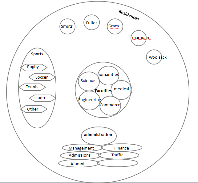
This is the initial sketch of our final prototype which is based on figure 1. Positive feedback was given to this design due to its originality and the high risk factor in making it work the way it’s supposed to.
c. Suggested changes for first prototype
1. The maps should not be used, and should only be for referencing to one of the queries if need be.
The visualization should not serve as a map whatsoever, as there is already an app developed for UCT that’ll aid in locating departments and so forth. The visualization should focus on what there is in UCT, who is in charge, and who to contact rather than where the people in charge are.
2. Addition of keys to help user know what each colour of node represents
The colours used relate to entity at hand, for example, each faculty has a colour of its own, but an outsider would not find that too obvious and using key or legend helps users identify objects easier.
3. Using a more appealing design which is more exciting
The visualization should be pleasing to look at, and should spark the interest of the user so they feel they want to continue using the visualization to answer their queries.
4. Answering significant visual queries such as “Who is the dean”.
The main point of the visualization is to be able to answer the user’s queries. Queries such as which sports are offered in UCT should be fulfilled.
d. Justifications and rationalizations of design (In terms of visual thinking principles)
Overview of Design Features
Our visualisation is based on a cell diagram, which already utilises a number of design principles that we are able to take advantage of in our visualisation of UCT as a cell. Structures and bodies within a cell often have different shapes, different sizes and are often depicted as having different colours from one another. By basing our design on a cell we already inherit some of these design features which can provide various advantages from a user perspective. Using different shapes and different colours helps distinguish the main structures within the UCT cell from one another. These shapes and colours also have learnability value, as users will eventually associate different structures with a particular shape and/or colour. Every cell contains a cell wall which encompasses all the bodies and structure within it, showing that they belong to the cell, and this metaphor is also evident in the UCT cell, as the cell walls represent the scope of UCT and all bodies and structure of UCT are contained within the scope of UCT. Spatial grouping is also used to group together related shapes and bodies and to minimise visual clutter within the cell, so that each structure and body within the cell and be visually processed with relative ease.
Colour Scheme
In creating this visualisation, many different colour schemes were tried and tested. The colour scheme for this visualisation had to be chosen so that the colours used balanced one other and no colour stood out particularly more than another, thus making a body or structure seem more important or distracting to the eye. This was achieved by choosing a dull/faded version of a relatively bright colour for the main structures and bodies. Bright colours help structures stand out from one another, while the fading or dullness prevented the brightness from being too overwhelming. Colour is also used to distinguish the different faculties from one another and these colours are also related to the actual representative colours of the faculties. For those familiar with universities faculties, this will help to immediately identify faculties, but for those who aren’t as familiar, a key for the colours is provided. Colour contrast between the labels and the background were also an important design consideration. Black labels were chosen for backgrounds that are lighter and white labels for colours that are darker to ensure labels are always clearly visible.
Interactive Features
The structures and bodies within UCT are rather large and although they can be placed into categories, some data abstraction is still needed to provide only the most necessary information to users. To allow users to access information specific to bodies and structures they are interested, interactions are made available between the user and the various bodies and structures. Slight movements of elements within the cell are evident when the user hovers over them, this serves a dual purpose of letting the user know that an element is interactive or clickable, and to help extend the metaphor of UCT as a living cell by making elements seem alive through their movements. The decision to make elements movable only through user interaction was also due to the fact that having many different moving objects on the screen at the same time could create visual pollution and annoy the user. Interactive features also help solve visual queries for example, by expanding the faculties body, different faculties expand into their relative sizes, scrolling over different residences shows a picture of what the residence looks like and clicking on the dean of a faculty shows what the dean looks like. In this visualisation only the most basic information about bodies and structure are shown, and often a link is available through which users can obtain more information about a required subject. This also saves the user time, by providing links to information rather than having to search for information links through tedious, time consuming menu systems on a website. When users interact with bodies that are expandable, the background is dulled out which directs users attention to the expanded visual structure they are interested and avoid possible clashing and distraction caused by background elements. Services are loosely couple as they have no direct relationship between each other and scrolling over these provides a label containing contact information needed for using the service, which is displayed to the side of the cell without obscuring any information or other bodies within the cell.
Metaphoric Meaning
For users who have an understanding of the various bodies that exist within a cell and their function, some of the bodies and structures in UCT might have a metaphoric functional relation to the bodies within a cell. For example, faculties are at the centre of the cell and look similar to nucleus of a cell and both are considered the most important part of the cell. The services are placed loosely as they have no relation to each other and are similar in structure to the Endoplasmic reticulum which provides support to the nucleus just as services support the faculties and UCT as a whole. Sports, societies and recreation are extra-curricular activities that keep students busy after hours and require lots of energy, thus they are depicted as the mitochondrion, the powerhouse of the cell. Golgi apparatus has a hierarchical structure which suits the hierarchical nature of the governance levels of UCT and vacuoles are loosely placed around the cell, just as residences are loosely located around UCT.
e. Strength and Weaknesses of design implementation
Strengths
Categorising large amounts of data related to the various bodies and structures within UCT proved to be a difficult task, but by making our design interactive, we were able to use data abstraction to show only the most important bodies and structure on the cell, and allow users to interact with elements to access more specific information about a body or structure of their choice thus accessing more specific visual queries.
Strengths of using html for design implementation:
• Integrates well with various elements such as scalable vector graphics.
• Methods to easily handle and add animations and user interactions.
• Connectivity to other designs or more information using html links.
• Can be easily update or added to by changing or adding property values of elements
Weaknesses
Using the cell design meant having to group related bodies and structures together and separating unrelated bodies, but often members of within separate bodies and structures would have a relationship (for example the dean of the faculty of science is also on the senate) and our design fails to show the intersections between related members.
There were a few html related implementation difficulties that we struggled to overcome such as:
• Lack support for multiple resolutions; Zooming in and out may be require in order to view visualization.
• The visualization may not be rendered correctly in all web browsers.
Conclusion and Future Work
A good visualisation is defined as one that can allow an entire system or process to be represented and can allow focus on individual components of the system while still supporting access to the global system. We believe that the UCT cell visualisation achieves that goal by displaying the main structures and bodies that make up UCT as cell bodies, which answers the main query of what UCT comprises of. Having interactivity of components supports specific queries and allows users to focus on specific components of the UCT organism and answer more specific queries. By applying various visual thinking principles through the use of space, colour, images and shape recognition to name a few, we have created a visualisation that allows users to easily and quickly find and view information about UCT that helps better understand structures and bodies within UCT and solves a previously existing problem; the difficulty and confusion in finding out what is available at UCT and the complexity in understanding what the UCT cell consists of.
Future Work
This visualisation is currently a design concept and can be created into a visualisation that fully supports all structures and bodies within UCT and their associated information. The current visualisation can also be extended to support more visual queries such as relationships between different people within different bodies and include bodies that are external to UCT but provide support or functions that assist UCT in some way such as funding and donations, media publications and marketing.
Work Allocation
Kevin Matidza – Lead Designer/Developer and HTML implementation of visualisation, creating interactions and interactive effects.
Sven Siedentopf – Coming up with initial design concepts, analysis of visual thinking principles and application to the visualisation (main critique) including metaphoric relation to cells.
James Lewis – Gathering and categorising data in an organised and understandable way. Summarising usable data and statistics to support visual queries. Coming up with additional design ideas to support the lead design.