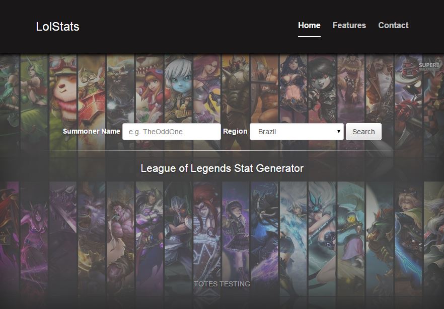
Introduction
The Topic
League of Legends is a multiplayer online battle arena style game. After its release from beta
in 2009, it quickly became the most played game in the world (by number of repeat users). The game
is extremely intricate and involves (on Summoner’s Rift, the specific game map targeted in this
project) a 5 versus 5 team battle where the aim of the game is to destroy the other teams nexus, or
base, before they destroy yours.
The reason this game is so closely followed is because of the intense amount of information that can
take place within one game as well as all of the different combinations of items, champions and
various other elements that players choose per match. This amount of information makes League
a perfect candidate for visualizations, which if utilized to the right degree can allow an
individual to inspect certain key aspects of their game, in order to improve from the ground up as
well as just highlighting any key interests they may have on certain areas of their game as a whole.
The Problem
Currently the statistics, if visualized at all, are far too generalized and do not really offer one
the opportunity to better their game on an individual and focused level, but
rather just tell if they have been doing reasonably well or not (which they could tell from the
general outcome of their games mind you). Thus our visualization is aimed at any players looking to
find any individual statistics for their games, the roles they played in the games (top lane, mid
lane, jungle or bottom lane) as well as the areas on the map and the times certain key events are
happening to them, on average or on an individual game basis. These statistics, as stated earlier
could be used to get better at the game, for interest sake, or just to brag to your friends.
Conception
What We Want To Do
We want to make a visualization that enables competitive players to analyze how they are
performing
relative to the map. Being able to visualize where you are getting kills and where you are dying can
help improve your play style and as a result improve your chances of winning.
Using the
data provided by the Riot API (match history, player data, player events, etc.) we can also create
overlays that can help optimize how you play your
role. Points can be generated to show where the player spends the majority of their time, how
efficiently they are killing minions in the jungle and what route they decided to take to clear
these camps. Scatter plots can help to visualise the position of kills and deaths for any given
player and give them valuable insight into their play styles.
As League of Legends is an
objective based game, our visualization will show which events took place leading up to the
objective, this will give insight into why you successfully took any particular objective or failed
to do so.
Through the use of our visualisations, we hope to help players getter a better
idea of how they play the game and what steps they can take to become better players.
Related Work
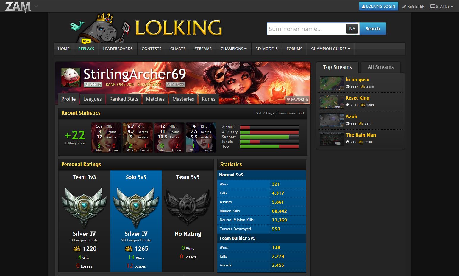
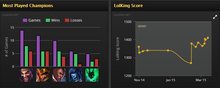
LoLKing.net is one of the most widely used information bases
for any league based statistics, news
and champion information[1], in general LoLKing is the go to place
for anything League. That being said, their mass of visual statistics are in the forms of charts
and graphs, as well as being more focused on teams rather than players. Their match history does not
provide any map based visualization, firstly, and secondly no medium to compare performance based on
Role or individual match.
Below you can see examples of their individual statistics and just how it has no map based
visualisations. That being
said, their use of colour is a good way of showing an increase or decrease in personal LoLking score
(a general metric of how well or bad you are playing presently) or your match history.
[2]
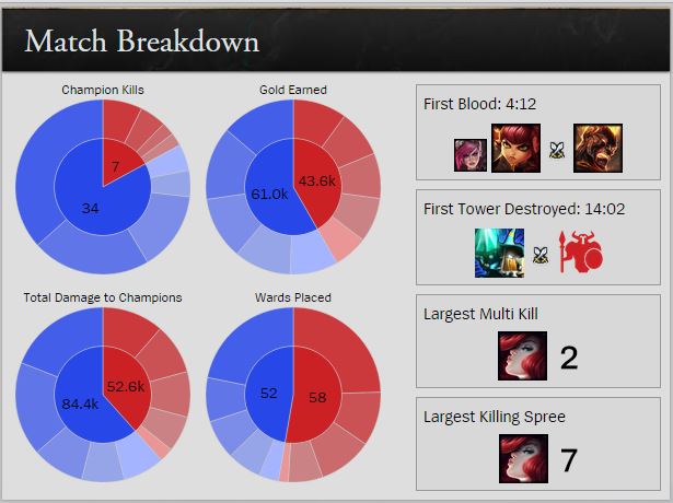
Here is an example from Riot's official League of Legends page. This uses pie charts to demonstrate
information and it is difficult to grasp the intricate details from such a representation.[6]
Another example we found was that of a visualization of the movement of players (random players) on
the map for 10 000 games, whilst this shows something on the map and would be interesting for a
player to see, it provides no meaningful statistics to an individual and shows too little
information. Here is what it looks like, for interest sake:[3]
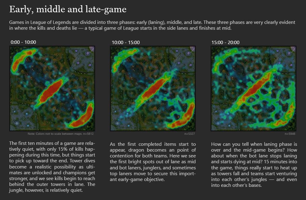
The next example shows something closer to what we were looking for. The heatmap shows regions where
player deaths (when they are defeated by an opponent) occurred on the map and the amount (darker
red) of deaths, as well as the time-span for these amounts[4].
While being closer to what we
envisioned, the graphic still had no individual value, you may be able to see where you are likely
to die, but not where you as an individual had been dying or what role you were playing. That
coupled with the fact that the heatmap isn’t easy to read on the background (poor colour
choice) and that it is in no way dynamic or interactive lead us to believe that this kind of
visualisation could be done better.
So as you can see from the above examples something personal and graphic, as to the locations on the map where events had occurred for that player was required.
Visual Queries
The following visual queries are what we believe our visualisation support and allow users to make.
Interface
The interface does well to answer these questions and using visual cues it helps guide the users eyes to the appropriate section of information, through the use of colours and offsets in the interface representation.
Map
Kills/deaths/assists:
The amount of kills deaths and assists you get and where these events occur is the most important visual query as it is the direct indicator as to how well you are doing and in what areas these good or bad plays are happening. Addressing areas where you die a lot is an easy way to get better quickly.
Objectives (Baron and Dragon):
Knowing at what times these objectives are taken and by whom as well as the activity around the area of these objectives is extremely important as the buffs these monsters provide your team are key to victory and people tend to fight stupidly around these areas, addressing these silly fights and poor execution is a good call for any league player. The most important thing would be to know if you are doing well in the fights around the objectives or poorly (which can be shown by kills/deaths/assists around the pits)
It is important to know where you are spending majority of your time on the map during a specific role, for example, if you are playing Jungle you may be ganking (trying to help your team) too much or too little and knowing these times spent in the areas of the map can really help your jungle clear times and overall play in the jungle. This is just one example from one role as to the importance of knowing where you spend your time.
Gold is used to purchase items which make your champion stronger and itemizing properly is a key part to victory, one incorrect item choice can be the difference between a win and a loss, as such it is extremely important to know how much money you are making and how much of that money is coming through farming (creep kills).
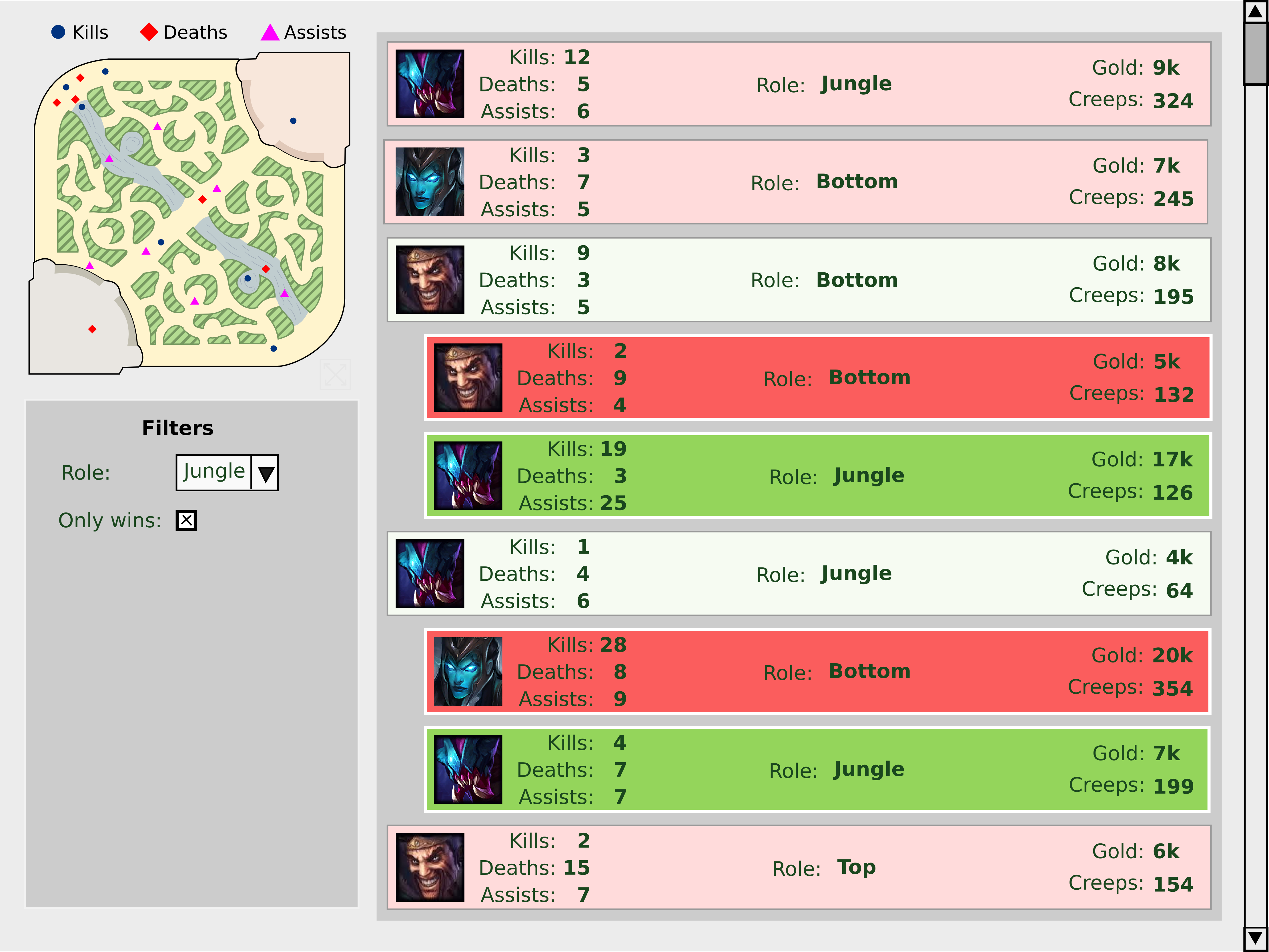
The map is the true form of the visualisation. It displays information of the matches dynamically by generating points to plot on the fly when a user clicks on the desired matches from the interface. The map uses an array of shapes with different colours to distinguish between key events in the matches. This allows a user to quickly and easily identify the respective event. We believe that the map is very effective at visualising the data that a player would want to see about his/her own matches.
Design Iterations
Our design followed a procedure of 3 iterations, involving refinement over each iteration. We had an extremely general principal to work with. We knew that we wanted a application to display the relevant statistics (kills, deaths, assists, ward placements and kills) and a map to display where they occurred. (Click the picture headings to display/hide them. They have icons next to them.)
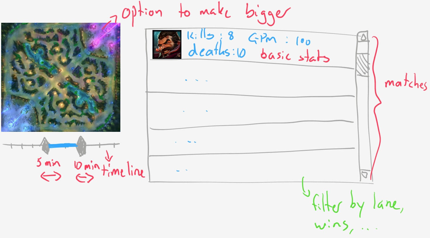
First Design
The initial design was a very rough mock-up of the interface that we wanted to use to display the
concept in order to decide whether it was worth going forward. The basic layout was decided here and
this was kept throughout all the designs. The box on the right displays the list of player match
history in separate boxes with a summary of their statistics for each respective game displayed in
the boxes. The summary would be the most important information that a player needs to see about
each match. These include:
The map on the left is used to show the kills and deaths of players based on the specific matches
which
data they would want to see of. This is added to the map when a box is clicked once and removed when
the
clicked box is clicked again. The map features a time slider that would allow events during specific
times to be shows, for closer inspection.
Various checkboxes will allow matches that are
displayed to be filtered by specific requirements.
-
Main View
When the map is selected, the background is faded out and an expanded map with much more detail is
shown in full, to allow a person to really take in the information surrounding the activities and
events that took place on the map for the games that are selected.
-
Extended Map View

Second Design
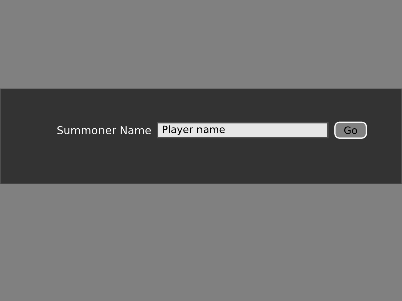
We started getting really excited about our design and though about what we could do to assist visual queries. Firstly, we added a most obvious feature which would be to search for a player to get that player's data. The design for this page was simple and the combination of the colours and text allow aid in helping people easily understand how to use it.
-
Search Screen
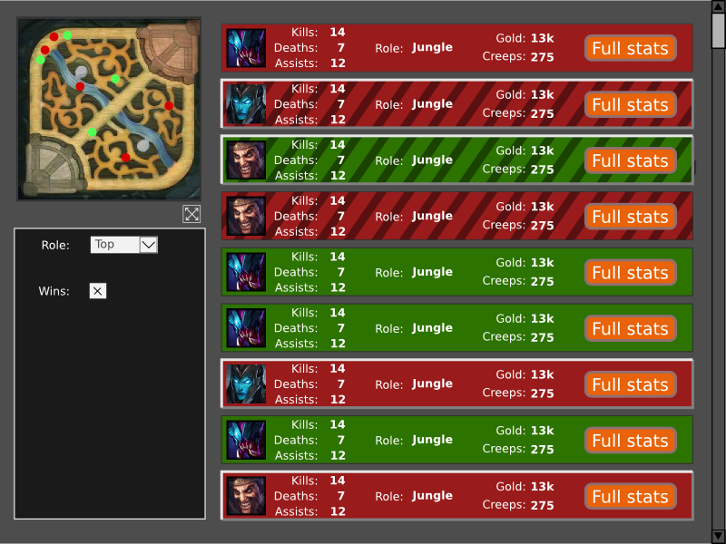
The main interface was given a major overhaul. Since this is the screen with the most information,
we needed to use good practices to allow people to easily satisfy visual queries. Each box on the
right represents an individual match, as mentioned before. For the status of a won or lost game, a
differentiation of typical green and red colours for each respective box is used. The player
champion icon is displayed to allow players to better remember prior matches and information was
laid out in a cleaner, better way.
The biggest change was the introduction of texture to
allow differentiation of matches that are selected and that are currently supplying information to
the map or not. When the box is selected, a diagonal texture is used to distinguish it.
-
Main Interface
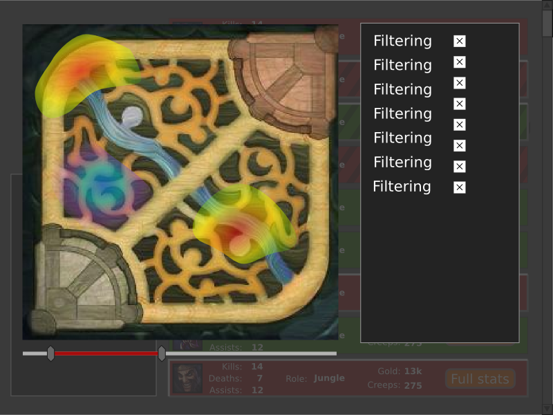
The idea of the focused map is improved on the second iterations and here we decided to add
filtering rules to the map, as well as move the time slider from the main interface to here. It
makes more sense to have the time slider in the setting that is larger, where more information can
be seen and understood.
Filters were also added, giving additional flexibility to have more
match specific features or events turned on or off, as opposed to just having the match history
affected. During this design phase we found that the API Riot provides developers in order to access
these statistics had some limitation in terms of the data that we could pull. We initially planned
on having ward placements and kills in the visualisation with specific timings, because they can
provide players with very insightful information, but unfortunately the geo-data on these are not
provided as we had originally believed.
-
Extended Map View
We received a lot of positive criticism on this design when we presented it to our class for
evaluation. Some of the suggested changed seemed to have less to do with the visualisation and more
to do with adding additional features. Video games are a popular topic. :D
We did get
useful feedback on the visual aspects, though. This included the ability to add more than one
player to compare, the making items appear in the timeline, toggling between multiple selected games
and a single one, using non-distracting texture and colour on the map, etc. These were well
considered and implemented for the final design.
This being said, there were some features/
design changes that we decided not to implement due to restrictions in time and complexity. These
features, such as comparing players will be considered for future designs when it is more feasible
to implement them.
Third Design
This design stage actually went through many fine changes and decisions as we decided to add and
remove things where we felt it necessary.
The search interface had a big change. We
redesigned it to be more welcoming to players of League of Legends and also fixed one big flaw that
we had forgotten about: choosing which region a player plays in. We made some usability changes like
preventing a player from submitting a blank name and also animating the search button to indicate
that the application is polling the API and generating the statistics.
-
Search Screen
We took the critique from our peers seriously and decided to redraw the map provided by Riot for use
with their API[5] (the design 2 map). Tracing it from scratch and
using scalable vector graphics, this not only allowed us to dull the colours and make it much more
appropriate for placing images on top of it, but also for resizing it without quality loss. We
utilized
colour shifts and texture to indicate water, jungle and etc.
-
Main Interface
Our final implementation of the map, populated with the user data utilizes a scatter plot like
approach across the map instead of a heatmap, for more readability. We believe that this combined
with the colour code as well as shapes to represent the different fields, marked by the key at the
top provides the user with the clearest version of the data they are seeking (from this they can
easily query where they are dying the most, killing the most etc). Textures and colours are also
used to indicate the “Jungle” region as well as the “River” and are done so in such a manner as to
not occlude any data or overly clutter the map in any way. If you hover above the individual points
more detailed information about the event is available such as the time the event occurred and the
exact coordinate of the event. We chose a dark blue for kills as it can be seen as a positive colour
(a lime green was an option but didn’t read well in the jungle regions) and bright red for the
deaths as it appeared most negative and would invoke the sense of a bad occurrence off the bat. A
fuscia colour being chosen for assists came as it was a sort of intermediary colour, whilst being
positive is still not as advantageous as kills. Even at high volumes of data, we believe this
implementation holds its value and provides the user with meaningful data.
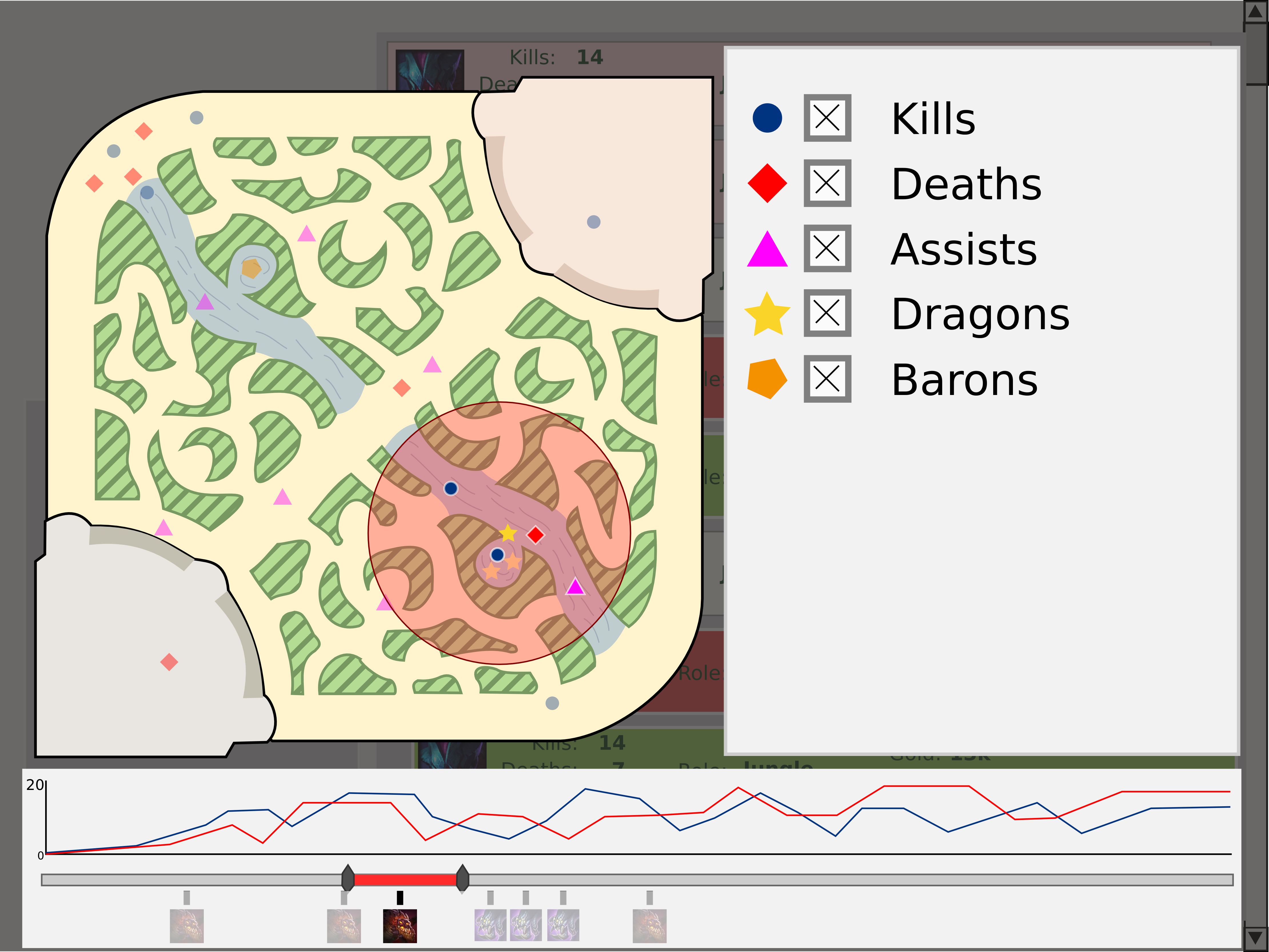
The Dragon overlay will display the events (kills/deaths/assists) around a particular area around
dragon pit (same principle for Baron) for a certain period of time and will show the dragon key in
colour if the dragon went to your team and greyed if it went to the opposition and will grey all the
other data selected. As such, players can get an idea of how well or poorly they are making
decisions around important objectives.
-
Extended Map View
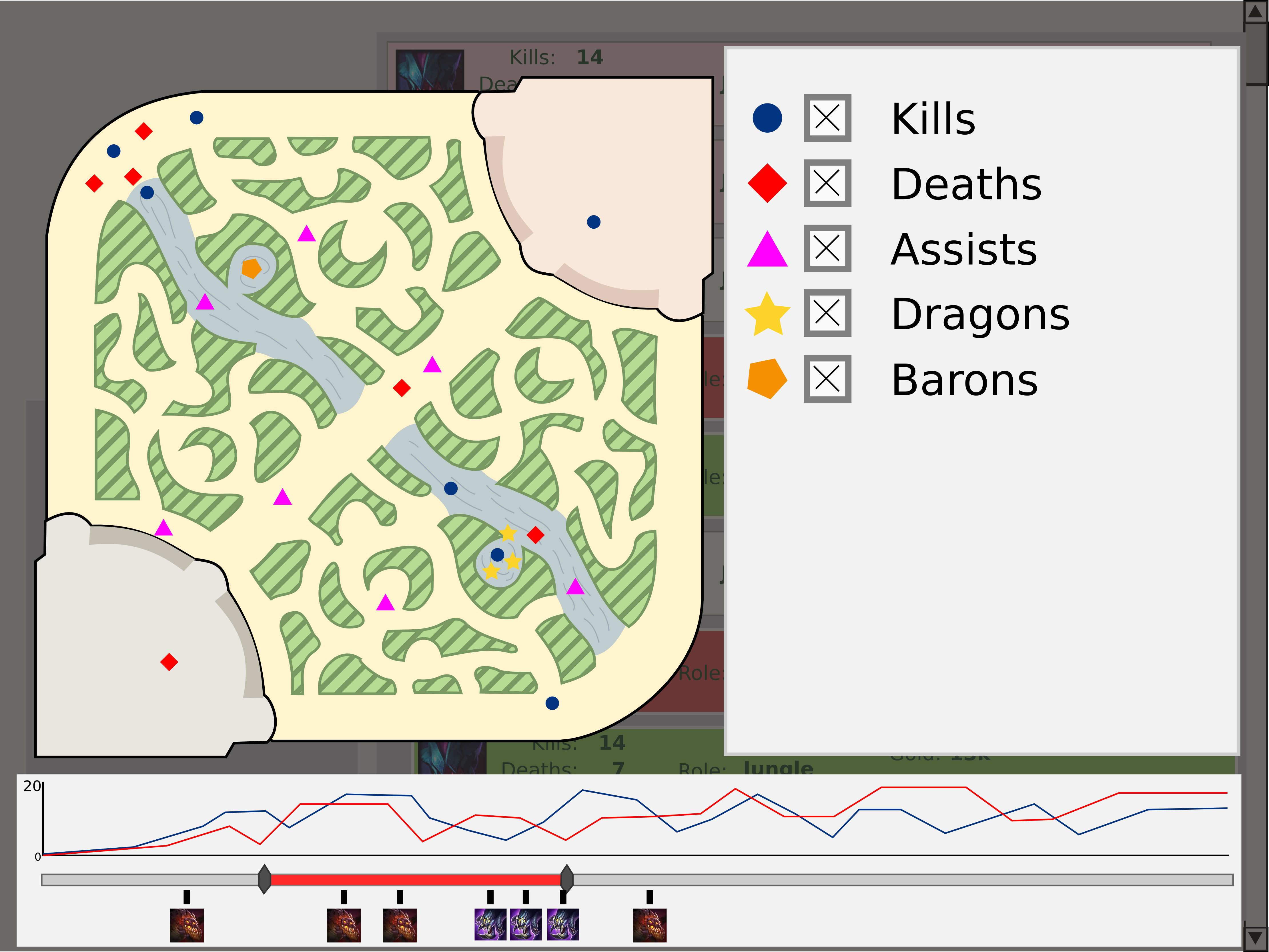
-
Extended Map View (Dragon overlay)
Strengths and Weaknesses
Firstly we believe that our visualization provides the user with a lot of information regarding
their individual play and how the play with each role, where they are doing well, or poorly and
helps overall to better their game. Secondly with the ability to compare to their other roles and
other people they can really get down to what they should be doing with what role. With our
visualization we believe that the user can get a real feel for their match history rather than
seeing what they already know from the post game statistics (kills, deaths etc) by putting into
context of the map itself as well as putting it into context with other players. The one weakness is
that with large amounts of data the map becomes cluttered and occlusion can occur and we needed to
find a way around this.
So we decided that with checkboxes which could
turn data on and off and only displaying the data for the specified time we could minimize noise on
the map and give the user the data they wanted to see. Coupled with a good colour scheme for the
points we believe our visualization overcame the clutter
and provide a meaningful portrayal of the data.
As far as difficulties during the project, we found that pulling
data from the API was extremely effective but we needed to sift through the data and decode it quite
a bit before it became useful and this took some time and effort. This combined with finding a way
to effectively display this large quantity of data in a small area whilst maintaining as much
meaning as possible was quite the challenge.
Conclusion
We believe that through our efforts after receiving feedback on the second iteration we have
addressed
most of the key points that have been brought up about the various aspects of the application. The
design has benefited tremendously.
As much as we
believe that our visualization has a lot of potential to be a meaningful source of information and
statistics for all players looking to get better at the game or just see how they are doing in
general, there is always room for improvement. In the future a potential switch to a heat map type
structure for heavily cluttered map could provide promising results. We also believe there is a
place for this visualization on a forum such as LoLKing or somewhere of the sort considering that
we, as avid League players see a definite benefit from a Visualization such as this.
Team Work
Teamwork was divided up among the 3 members of the group in the following manners:
| Name | Tasks Assigned |
|---|---|
| Calvin Mills | Report and concept design |
| Eugene de Beste | Implementation of idea and design of app/report |
| Mark Grivainis | Design and code support |
Overall, the team worked well together. Perhaps not enough effort was put in when there was time and
some did more conceptual design than implementation and vice versa, but the team worked well with a
good range of creativity and effort.