Every six months Google releases their Transparency Report. In this report, Google discloses data regarding the number of requests they receive from governments to either obtain or remove information from Google’s services. Our focus is on two sets of data within the report. The first being the number of requests that Google receives from governments to remove content from their services. The second being the number of requests governments make for Google to release user data to the governments. The data used in our visualization ranges from July 2009 to July 2014.
Visualizations of this data already exist, but there are no comprehensive, interactive visualizations that allow users to compare this data between countries. Our visualization will include both a global overview and a comparison view. This allows users to compare countries broadly on a global scale helping them to decide which countries they would like to compare head to head in the comparison view.
Our visualization is aimed at people who are interested in how governments around the world attempt to control and moderate the internet. These people are likely to be technology savvy and will understand current topics on information security. They will also appreciate an interactive, web-based visualization.
Previous visualizations of this data were already focused on comparing countries, however, making important visual queries from these visualizations is difficult. In two of the reviewed visualizations (Fig.1 and Fig.2), only certain countries are displayed, making it difficult to make comparisons on a global scale. In Fig.3 the use of a map makes it easy to make global comparisons but it is difficult to compare countries that appear similar on the map as they are an extremely similar colour.
Bourgoin (2013) makes exclusive use of pie charts (Fig.1), while this makes it quickly clear which reasons are most commonly cited in takedown requests the smaller regions can be difficult to compare. This difficulty is compounded by the lack of percentage numbers on the pie charts. The regions that occupy extremely small percentages on the pie charts are also extremely difficult to see. The circular outlines around the pie charts are difficult to compare and only exist for a few countries.
In Fig.2 the only comparison of data between countries is given as a simple count of takedown requests, as well as the change in ranking between two dates. This visualization becomes chaotic when multiple countries are represented at one value, especially when more than one country moves from a particular value to another particular value. The lines connecting these data points appear in exactly the same point and that makes it difficult to follow the change in certain countries. There is also no real vertical scale so the vertical space between countries has no meaning. The stacked bar graph is useful for showing the increase in total takedown requests made over time. However, beyond the first category of data it is difficult to compare the other categories as the bar for each time frame starts at a different place. Once again as in Fig.1 small categories are difficult to compare.
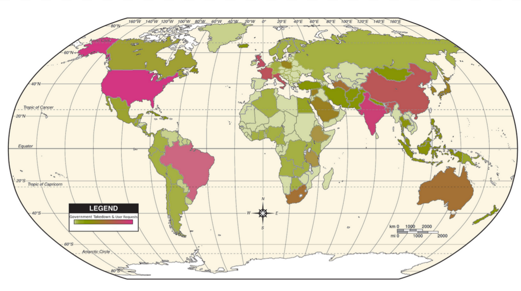
Serrao (2012) makes use of a 2D Mercator projection and a colour scale to show takedown requests for each country Fig.3. While this makes it easy to compare countries globally the scale makes it very difficult to compare the majority of countries. This is because most countries fall into the lower, green half of the scale with only two countries falling onto the upper, read half. The grey colour in the middle of the scale also makes it difficult to differentiate between white countries which have no data and grey countries that fall in the middle of the scale.
Our implementation aims to combine the effective aspects of a 2D map and a more in-depth head to head comparison using bar charts.
 Fig. 1: "Visualizing Online Takedown Requests" by Auriane Bourgoin (2013)
 Fig. 2: "What does the World ask Google to censor?" by Sebastian Sadowski (2013)
 Fig. 3: "The Land of the Free" by Elroy Serrao (2012)
There are two main components to our data set: Number of governmental requests for personal data about Google users, and number of requests to have URL’s removed from google searches. Our most important visual queries are therefore:
Although we did not find any of the aforementioned visualizations to be totally satisfactory, they did provide valuable insight into further, more peripheral, visual queries we wished to be able to answer.
Fig.2 attempts, although quite poorly, to answer visual queries related to time. We wish to improve on this:
Fig.1 above highlights the different reasons that were given for requesting certain URLs to be taken down. This is a portion of the dataset we felt was too interesting to be ignored, leading to a further query:
Of course, these URLs actually have meaning in and of themselves. We wanted to be able to show who’s URLs were being targeted the most:
Finally, note that all of the figures above, and many other similar visualizations, attempt to allow the user to in some way compare the data from countries. Not only did we want to be able to answer all of the queries stated, but also to directly compare any two countries in terms of all the areas of interest we have highlighted.
When visualizing data regarding countries (or their governments), it is hard to avoid the use of some sort of map projection. Although not strictly necessary, especially since the geographical location of countries is not pertinent to our queries, we felt that using a mercator projection (or similar) would be a familiar way to organise and display data about all of the countries at once. This also affords an opportunity to get a general overview of the data for a user who does not know much about the topic, before going into more in depth data. Below is our initial overview design:
We used a more accurate representation of the world than the traditional Mercator projection, as we felt that the distortions in country size could do with being somewhat mitigated. We realized, given the scale, that it would be impossible to easily answer more than one visual query when looking at the whole globe. Given that countries vary so much in size, some are simply too small to have icons/texture variations to answer more visual queries immediately. These techniques would work for more homogenized border areas, such as states in the USA, or provinces in South Africa. We chose a colour scale going from green to pink, and a very light yellow background. Both the green and pink colours are known to stand out well from this background colour, and vary significantly from each other as well. We also varied the opacity of the colours, trying to differentiate countries in two visual channels. Our scale therefore went from semi-transparent green, to opaque pink.
Although we felt that this colour gradient was visually fairly effective, there were some issues. People felt that the scheme was confusing, perhaps due to the fact that most scales vary on the green to red scale, and our motivations for disobeying this were purely aesthetic. Another issues was that legend was far too small, making it hard for people to tell what information the colour gradient was trying to convey.
In response to these flaws, we redesigned the overview screen, and implemented an interactive version. This time we stuck to a green-red colour scale, and increased the size and readability of the legend. Information about a country is displayed when the user hovers their mouse over a country. The mouse wheel can be used to zoom in and out, and clicking on a country will cause the camera to zoom in on it.
After viewing the map above, otherwise uninformed users will have a better idea of which country they would like to learn more about, or which two countries they would like to compare. Subsequently clicking on any two countries will populate the country comparison view (which will be directly below the map), with the data from the two countries, facilitating a direct comparison. Below is our original mockup for the comparison view:
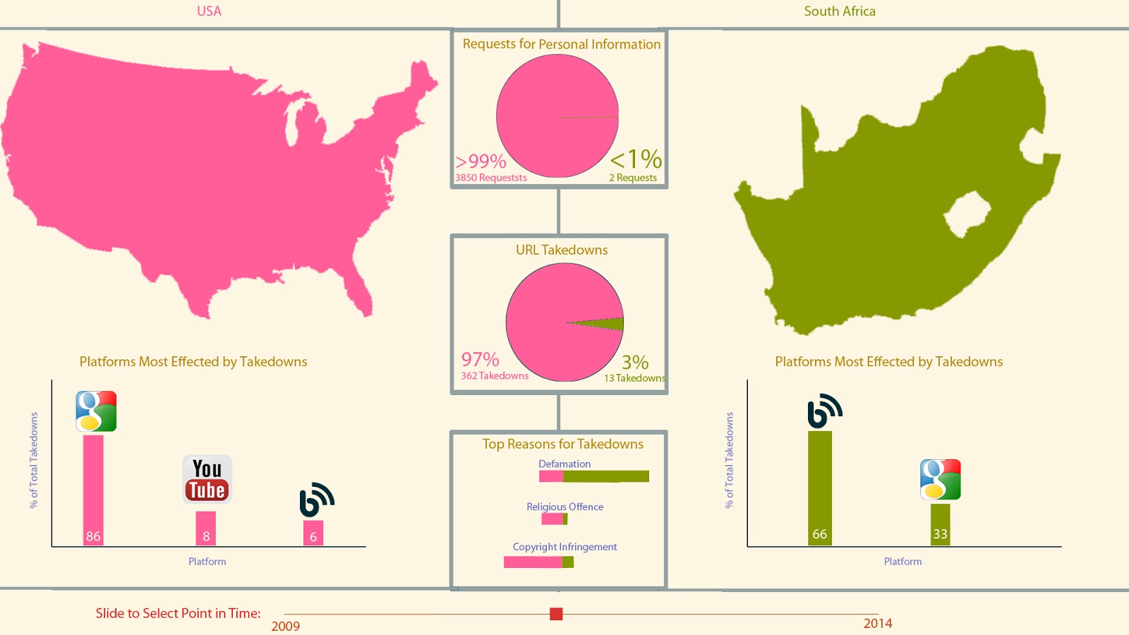
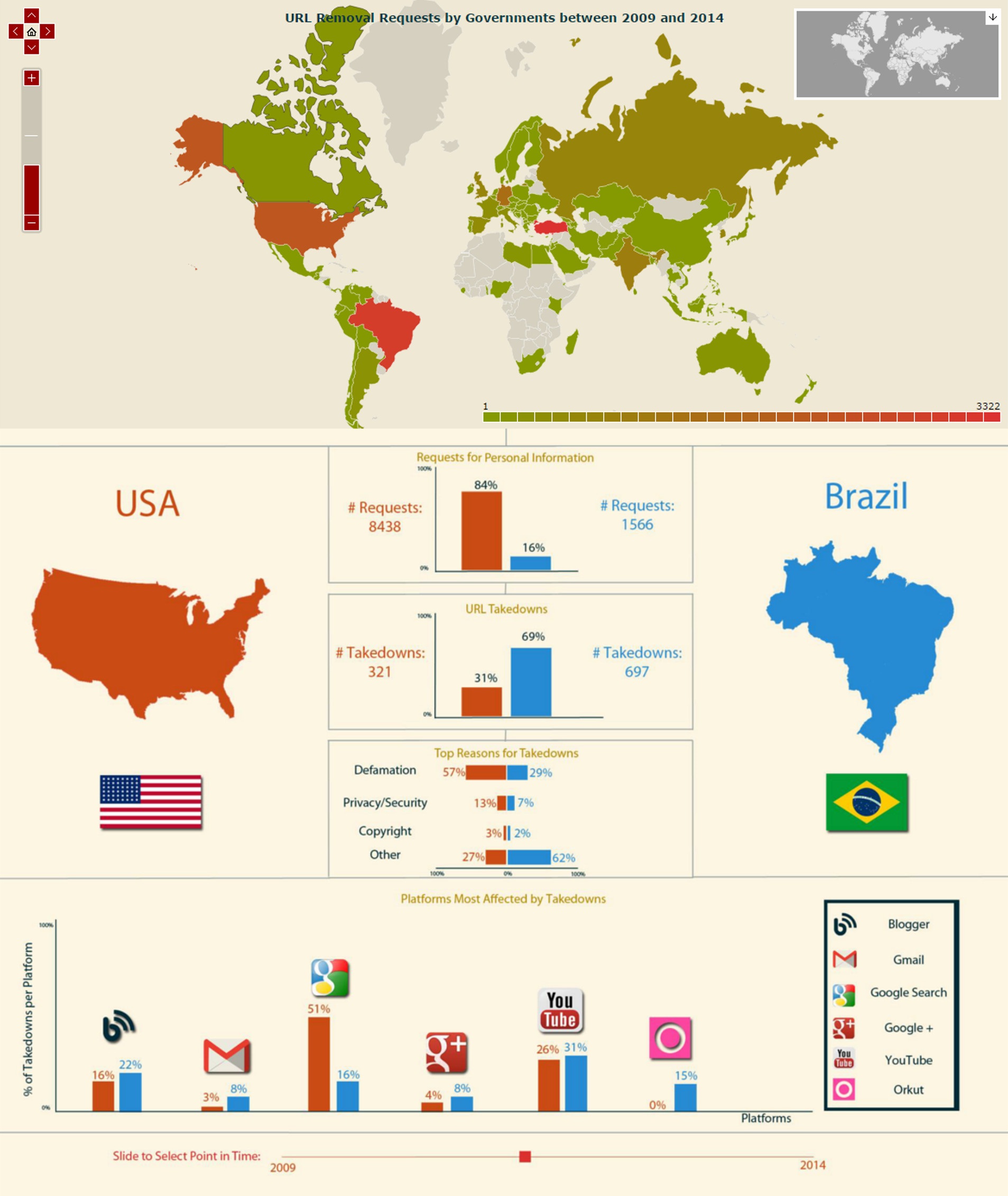
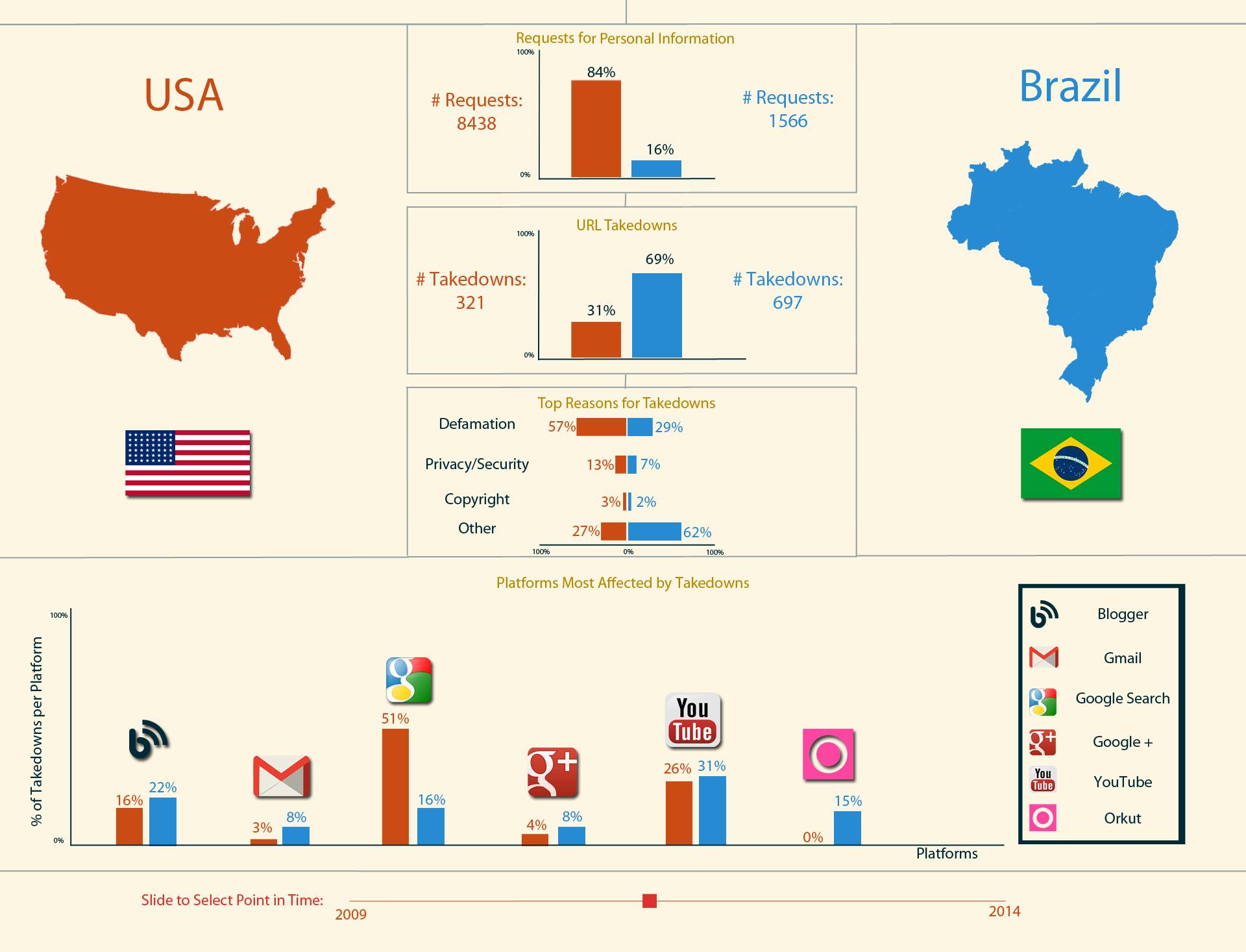
Each country, and all of the data associated with it, is assigned a colour at the opposite end of our green-pink colour scheme. This makes it easy to identify which part of each chart belongs to which country, and the contrast between the colours makes the boundaries easy to see. The use of space, split right down the middle, also helps to divide the data. The countries are both depicted, as well as named, for easy identification. We chose to use pie charts for our two main visual queries in this mockup, as we were comparing rations, and only between two things. We thought that this type of graph, although limited, allowed for a very fast identification of which country had a higher score in an area. The actual percentage is also displayed, as well as the numbers of takedown requests and user data requests, to answer these visual queries more specifically. As there are always multiple reasons for URL removal requests in the data, and we felt that a pie chart would not be able to display this accurately, we chose to use a mirrored bar graph. We aligned it vertically so that the scores for the various categories for each country would be on that country’s side of the panel. To illustrate which platforms were most affected by takedowns, we decided to use separate bar graphs with icons to identify the platforms. Most of the platforms affected are very well known, so we thought icons would be a fast way to distinguish them. This interface design also includes a slider at the bottom, that would allow users to see how the data for the two selected countries varied with time.
There were several problems with this initial design. Perhaps the most obvious was that the depictions of the countries were taking up far too much space, and not putting it to good use at all. The colour scale used was the same as on the overview panel, but the data informing this scale changes between the overview and comparison panels, leading to confusion. A lot of the text was so small that it became completely invisible on some displays, making it impossible to answer visual queries such as “how many URL take down requests did the USA make?”. The fact that the “Platforms Most Affected by Takedowns” bar charts were split up, actually hindered the ability to compare the countries in this regard, and the lack of a key meant that the more esoteric icons would be totally useless for a majority of users. The green-pink colour scheme did not work as well as had hoped, and both the pie charts and mirrored bar chart were less readable because it was hard to distinguish the exact point at which the colours met. The lack of scale on the bar charts also hindered readability, and credibility.
In order to address these problems, the comparison panel was redesigned as follows:
In order to address the issues with the initial design, the following changes were implemented for this new interface design:
By using colour, space, and icons effectively, this comparison panel allows all of our visual queries to be very quickly answered at a high level. Ensuring that the appropriate detail is included in easily readable text allows these same queries to be answered with the maximum possible level of precision.
All of the values and graphs in the final design above are accurate visualizations of the Google transparency report data from December 31 2012 to June 31 2012.
The full design can be seen in the conclusion.
The 2D map with countries coloured according to a red-green scale is effective for comparing countries at a global scale as the colours contrast well and have social connotations. It is simple to identify which countries’ governments are making a lot of takedown requests and users’ eyes should be drawn to the red countries as red tends to be a cautionary colour in western culture. This feature, combined with a tooltip that appears when the user mouses over a country helps to give an overview of the data. The tooltip also gives more information to help the user identify a country in order to mitigate the 2D map’s reliance on the user’s geographical knowledge. This idea extends to the head to head comparison view where each country’s flag is displayed. This is done so that the user does not have to identify a country by its shape as this may prove difficult for lesser known countries.
The head to head comparison view simply compares two countries that the user has selected. An orange-blue colour scale is created to quickly show the user which country makes more requests. Simple bar charts are used to quickly show a comparison for the different types of requests. The actual number of requests are also shown to provide a hard comparison in case the bars are of similar length. The two-sided nature of the bar charts and the positioning of each country on the respective side encourages direct comparison between the two countries. Recognizable icons are used to represent the various platforms so that our targeted users should be able to easily identify them. A key is also added in case the icons cannot be identified.
One of the difficulties encountered was the effect of the United States of America’s data on the 2D map view. The amount of requests that the USA makes to obtain user information is much higher than any other country. If this data is factored into the 2D map view the USA becomes red and most of the other countries become green. This makes it difficult to perform any visual queries other than which country makes the most requests. This lead to the decision to only make use of government takedown requests to rank countries on the 2D map as this gives a much broader range of colours for comparison.
Another difficulty encountered was the use of colour scales. Using the same colour scale on both the 2D map and the comparison view lead to confusion as the colour of each country changes between the views. Instead, a new colour scale was adopted for the comparison view. This may still lead to confusion but it should show that each country is assigned a new colour based on how it compares to the other country in the comparison.
The Mercator projection also distorts the shape of some countries, making them appear smaller or larger than they should. The 2D map allows the user to zoom in and out, helping to show smaller countries that may be difficult to distinguish initially. When the user clicks on a country the map will also be oriented and zoomed so that the selected country is clearly in focus.
According to the reasoning and rationalizations for this design, this visualization should be effective at giving both an overview of the data as well as an in-depth comparison between two countries that the user selects. This visualization attempts to reach its aim to provide people interested in information security with information regarding their governments’ interest in content and information generated by its citizens. It also makes it clear which country’s governments make an abnormally high amount of requests to obtain or remove their citizens data, and in turn, create awareness about information security issues.
While the implementation of this design is not complete and the design itself is not perfect. This leaves room to improve the visualization as an avenue for for future work. Another avenue of research might involve creating and calibrating a method of scoring countries based on their user data and takedown requests. This would be useful as a standardised measure of government data requests to rank countries.
A potential future project that we are quite excited about is converting the full implementation of the comparison panel into an API. We feel that the design as a comparative tool is good, and need not be restricted to only the transparency report data. The comparison view could be used to compare any two things with sufficient data.