

Introduction
The University of Cape Town (UCT) is set on creating an environment which encourages sustainability and is committed to policies and practices that will ensure a contribution towards the bigger picture. UCT signed the Talloires Declaration in 1990 (University of Cape Town, 2014) and with that began implementing energy saving policies and using resources to achieve these goals. Such policies inspired students to form the Green Campus Initiative in an effort to be involved in conserving the campus environment.
The most recent international commitment UCT has made is with the Sustainable Campus Charter (ISCN, 2010). This charter provides cooperating institutions with the opportunity of integrating research and sustainable operations to determine the best practices and apply them, while allowing independent goals to be created that are in line with the Charter. Not only does this motivate collaborative work, but also transparency among the institutions.
The Carbon Footprint report focuses on greenhouse gas emissions that are caused by activities (directly or indirectly) and by a product or service over time. Using the global standard Greenhouse Gas (GHG) Protocol for measuring, managing and reporting greenhouse gas emissions (Ghgprotocol.org, 2015). Emissions are expressed in carbon dioxide equivalents (CO2e) and categorised into three scopes, namely:
- Scope 1 - Direct emissions
- Scope 2 - Indirect emissions from purchased electricity, heat or steam
- Scope 3 - Other indirect emissions
Currently, the visualizations often used to represent the findings are pie and bar charts. The pie charts are used to show proportionalities, where each sector of the pie represents categories from the three scopes. The issue with this is that the data contains many small amounts, which makes it unsuitable for viewing. The bar charts are great for comparisons (current vs. previous year) but fails to effectively represent data that has discrepancies.
The data for this report is retrieved primarily from the Procurement and Payment Services (PPS), with the remaining data from Student Housing and a small number from the different satellite campuses. This is compiled and presented for the ERC, UCT management, PPS, the International Sustainable Campus Network (ISCN) and various UCT staff departments.
Literature Review
Many universities around the world are dedicated towards lowering their carbon emissions. With this goal, it is important that data is collected accurately and displayed correctly in order to determine areas of concern and possible change. With the intention of improving the current state of carbon emission visualizations, we sought out a few institution’s carbon footprints online to see how the data is displayed and how effective it is. The following institutions all use the Greenhouse Gas Protocol when measuring their carbon footprint, thus the visualizations they use are worth noting:
The American University in Cairo (AUC)
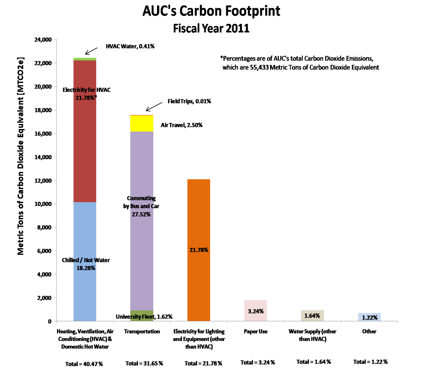
The graph shows the AUC’s total carbon dioxide equivalent emissions, where the x-axis shows the different categories (in percentages) and the y-axis shows the amount of emissions (in Metric Tons of Carbon Dioxide Equivalent). Comparisons can be made just by looking at the visualization plainly, and the division of each category allows one to see the activities involved and their contribution. Percentages are also added to the divisions which help with queries pertaining to amounts. One issue is that each category can easily become busy if it has many activities involved in it. The second is that there is a discrepancy between the figures, which makes Paper Use, Water Supply and Other seem somewhat meaningless. Another issue is that all the text and percentage amounts make the visualization overwhelming. A positive that can be taken away from this visualization is the stacking of individual categories into similar groups.
The University of Maryland

The pie chart gives a breakdown of the total emissions incurred by the University of Maryland. For the activities that contribute less than 10%, the proportionalities are no longer useful; the slices become very thin, making it hard to picture the estimation and possibly writing it off as minor. For example, it is not possible to tell the difference between the faculty/staff commuting and student commuting pie chart slices. The fact that the pie chart is 3D does not help in answering other possible queries.
Washington University in St. Louis
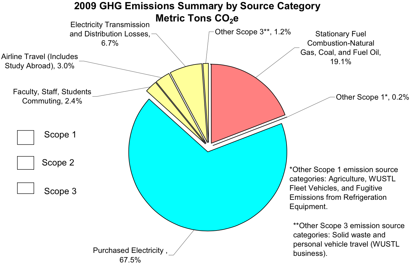
The Washington University in St. Louis’ pie chart is similar to the University of Maryland, but the slices are arranged according to scopes and it is a 2D perspective. The annotations on the side are somewhat misleading, the keys for the scopes have no relation (or colour) to the pie chart itself and the amount of text makes the visualization quite busy. The colours differentiate well, but there is no fixed key to which they refer to. “Other Scope 1*, 0.2%” is almost non-existent and the lines which refer to slices are hard to see. This is another good example of a pie chart that is difficult to interpret.
The University of Cape Town (UCT)
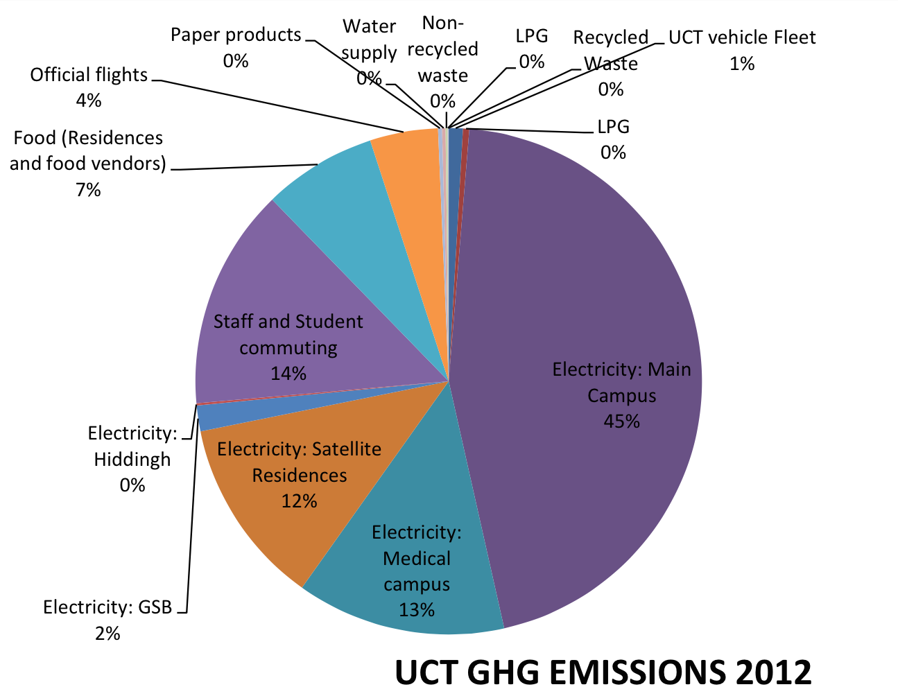
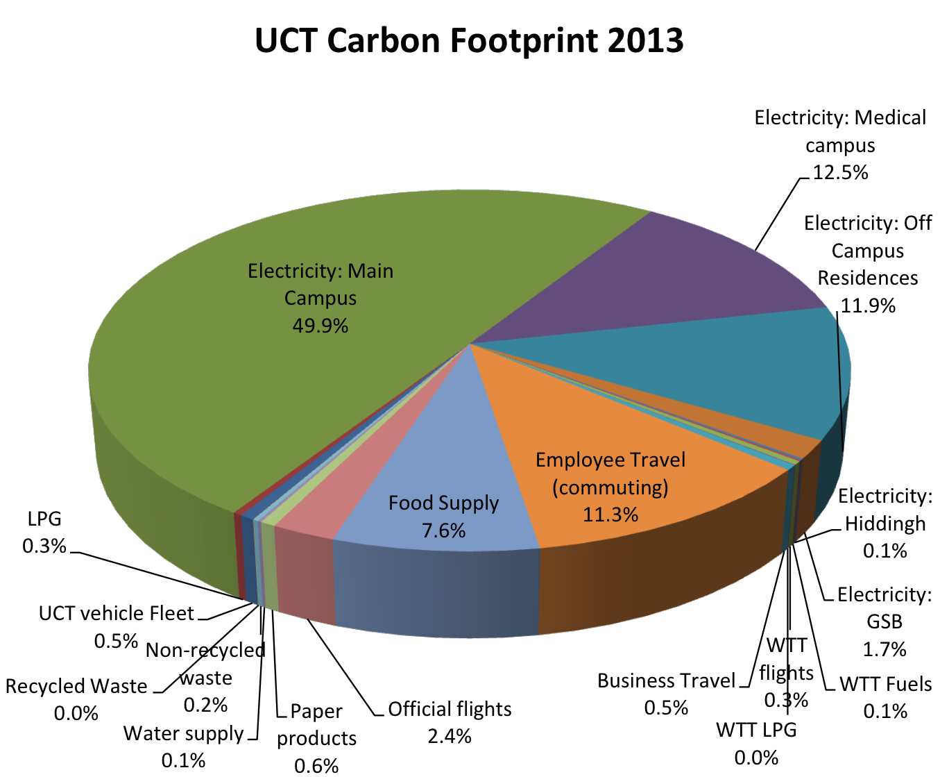
The two pie charts above are taken from the 2012 and 2013 UCT’s Carbon Footprint reports.
The pie chart representing the data from 2012 has a number of concerns. The title of each activity is not placed consistently; some titles reside inside the pie while others have lines directing the viewer to the relevant slice. Most of the activities have percentages that are less than 1%, which makes that data hard to differentiate. A number of activity’s have a 0% contribution, which is not an entirely correct representation of the raw data, making it misleading and unnecessary in adding it to the pie chart.
The pie chart from the 2013 year is a 3D pie chart. This interferes with the proportionalities of the pie chart, where a 2D one would have sufficed. Again, many of the activities have percentages below 1%, which makes it difficult to read and interpret them. It is also useful to indicate which activities fall under scope one, two and three respectively for easier querying.
Visual Queries
With the design proposed in this web page to represent the carbon emission data, these are the primary visual queries:
Which scope contributed the most to the total emissions?The first query that is asked when viewing an institution’s total emissions is which scope had the largest impact. This allows the interested parties to immediately recognise which activities are a cause for concern and how they can be adjusted to produce less emissions in the following year.
What are the year on year trends for each category?This query looks at whether the recommendations implemented throughout the year (with expansion of students and resources in mind etc.) made a difference compared to the previous year, and how significant this difference is.
Which category contributed the most in each scope?This narrows down the above query by identifying the specific activity/groups of activities that are producing a high number of emissions.
Which category contributed the most to the total emissions?This query focuses on the category that has the largest impact on an institution’s emissions, and how significant this contribution is.
Which category contributed the least to the total emissions?This focuses on how small a contribution by a category can be, and whether it may be overlooked or not.
Design Description
Initial proposed design
Once the primary visual queries were decided on, we proceeded onto designing the visualization. Figure 6 shows the initial design, followed by the rationale behind it:
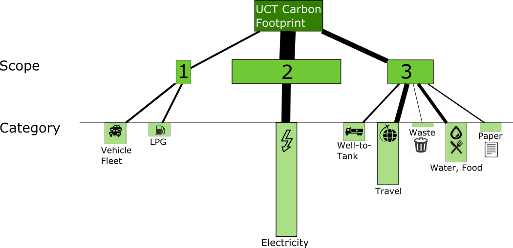
The inspiration behind this design is taken from the “Mandela’s Descendants” visualization presented in class. Three shades of green are used, where: (1) the darkest green colour shows the context of the kind of information we are dealing with, which in this case is UCT’s carbon footprint, (2) the “regular” green shows the three scopes dealt with in the report and (3) the lighter shade of green shows the different categories. Icons are used to depict the different categories (for their quick, easy recognition) and text is included to avoid any possible misinterpretations of the icons.
Relationships are shown using edges: the thickness of an edge gives a comparative estimation of how much each category contributed to each scope, and likewise how much each scope contributed to the total emissions, which makes it easy to answer certain visual queries. The size of each category allows for comparisons to be made along any other category. This is depicted by the height of a category’s box.
Details are available on demand for each category, where a click on the box of a category brings up a bar chart that shows the emissions from the current year vs. the emissions from the previous year.
Challenges from initial proposed design
There were several challenges identified from the initial design. Firstly, the upside down bar graph representation of the emissions. The upside down bar graph was used in an attempt to show the weighting of the categories/scopes. The idea behind this was the relativity of the differences in emission recordings instead of basing length of the bar on the mapping to its exact recording. This approach made it easier to view smaller readings such as Waste emissions. However, this approach can be difficult to accept as an upside down bar graph can be counter-intuitive. Secondly, the relativity approach of weighting bar graphs is only effective for a small domain of categories/scopes.
The colour used in the design was the green. The use of this colour was inspired by the fact that green generally represents the colour of nature, life and harmony. Therefore in the initial proposed design, darker and lighter shades of green were used to differentiate between categories. The challenges with this approach are that it can prove to be a problem especially for people who are visually impaired or have eye defects relating to their receptor cells (rods and cones).
The icons used inside of the bar graphs was a challenge. Icons are a very good approach for identification, but the challenge comes when placing it in small bars. This made it difficult to identify what the icon is and therefore making it confusing. In the case of this situation, the icons are then placed below the bar graph.
A tree like model was used in such a manner that branches were used to indicate the weighting of the scopes and categories. The branches were also used to indicate relationships. An example is the thickest branch linking to scope 2 meaning that scope is a part of the Carbon footprint (relationship) and that it contributes the most (thickness) . The challenge with this approach is that the more scopes and categories are added thickness may become an issue to differentiate although relationships can be easily seen for any number of categories and scopes.
Feedback concerning the initial proposed design
Once the initial design was presented to the class, these are the comments that we received:
- Colours could be used to either differentiate the three scopes or differentiate the categories (along with highlighting severity)
- Category labels should be placed on a single line for easy readability (avoid constant up-and-down movement while reading)
- Instead of using lines to group the three scopes, cluster the categories according to each scope to show grouping
- Adding numbers and possibly a scale is necessary (to avoid size estimation of data)
- No need for lines/thickness of lines for differentiation (idea of grouping)
- Visualization running downwards is almost counter-intuitive; look into making it upright (or possibly horizontal)
- Add a timeline slide at the bottom to scroll between years, and ensure data dynamically adjusts
The feedback received was useful and considered in making the final proposed design. This can be seen in Figure 2 followed by the rationale behind it as well as the feedback that was put into effect.
Response to above feedback mentioned
After careful consideration of the useful insight the class gave us, we decided on the following to implement into our final design:
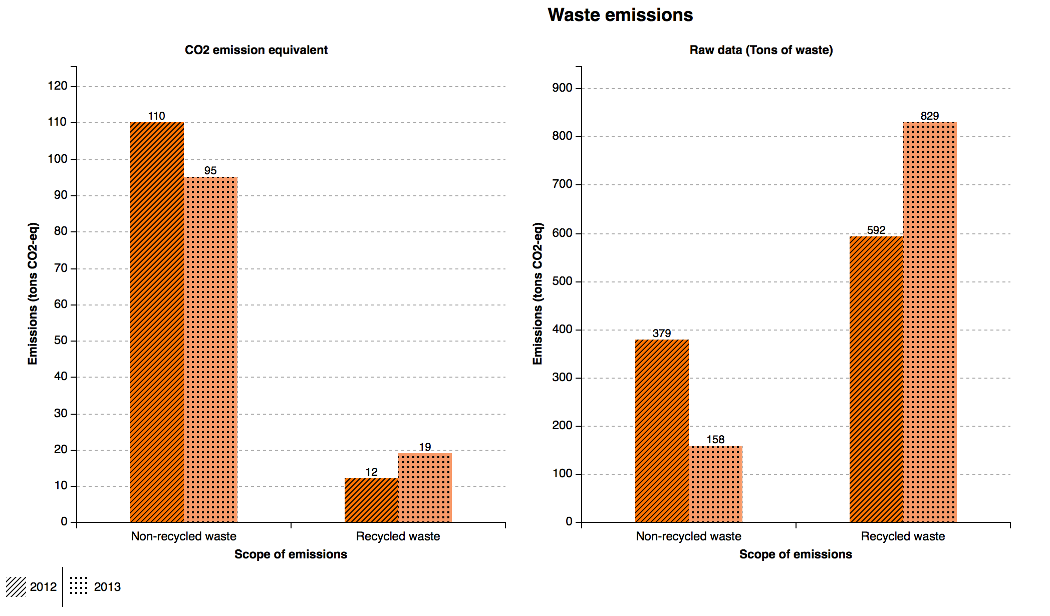
- Colours are used to differentiate the three scopes; this easily highlights the different scopes and blue, green and orange contrast each other nicely. This is taken further to account for both 2012 and 2013, where this distinction is made using shading with texture
- The labels for each category is placed on a neat, single line and the icons follow under each one respectively. This creates one line, sight of reading to avoid a constant up-and-down motion while reading
- The categories are grouped according to each scope, and this is shown by having categories clustered together
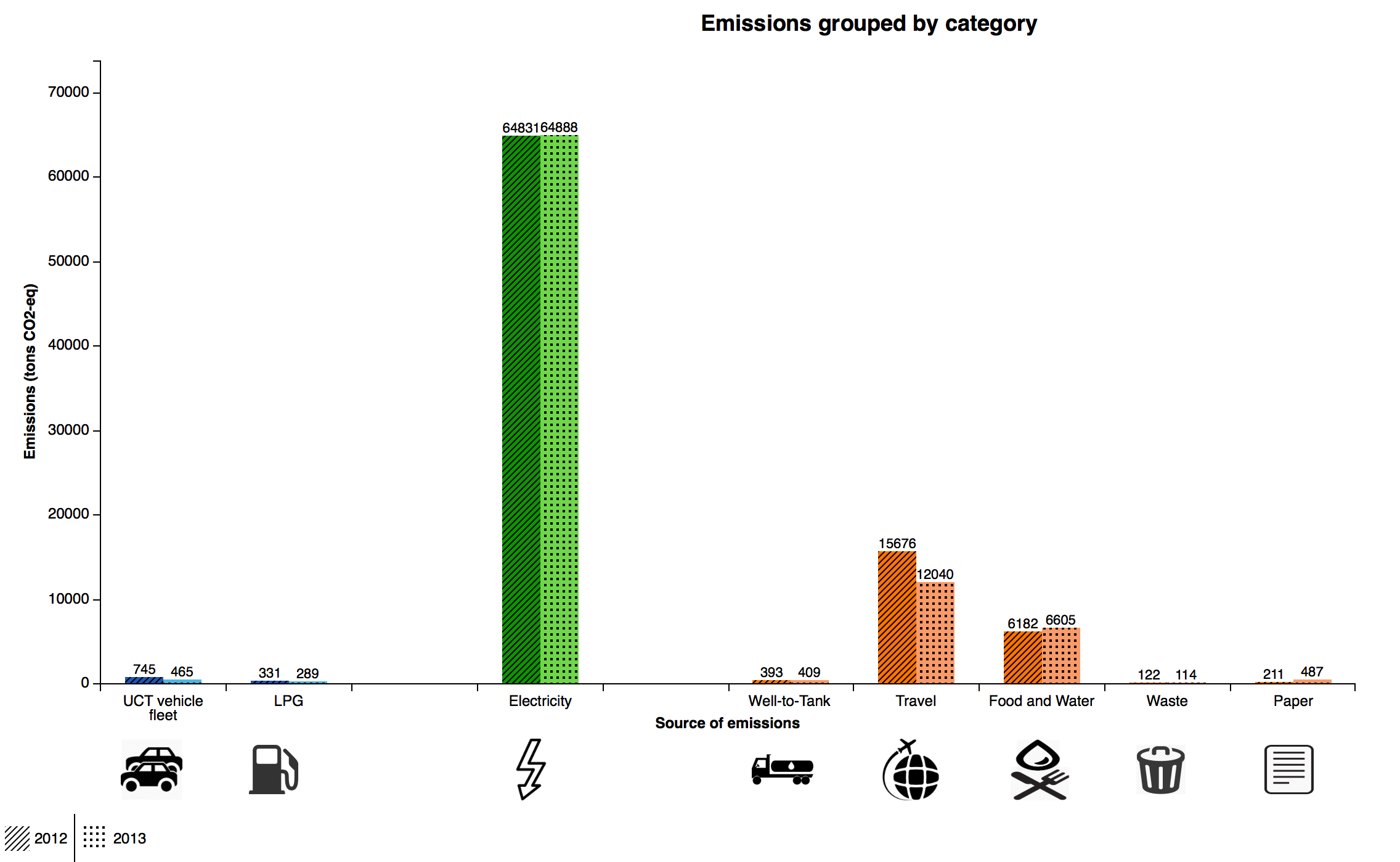
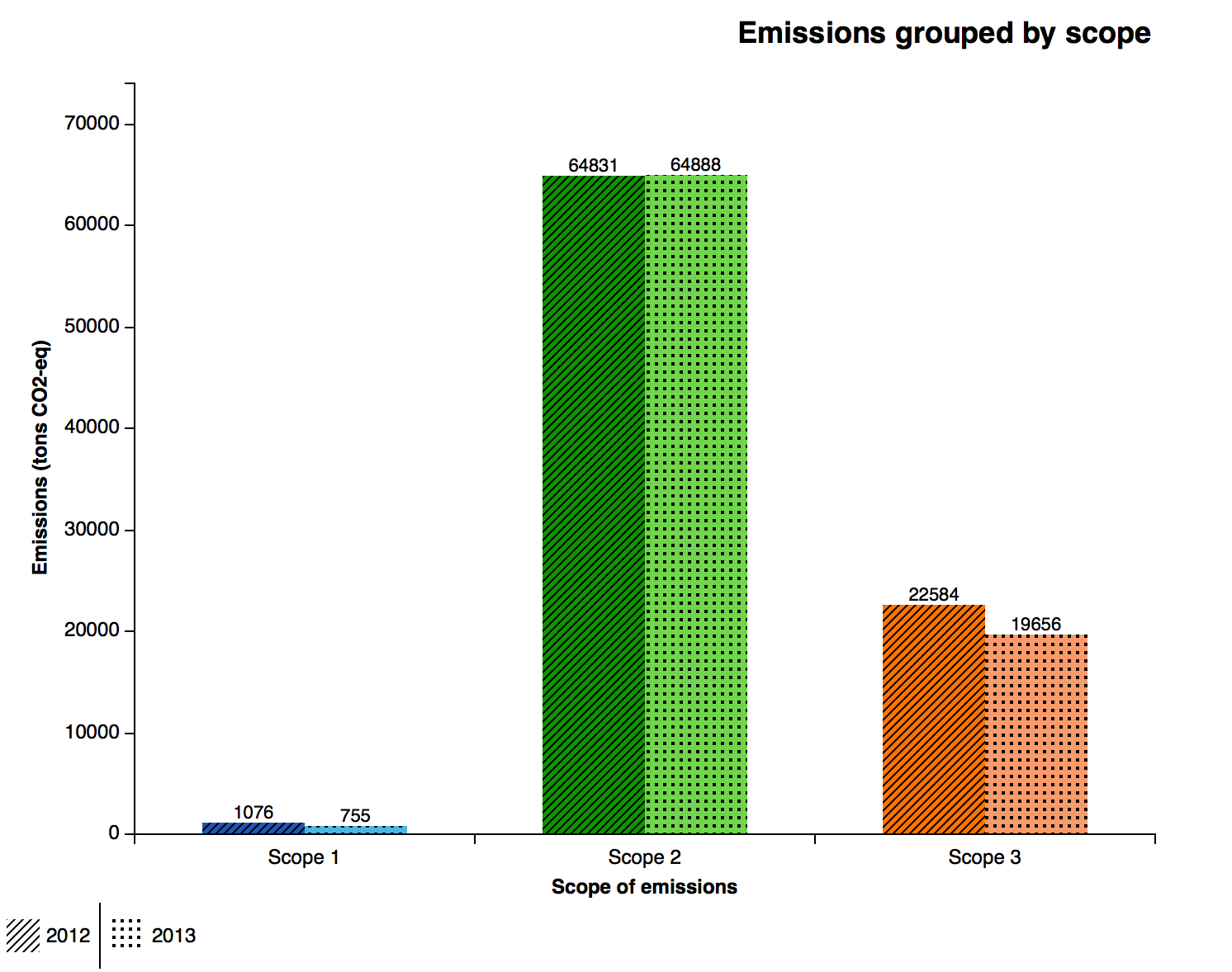
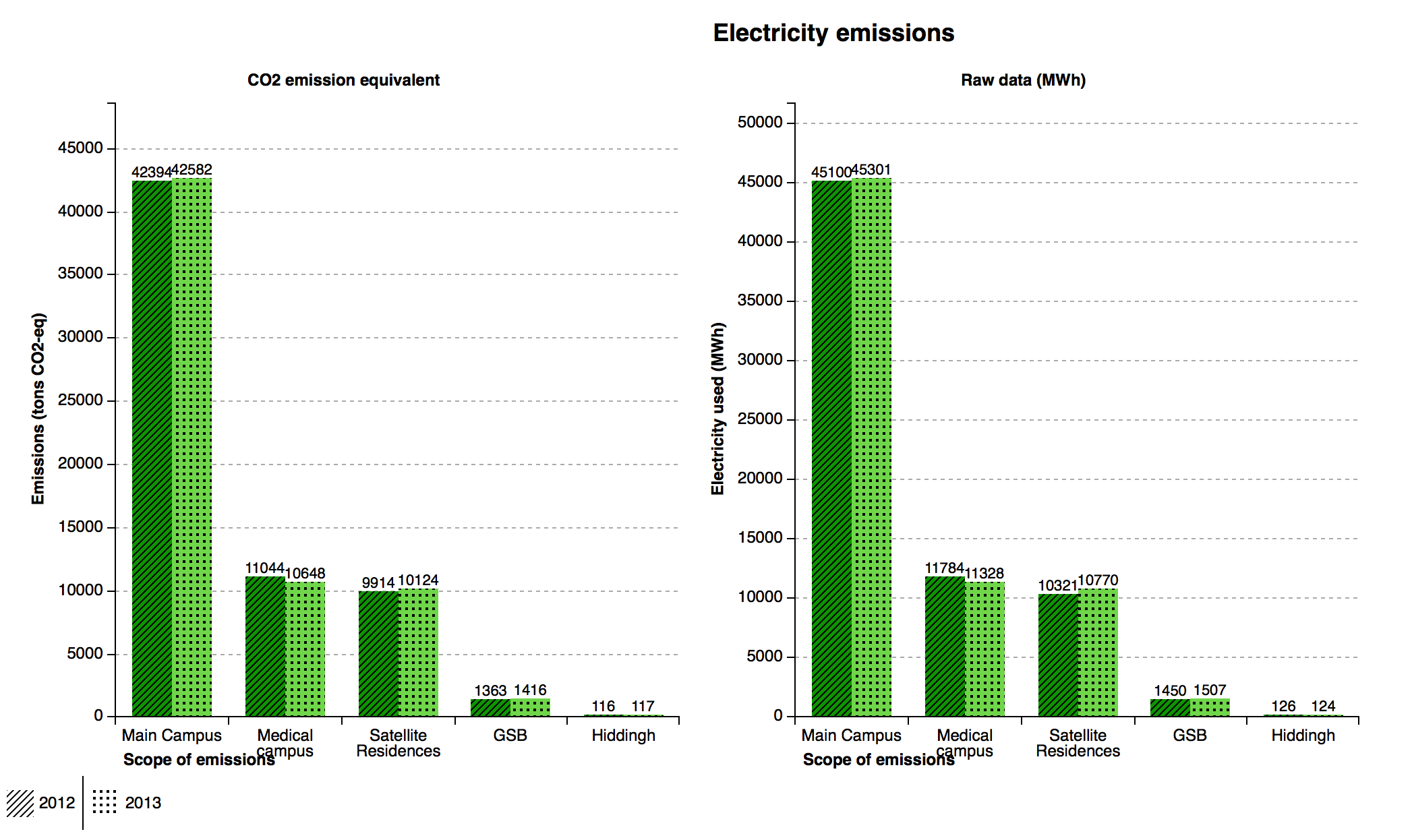
- A traditional bar chart is used; a scale is present and each category its total value placed on it to represent the raw data
- Lines and thickness of lines were removed completely
- This notion was removed, so the bars are now standing upright
- A timeline slide has not been added here; the data visualized is only for two years. So the idea is to add a timeline slide as more Carbon Footprint reports are produced by the university
- The idea of a dashboard suggested is great, which would give an overview of the entire data set that is being viewed. However, it was not added to the final design due to restrictions of the JavaScript library used. Although, it is a design element that is recommended for future work
Final design
Implementation
The final design was implemented in a HTML webpage using JavaScript and CSS. The JavaScript libraries D3.js and C3.js were used to generate the bar graphs and CSS was used to customize the web page layout and graph properties. C3.js is a D3.js based library that allows the creation of reusable graphs.
Texture
Texture was used to differentiate the different years because texture can be seen even in black and white. This makes it easier to differentiate between years quicker and possible without the use of colour.
Colour
The use of colour differentiates between years as well as categories. In the case of yearly comparison (both years’ data displayed concurrently) a lighter and darker contrast of a colour is used. A change in colour for every category is also used to make identification easier to the eyes. This makes it much more effective alongside texture.
Spatiality
Spatiality is used between the categories to have a clear sense of grouping of data. This helps reduce ambiguity in the representation of the type of category as the bar graphs are spaced 4 cm evenly, and avoids additional use of tools to show grouping.
Icons
The use of icons for categories gives the bars an identity, as the images which are implemented are commonly used to represent the objects. It is said that pictures speak louder than words and this is a way to make identification much easier for the users.
Additions to final design
After showcasing our final design to the class, we received valuable feedback that we had the opportunity to implement. One suggestion was to increase the intensity difference of the colours used; in this case, make the lighter shade of the colours more lighter. A second suggestion was to give an overview of a specific scope and filter the remainder out, to present the data in a way that would avoid discrepancies. This second suggestion has not been implemented into the final design implementation but an illustration can be seen below.
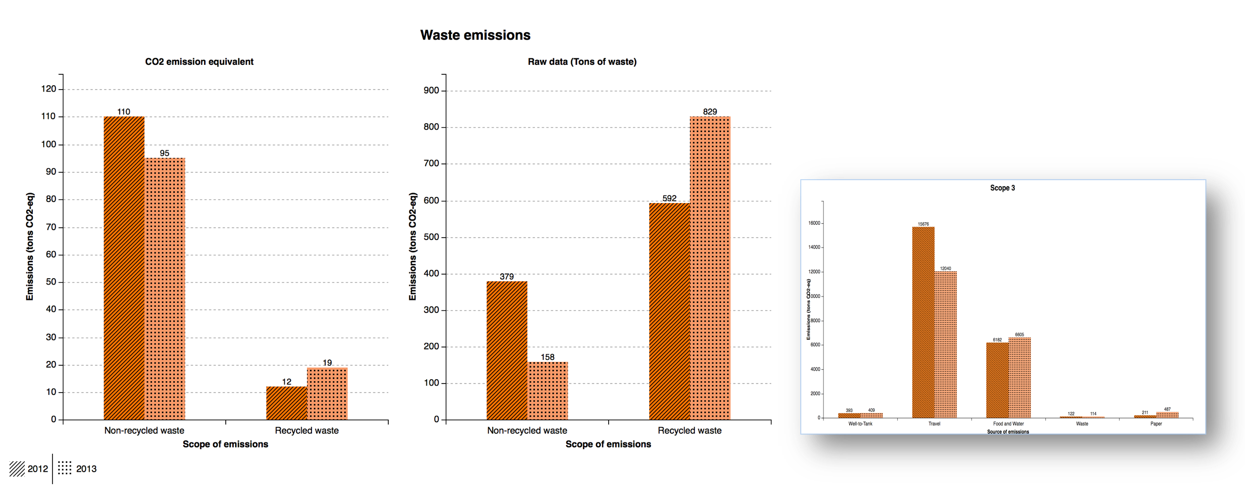
The idea of the overview is that is gives the person viewing a specific category, in this case waste, an overview of how the rest of the categories in the same scope compare. Our design for the overview is that is would remain stationary as the user scrolls down through the different categories and will change to reflect the scope of which the category displayed is in. The overview graph has a shadow so that it gives the impression that is in fornt of the other graphs.
Strengths and Weaknesses
Strengths
Interactivity with the individual bar graph to narrow into more specific dataset once selected, allows for more information to be shown clearly segregated using a year by year comparison or locations in which a specific category is in.
The use of a key on the bar graph showing texture matching to corresponding year makes it easier for to show variation between the years.
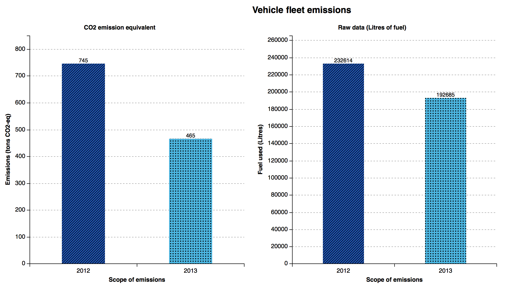
The use of values on top of the individual bar graph has been used to make it simpler to make comparisons as the emission scale can be difficult to read because of the wide range of emission recordings by the different categories/scopes.
Weaknesses
The are only two years’ data available currently. The use of buttons instead of making use of a timeline to navigate along the years means that as amount of data starts to increase over successive years this can make the design cluttered and less appealing to view as a button will have to be added for each year.
A seen in Figure 7, electricity carbon emissions contribute 64,888 (tons CO2-eq) on the year 2013 compared to Waste carbon emissions contributed an insignificant amount of 114 (tons CO2-eq). Therefore, depending on the amount recorded on each category, it may be possible to have oppositely extreme values i.e. huge recordings compared to relatively small recordings. This makes smaller recordings on the bar graph harder to observe.
Conclusions
Since 2012, UCT has produced a carbon footprint report and will continue to produce reports for the coming years. These yearly reports will allow for year on year comparisons and trends. To visualize this, future work can be done with the visualization we have created to include a timeline implemented as a slide bar that allows sliding between years and displaying a range of years. As the user moves the slide, the displayed data will dynamically adjust according to their preferred year of interest. The intention for this design is to make the process of viewing carbon emission information easier and quicker.
After completion of our final visualization, we met with Gwamaka Mwalemba to show him our visualization. Gwamaka is a lecturer in the Department of Information Systems at UCT and was the lecturer for our INF3011F course. We completed the INF3011F course and worked together as a group in that course as well. It was through INF3011F that we were first introduced to the process of gathering and analysing data for UCT’s carbon footprint and it was because of the work we did then that we believed that visualising UCT’s carbon footprint would be helpful and useful. We contacted Gwamaka and asked him to put us in contact with Sanda Rippon who has put together UCT’s carbon footprint for the past two years and who was able to provide us with the information we needed.
When meeting with Gwamaka, we received positive feedback and he was impressed with the work we had done. He also explained to us that an Information Systems honours group is working on a similar project but whose focus is more towards building a system that is capable of taking source data (actual raw data from Excel spreadsheets) and entering it into a database to then be analysed and visualised. He said that the design we have created and the knowledge we have gained from this project will be helpful to the IS honours students and put us in contact with them. We will be sharing our final visualization and report with the students in the hopes that it will help them with their project.
A note on who did what
This project was completed collaboratively using a Google Doc to write the rough report which was then transferred to the HTML report. This approach allowed each of us to add information wherever we were able to do so and proof read over each others work. Apart from the written work, the designs and findings presented were discussed and critiqued by each member of the group. We found that the group dynamic worked well and this feeling was mutual among us.
Darryl Meyer
Darryl was the group leader and completed most of the implementation work for the final visualization which included writing the code for the HTML webpage, JavaScript graphs and CSS formatting. Although Darryl completed most of the code for the final visualization, Montlamedi and Lubabalo offered critique and further design improvements and refinements.
Montlamedi Maikano
Montlamedi came up with the initial design idea which was based off of an image displaying the relationships from Nelson Mandela to his descendants. Montlamedi wrote about the changes for the initial design to the final design and detailed the visual features of the final design.
Lubabalo Nazo
Lubabalo critiqued the reviewed material in order to use the lessons learnt in our designs. Lubabalo briefly described the initial design, the feedback that was given in class as well as explaining the visual queries commonly associated with this kind of report data.
References
-
The American University in Cairo. (2012), Our Carbon Footprint
[Online] Available from:
http://www.aucegypt.edu/Sustainability/Rise/Documents/FootprintFY11Final.pdf
[Accessed: 02 March 2015] -
The University of Maryland. (2010), Carbon Footprint of the University of Maryland: Greenhouse Gas Inventory 2010
[Online] Available from:
http://sustainability.umd.edu/documents/Reports/2010_UMD_GHGinventory_final.pdf
[Accessed: 02 March 2015] -
Washington University in St. Louis. (2009), Greenhouse Gas Emissions Inventory
[Online] Available from:
https://sustainability.wustl.edu/wp-content/uploads/2013/01/GHGEmissions.pdf
[Accessed: 02 March 2015] -
The University of Cape Town. (2013), The University of Cape Town Carbon Footprint Report 2012
[Online] Available from:
https://www.uct.ac.za/usr/about/greencampus/UCT_Carbon_Footprint_Report2012.pdf
[Accessed: 24 February 2015] -
The University of Cape Town. (2014), The University of Cape Town Carbon Footprint Report 2013
[Online] Available from:
http://www.uct.ac.za/usr/propserv/UCT_Carbon_Footprint_Report_2013.pdf
[Accessed: 24 February 2015] -
Ghgprotocol.org, (2015). About the GHG Protocol | Greenhouse Gas Protocol.
[Online] Available from:
http://www.ghgprotocol.org/about-ghgp
[Accessed: 25 February 2015] -
ISCN.org, (2015). Implementation Guidelines to the ISCN-GULF Sustainable Campus Charter.
[Online] Available from:
www.international-sustainable-campus-network.org/download-document/365-implementation-guidelines-for-the-iscn-gulf-sustainable-campus-charter.html
[Accessed: 13 March 2015]