Introduction
In New York City, the Stop-and-Frisk Program is a practice of the New York Police Department (NYPD) in which a police officer stops and questions a suspicious individual and pats down the individual that has been stopped to determine if the individual is carrying any concealed weapon or other contraband. This type of search is done in an effort to prevent a crime occurring. The Stop-and-Frisk practice came into effect in 1994 when the New York State Legislature made an amendment to the Code of Criminal Procedure that included a new section, Temporary questioning of persons in public places, which authorised the stopping and questioning of persons whom the police reasonably deemed suspicious [1].
The aforementioned bill states that:
- A police officer may stop any person abroad in a public place whom they reasonably suspect is committing, has committed or is about to commit a felony or any of the crimes listed in the code of criminal procedure, and may demand of the person his name, address and an explanation of his actions.
- When a police officer has stopped a person pursuant to this section and reasonably suspects that someone could die or be injured, the police officer may search the person for a dangerous weapon. If such a weapon or any other item in the possession of the individual may constitute a crime is found, the officer can take and keep it until the questioning is done, at which time he shall either return it, if lawfully possessed, or arrest the individual.
The Stop-and-Frisk program raises concern over racial profiling as the majority of people stopped are Black or Latino, illegal stops and privacy rights. Nearly nine out of ten New Yorkers that have been stopped were “people who had engaged in no unlawful behaviour as evidenced by the fact they were not issued a summons nor arrested”. That is to say, they were “innocent”. [2]
Problem Description
Our visualisation is aimed at people who wish to see a representation of the Stop-and-Frisk data. Their purposes may range from a general overview of the Stop-and-Frisk policy’s results, to its success or for a deeper look into possible trends of racial profiling. We do not interpret or distort the dataset to remain accurate but simply display information the stops.
The dataset that we used for our visualisation was taken from the NYPD database [3], which is made available to the public. We displayed stops for the most recent year, 2015, rather than every year. Existing visualisations on this dataset do not display intersection of factors contributing to stopping, such as the combination of race and age, which this visualisation aims to improve on. Previous visualisations were one-dimensional despite the multi-dimensional data.
Related Work
The NYPD’s Stop-and-Frisk practice has been surrounded by much controversy. Therefore it is essential that data is collected and displayed accurately in order to draw meaningful conclusions and to determine areas of concern and possible change. Literature regarding this practice has been reviewed in order to improve the current state of stop and frisk visualisations. We have found several visualisations that illustrate the NYPD’s Stop-and-Frisk data. These include:
WNYC Map
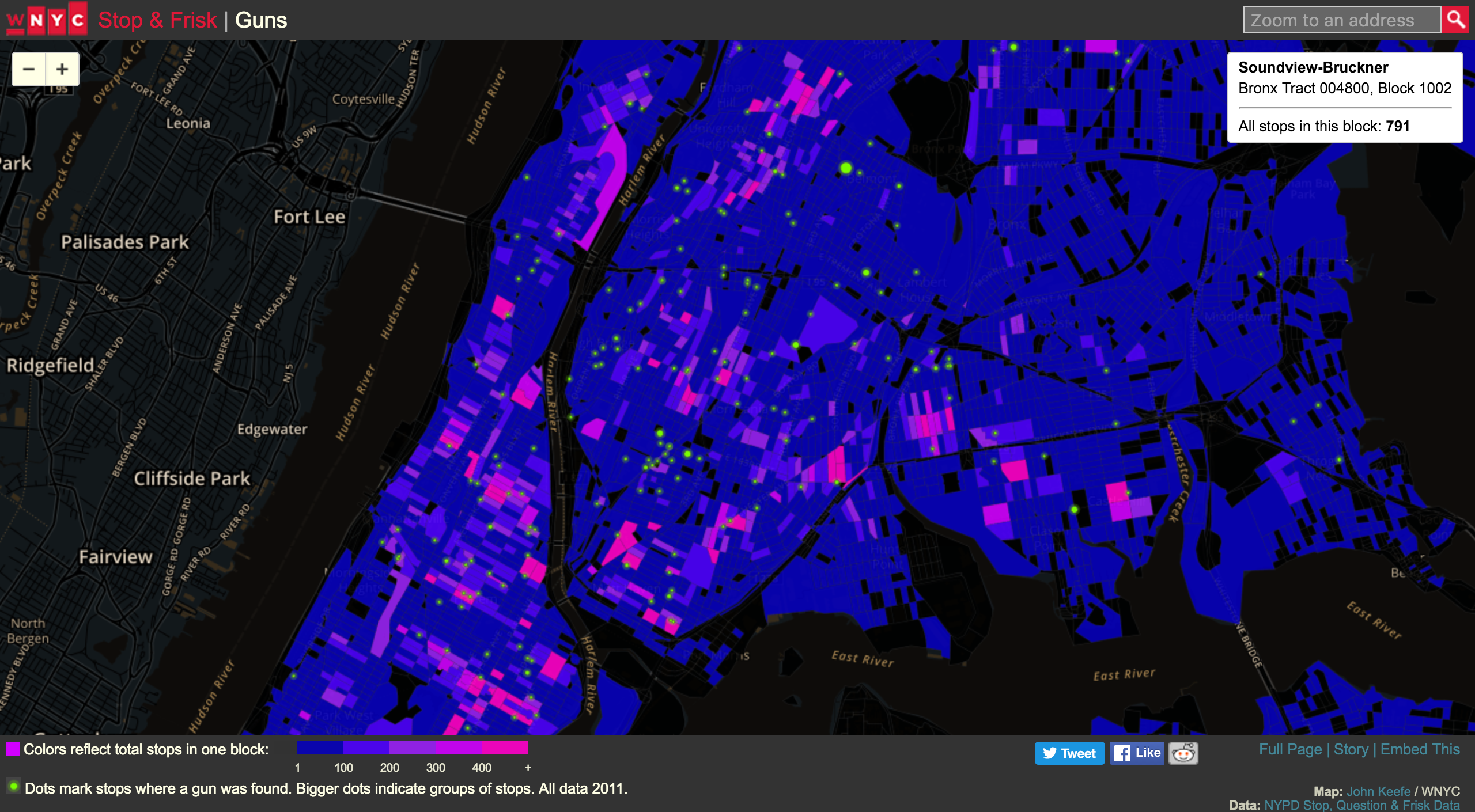
WYNC screenshot from http://project.wnyc.org/stop-frisk-guns/ taken on 3 April 2016.
This map depicts the New York area and aims to illustrate the relationship between stops-and-frisks and gun recovery. The map makes use of census block boundaries and the choropleth technique, where the intensity of the colour corresponds to the intensity of the data. By using these techniques, hotspots are able to be identified and an inversely correlated relationship between stops-and-frisks and gun recovery is revealed since it appears that gun recovery (indicated by the green circles) is not usually closely linked to where more stops are made.
This relationship is not very pronounced as the creators only distinctly differentiate on one channel: colour. While colour is effectively used by using contrasting, bright colours that are distinct from each other very well, the dots are simply hard to see considering their size. Additionally, humans find it difficult to differentiate colours on a blue-green spectrum as easily as other colour combinations. This means that it is difficult to read or see the green dots on the blue background despite their luminance.
Size is used as another channel since the dot sizes vary, however, this fails to make most of the dots prominent due to their sizing scale. This map does make use of depth, texture or any other differentiating factors.
Specific locations can only be identified on the map by zooming in. There are also no borough boundaries demarcated. This makes the map meaningful only to those who know New York City and not perhaps any party with an interest in the data. Representing specific locations would have made the map more accurate and meaningful.
Density Grid
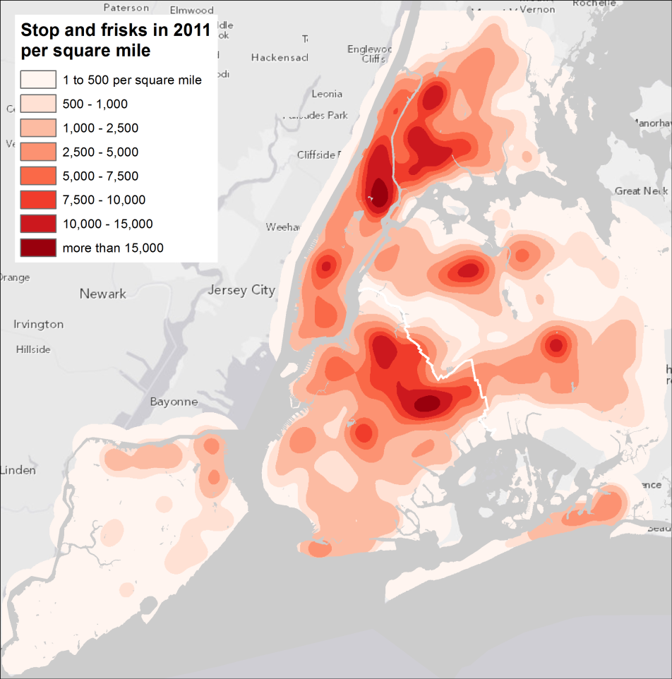
Heat map screenshot from http://spatialityblog.com/2012/07/27/nyc-stop-frisk-cartographic-observations/ taken on 3 April 2016
This map simply shows the frequency of stops-and-frisks (a one-dimensional display despite more data being available) using a heat map. It depicts the data in the form of a density grid. This offers a clearer overview of the hotspot areas as it shows intensity and trend. However, as with the previous map, the map is still too general, since specific locations cannot be identified. Colour is still used effectively.
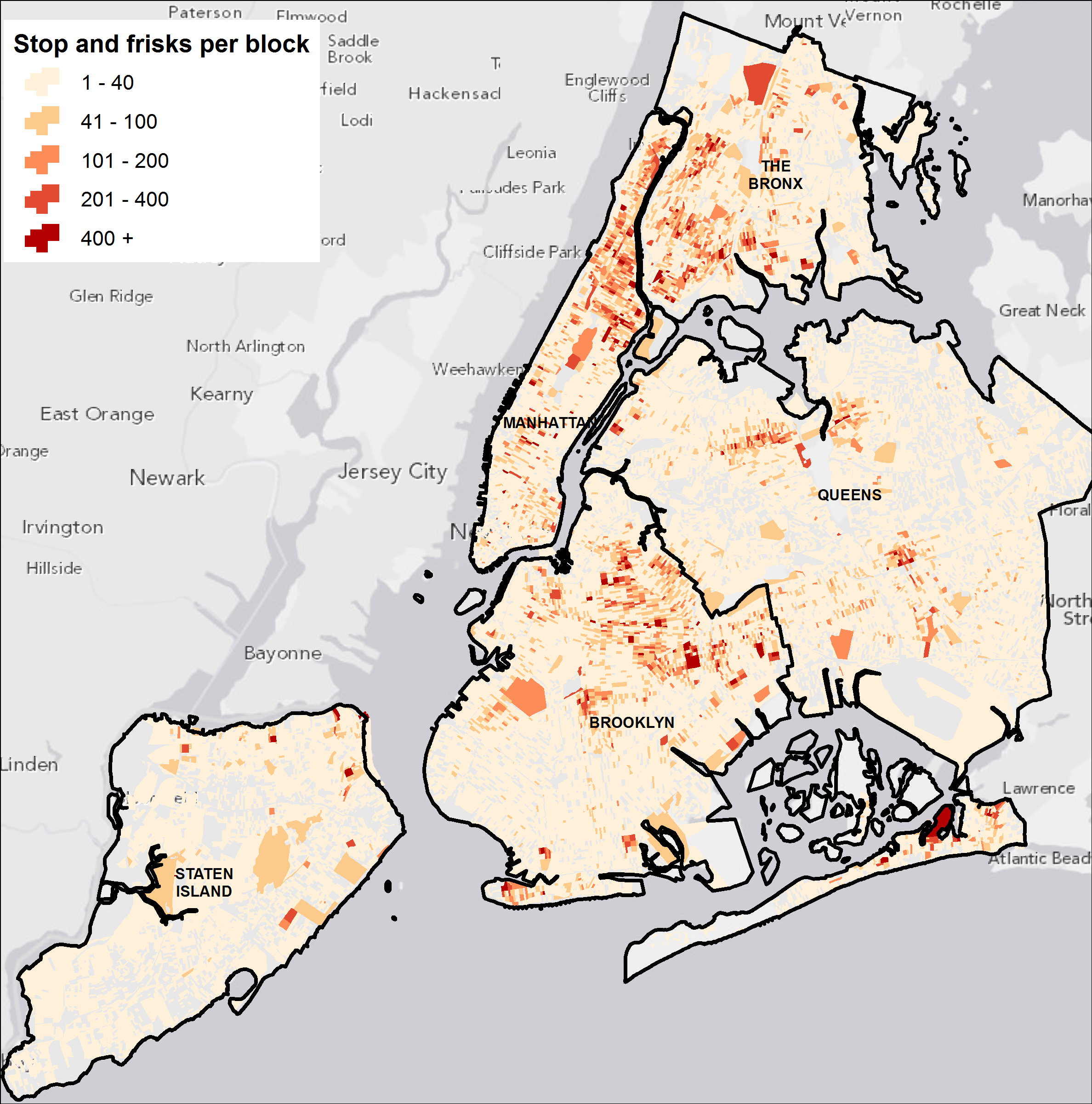
Frequency map screenshot from http://spatialityblog.com/2012/07/27/nyc-stop-frisk-cartographic-observations/ taken on 3 April 2016
Instead of using fluorescent colours to highlight high values, this map highlights the prominent areas while the less prominent areas fade into the background. By using this technique, the visualisation is easier to read and more meaningful since the specific areas are clearly depicted on the map. Thus, the number of stops-and-frisks per borough is easy to identify.
All the Stops
See visualisation at: http://bklynr.com/all-the-stops/
This visualisation, which reflects the more than 530,000 stops that occurred in 2012, reveals who is being stopped, why they’re being stopped, and what, if anything, is being found by the police as a result. This actually makes use of many of the factors of interest in the New York Police Stop-and-Frisk data, unlike the previous graphs. It is an interactive visualisation which makes it interesting and easier to work. However, it does not show the intersection of the factors of interest in a way that is useful and accurate. We can determine which age group, for example, is the most stopped (20 to 29 years of age in their age brackets) and we can determine which race is the most stopped (black) but we cannot not tell which combination of age and race is the most stopped and would need to make a leap of faith to assume that black males in the age range of 20 to 29 years of age are the most stopped.
It is also hard to count the dots and get an exact number of people belonging to each group since each dot represents 1000 stops and clusters them in a circle. While the size of the cluster can tell us generally that one group is larger than another, it cannot tell us exactly. This gives an overview of the data without, perhaps, enough detail to be widely useful.
Trend Graphs
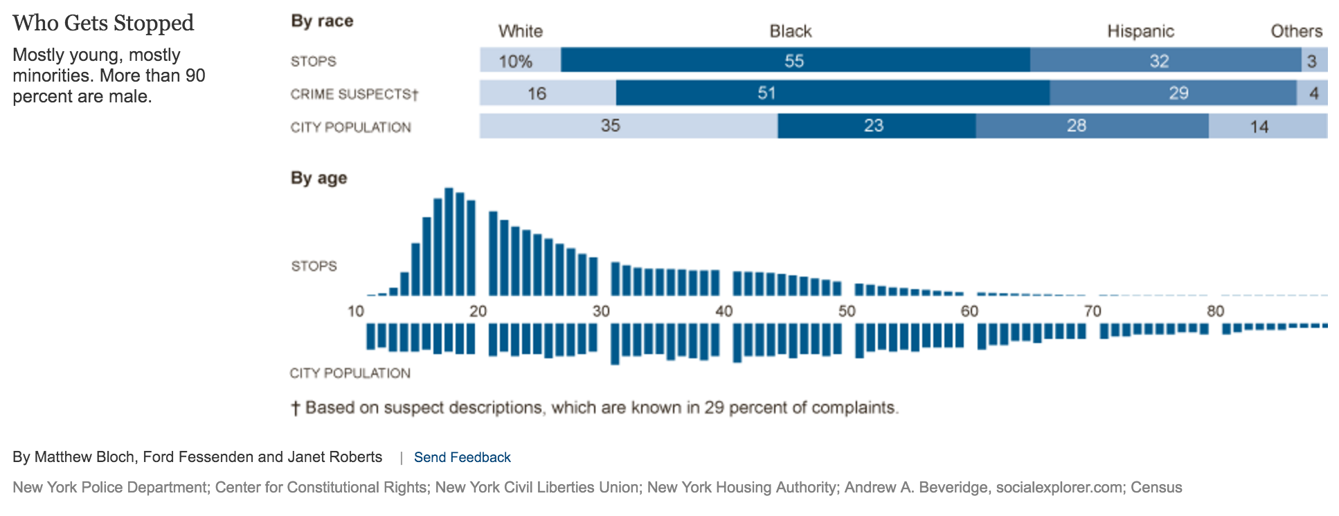
Trend graph screenshot from http://www.nytimes.com/interactive/2010/07/11/nyregion/20100711-stop-and-frisk.html taken on 3 April 2016
This chart represents multiple dimensions of data based on race and age. This makes it perhaps more informative than the others (or at least as informative as) but it still does not show the intersection of factors. The design is clean and effective regardless which makes it more effective and among the easiest to read.
The information is perhaps distorted as the “Stops” scale on the trend graph is larger than that of “City Population”, making it appear as if there were a greater number of stops than city population.
Trend graph screenshot from http://bit.ly/nypdstopnfrisk taken on 3 April 2016
This visualisation is another graph, which shows a number of stops per month based on race. It succeeds in showing the visualisation, while making it difficult to identify the name of month and compare individual stops between different races.
Important Visual Queries
Our dataset concerns information about stops done by the New York Police Department in New York City as part of their Stop-and-Frisk scheme. We identified the main visual queries one may wish to have answered by this dataset. Our design consists of two components – a map of New York City, delineating its five boroughs, and a graphic. Due to the dimensions we used in the map section, the only visual queries we choose to answer and can usefully be shown with our design is:
- Which borough has the greatest number of stops?
- In which boroughs are people stopped most?
The bulk of our information is represented in the graphic. Here is a ranked ordering of visual queries indicating our prioritisation of the information we choose to show:
- Which race is stopped most often?
- Why are people stopped?
- Which factors contribute to being stopped most often? Is this a certain race, gender or other factor or a combination thereof?
- Were these stops successful or useful? That is to say, were any weapons or contraband found on people who were stopped?
- Did the police use force? Against whom most commonly?
- Are stops higher for black people in Manhattan or Brooklyn? Or any other combination of boroughs or suspect identifiers like race or gender.
Initial Design
The NYPD Stop-and-Frisk data is rich with information which can show many facets of the profiling police officers make on the job in New York City. There were many aspects of the data we found interesting such as the type of person most commonly stopped (an intersection of age, race and gender) as well as other fields in the dataset such as reasons for stopping the person (reasons which included “a suspicious bulge”). Another concept we wanted a viewer of the data to interrogate would be whether the stopping and frisking of people in New York was actually a necessary and successful exercise i.e. did it result in valid arrests.
With this in mind we created a visualisation centred on people. The challenge would be to display as much of the data as possible in one view, with further data on demand. We settled on a design where a symbol such as a dot would represent a certain number of people. We would then arrange these dots as groupings based of the categories a viewer would want to inspect. The categories included:
- Race of the person stopped
- Age
- Gender
- Reason for Stop
- Was there contraband (weapons, drugs) found on the person?
- Where a person was stopped? (Which Borough of NYC)
- Was the person arrested? (Arrested)
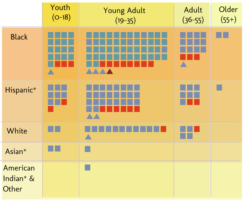
The viewer would be able to use drop-down menus to select one category to be compared against another, such as age and race. The output of this selection would show groupings of dots based on intersections of different races and age bands, showing (for example) the number of white youths stopped as a cluster. These clusters could be compared to one another as we used a square grouping of dots as opposed to circular clusters.
In order to display more information immediately, we removed ‘Gender’ and ‘Arrested’ from the selection of categories and displayed that information constantly using colour and shape. Colour was used for Arrested – with blue being not arrested and red (connotative of danger) for arrested. Shape was used for Gender, and we replaced the notion of dots with Squares for males and Triangles for females (due to the differentiation and intuitive interpretation of these shapes). We used triangles and squares instead of the conventional gender symbols as these are easier to distinguish from one another at such a small scale. These shapes are also highly learnable as symbols. Thus these two attributes, Gender and Arrest, became parts of the main graph key and displays two dimensions of data intersected at all times.
We also removed the borough from the categories to rather display this geographic information visually using a map. This would be more intuitive as the layout of New York would likely be familiar or relevant to the viewers/users. One could then see where the police are most active in stopping and frisking people.
These initial decisions and discussions resulted in our initial design pictured below.
Figure 1: Initial Design Home |
Figure 2: Hover Functionality |
|---|
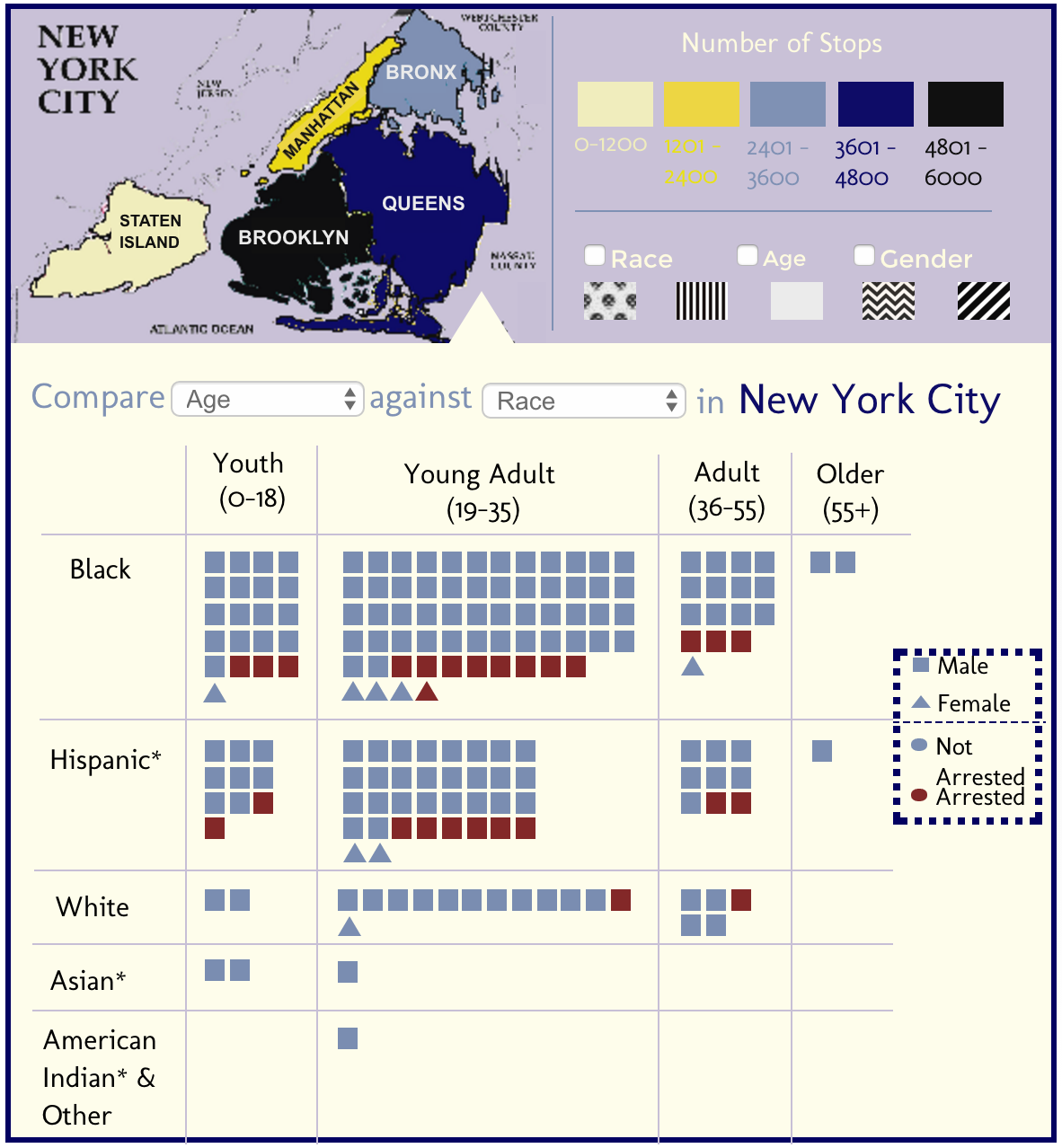
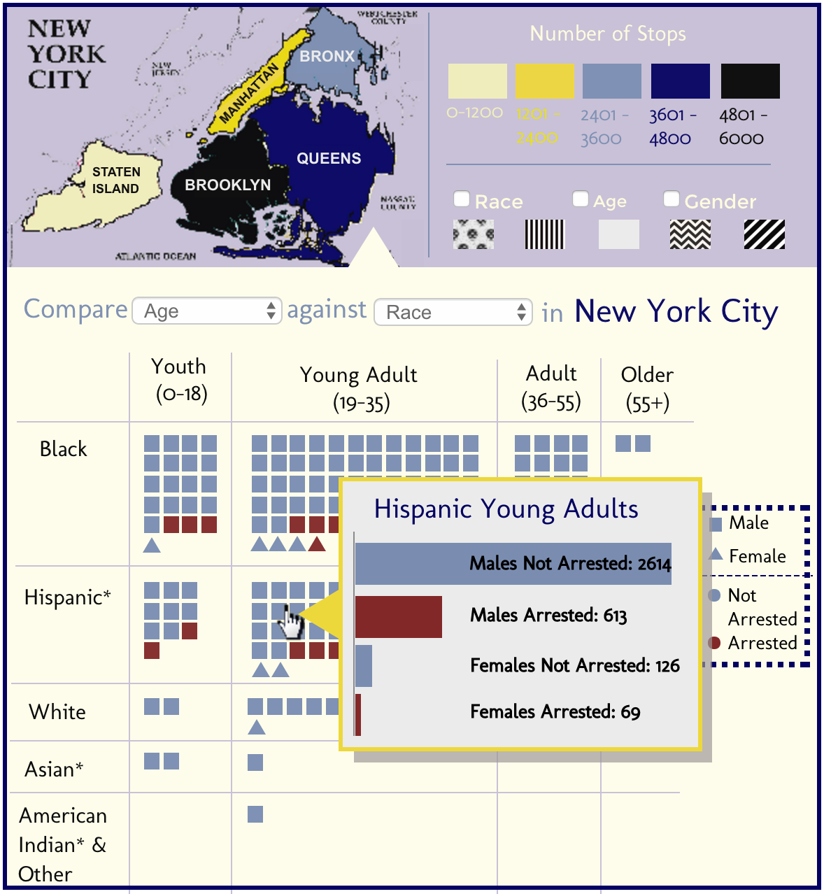
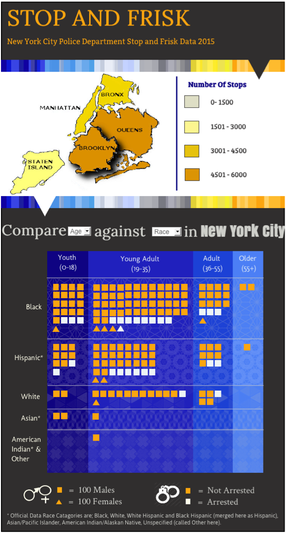
Figure 1 depicts the main view of the visualisation. This view is portrait in orientation to facilitate the splitting of geographical queries on the top, and intersectional data queries at the bottom. The map section contains a colour coded key to indicate the number of stops in each borough, seen on the map. In addition there is a second key with patterns. A viewer would select either Age, Race or Gender and the pattern key would change accordingly and would describe the most arrested age or race or gender in each borough, with a patterned overlay on each borough in the map.
The bottom section contains the main comparison (and is thus larger). The heading firstly describes the data depicted below in the table/graph and also has dual functionality as the drop down menus are embedded in the heading to allow the user to select different categories to compare. These category headings would be displayed on the top row and left column and would describe the different intersections of clusters. The size of clusters as well as width of the rows and columns would show general trends of the most and least stopped people in New York.
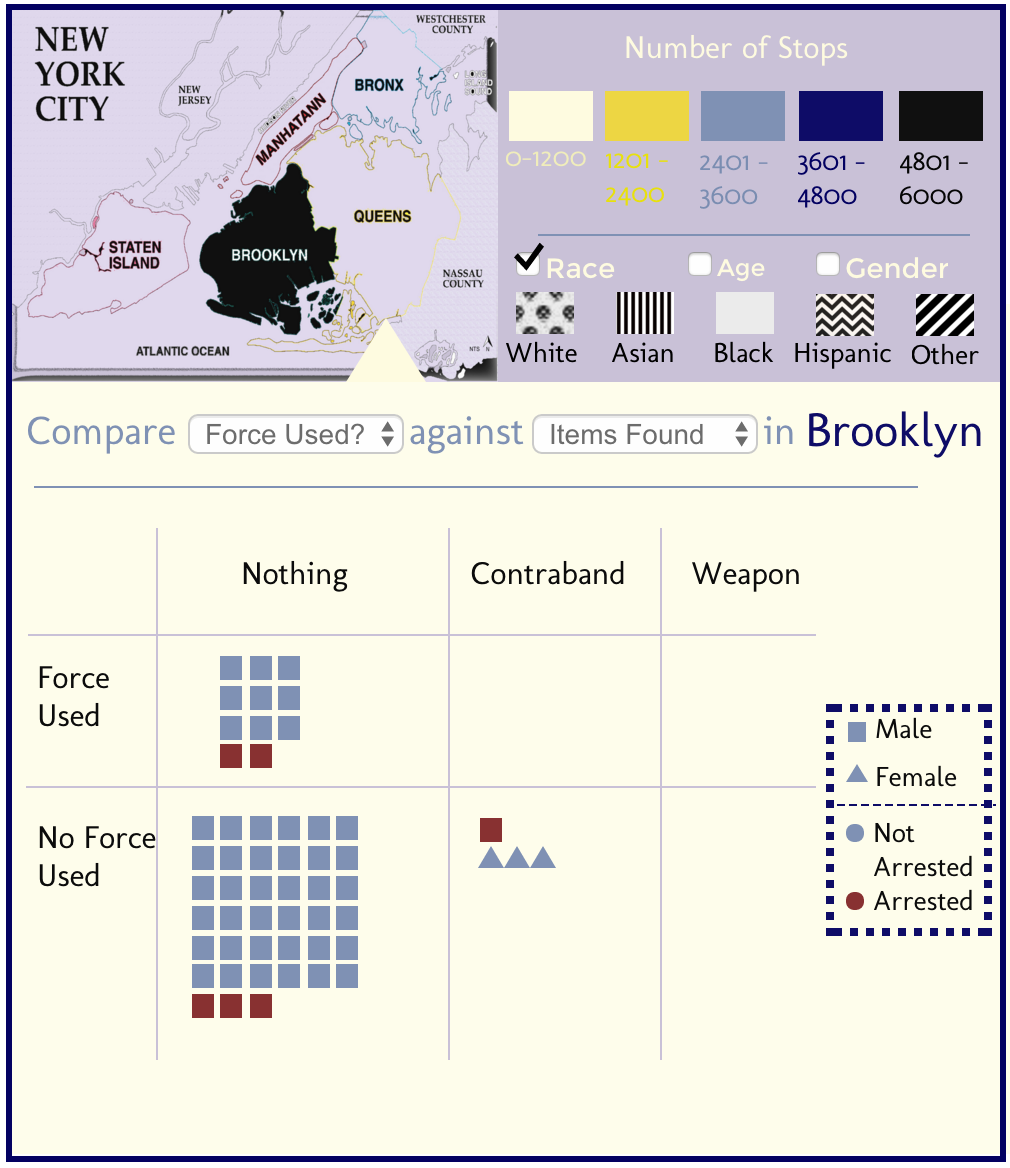
Figure 3: Borough Selection |
|---|
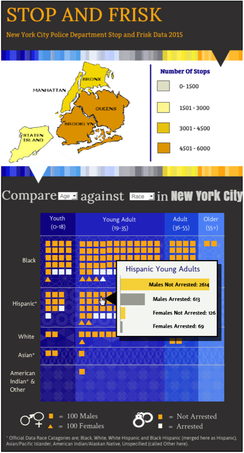
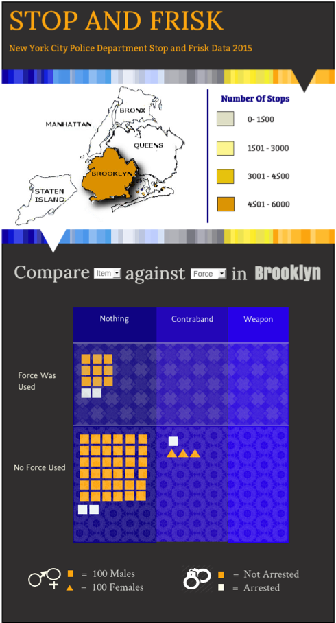
Additional functionality was included as seen in Figure 2. We decided that a user should be able to hover over a cluster and have a tooltip pop up to provide the actual accurate numbers for that intersection, displayed in a horizontal bar graph. In Figure 3, we added functionality allowing a user to select a borough on the map (which would grey out all the other boroughs). This selection would tailor all the data in the bottom half of the graph to be just for the selected borough – allowing for 5 categories of data (age, race, gender, arrested and borough) to be displayed per cluster. The heading would also change to reflect that the data has changed for the selected borough (in this case, Brooklyn).
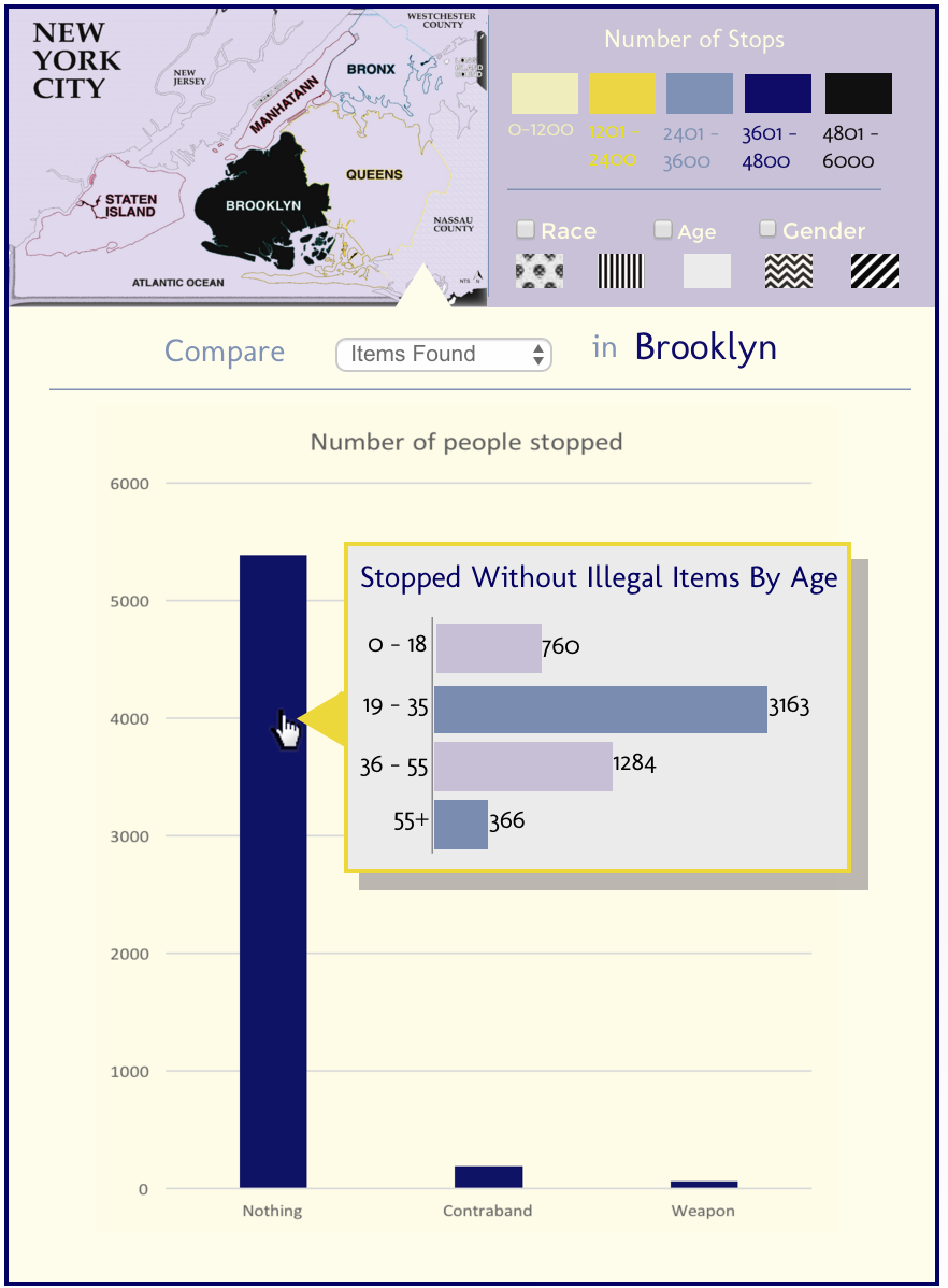
Figure 4: Bar Graph |
|---|
Figure 4 depicts the possible inclusion of a simple bar graph to the visualisation, to just display one category of data at a time, with possible further information on a tooltip. This idea was later voted against as it was proved unnecessary during the initial design presentation.
Criticism
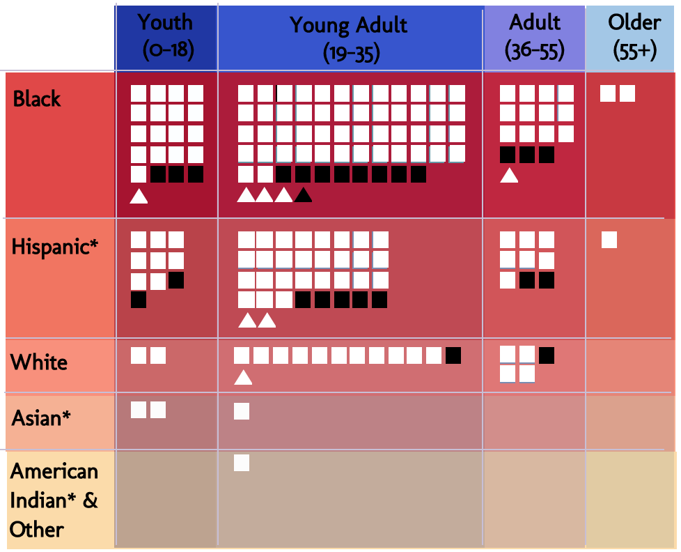
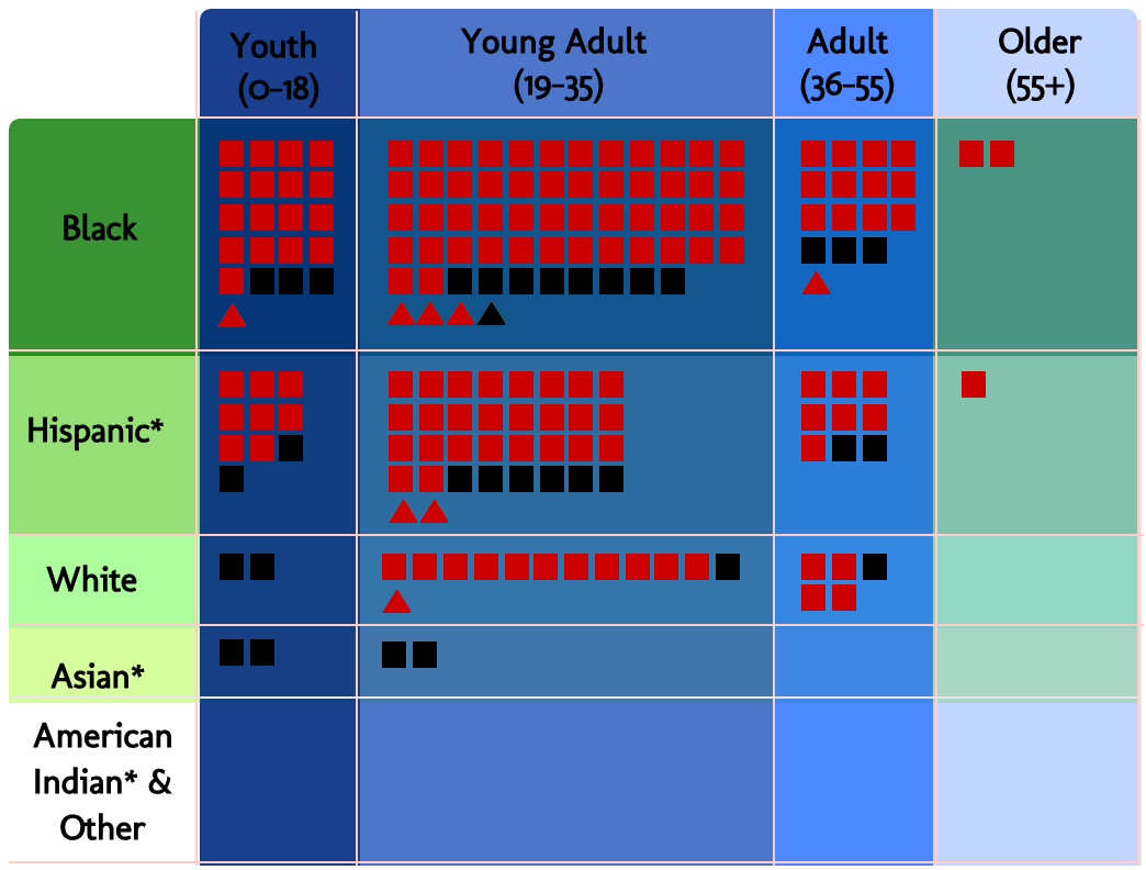
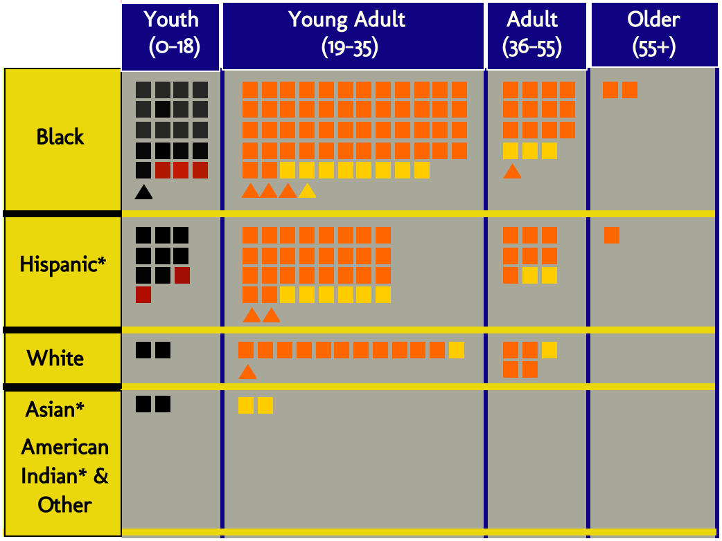
We received a lot of positive feedback on this design when we presented it to our class for evaluation. The positive feedback included an appraisal of our visual queries as well as good use of texture on the map. Another positive aspect to note was the visually appealing colours which enabled easier comparisons and more rapid answers to visual queries. The criticisms included that the use of symbols and icons was lacking and that we could’ve used size of the squares and triangles for age. Our lack of variety when it comes to fonts of different colour was also listed as something we could improve on. It was also suggested that we use varying shades and textures instead of line for the columns and rows.
In addition to the presentation feedback, our group looked at the design again and found areas of improvement. We liked the colour aesthetic colour scheme, however it did little to convey theme of the data and without the headings and one doesn’t know what the visualisation is about at a glance. The colour also proved problematic for the map key as it wasn’t intuitive that one colour was “greater” than another. We decided that the bar graph in Figure 4 was redundant and so that was removed. The goal for the second design would be to experiment with colours, patterns, fonts and symbols as the feedback had suggested.
One problem we encountered during the map stage was that when trying to implement the pattern overlays for the secondary key, we found that the most common age, race and gender would be the same across all boroughs as it was a city-wide trend. So all the boroughs ended up with the same pattern overlay, making that aspect of the map functionality redundant. We thus removed this aspect and focussed on the map’s two functions as to depict the total number of stops per borough and to select a borough to tailor the graph data.
Experimental Designs
During this phase, we experimented with colour combinations, patterns and incorporating symbols into the design. Those designs can be found here:
Iteration 1
Iteration 2
Iteration 3
Iteration 4
These designs were abandoned in favour of a two-channel differentiation of not only colour (and intensity or gradient) but also texture as we incorporated texture in the following final design.
Final Design
The final design kept the portrait layout of the original design, as well as the separation of map and main graph. The first image of the design (click links to view design) displays the normal view of the visualisation. The second image shows a hover feature over the main graph. The final image displays the data being tailored just to Brooklyn by selecting Brooklyn on the map. In addition, a change of axes was depicted.
Map
Figure 5: Map State - Normal |
Figure 6: Map State - Hover |
Figure 7: Map State - Selected |
|---|
The map section of the visualisation contains the map on the left and the key on the right. The colour scheme of this section has varying tones of yellow with a burnt gold being the most intense and paler colours showing less intensity. This colour scheme allows for an intuitive understanding of magnitude based on the saturation of the colours used.
The map itself has three states. The initial state displays all the boroughs of New York in the appropriate colour from the key as seen in Figure 5. A second state will allow the boroughs to pop out towards the user when a mouse hovers over the borough. This is accomplished with slight occlusion, displacement and shading to achieve this depth cue, as seen in Figure 6. The final state occurs when the user clicks on a borough. In this situation, the pop out effect will be used as well as greying out all the other boroughs to ensure the selected borough stands out – indicating that all the graph information is tailored for just the selected borough. This map state can be seen in Figure 7.
Graph
This section’s heading includes drop down lists to choose which categories the user wants to cross compare, which hasn’t changed format since the original design (except for the change in fonts). The key has been moved to the bottom and contains symbols (handcuffs and gender icons) to ensure fast recognition and learnability of what the shape (gender) and colour (arrest) of each ‘dot’ means.
Once the categories are selected, the axes will reflect the accurate aspects. The squares and triangles will be grouped within the appropriate clusters. These different clusters are shown as an overlap of colours and patterns unique to each cross-section. Columns differentiate based on colour (shades of blue) and rows differentiate based on different patterns which do not interfere with the main design aspects.
The only other functionality aspect of this section of the visualisation is the ability to glean further details on demand when hovering over a cluster of people. A tooltip will appear to show the exact breakdown of that cross-section of categories in a bar chart as seen in Figure 8.
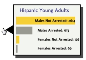
Figure 8: Hover Tooltip |
|---|
Design Elements
Font
Fonts vary to bring emphasis to certain phrases such as the title of the visualisation as well as the name of the borough being depicted (if not the entire New York City). Fonts are largely kept simple, to avoid interfering with the detail of the visualisation, the actual squares and triangles.
Colour
The semantics of colours used have been tailored specifically for the themes of New York City (blue and orange) as well as for the police (navy and yellow). These colours create instantaneous gist of the subject matter before one even reads the title. These colours are also “good colours for humans” as they are easily recognisable and named unlike in the old design. White is used for arrested individuals because of the high luminance contrast on the blue background. This allows for easy visibility of a rare symbol. Orange is used for the rest of the ‘dots’ due to the chromatic contrast with blue. The symbols all differentiate on two channels (shape and colour) to allow more information to be visible in the overall view.
A border made up of different strips of colour separates the map from the rest of the visualisation so that the colour theme is enforced and texture is used to guide the eye. The dark grey background creates some seriousness as well as makes the rest of the visualisation look more striking.
Visual Space
Depth and occlusion are used for hovering pop-outs within the map and the main graph. Proximity and size of the small symbols for people will indicate the grouping of data for different cross-sections, as well as the idea of an entity per ‘dot’. Square-shaped clusters are used instead of circles for easier comparisons based on size. The differences between the textures of a pattern of squares versus a pattern of triangles is easy to distinguish. This is unlike conventional gender symbols.
Strengths and Weaknesses
Strengths
- Spatial grouping, size and colour (divergence on two channels) are used effectively to indicate information with luminance contrast for clarity.
- Theme is immediately clear and strong from the cohesive design and colours used.
- Visual Queries are processed rapidly and correctly due to a simple use of spacing of squares and triangles.
- A large amount of data is immediately shown (global view) and it is easy to answer high level visual queries e.g. which age and race groups are targeted or whether frisking a person usually leads to contraband being found etc.
- Further detail on demand (second level – hovering) is used for accuracy and avoiding distorting data through a simplistic representation.
- Large data is set instantly coherent with clear purpose.
- Flexible combinations of categories allow for many dimensions of data to be displayed at once (with arrest state, gender and geographic location being a constant 3 dimensions of data).
Weaknesses
- Portrait orientation of the visualisation will require scrolling if implemented for computer screens (opposite is true for mobile devices).
- Map information is quite general (an entire borough) as opposed to more specific locations of frequent stopping in New York City.
- Using squares and triangles (while much easier to distinguish) removes the human perspective of these symbols, unlike conventional male and female stick figures. Thus it’s easier to care less about the meaning of the data as you don’t think of the symbols as people.
Future Work
The design is certainly not perfect, as discussed in its Strengths and Weaknesses section above. Improvements can be made. Currently, our prioritisation is on borough-specific or general City-wide data display – a viewer can see Stop-and-Frisk statistics for one specific borough (through using the map as a selector) or New York City in its entirety. It is difficult to compare statistics across boroughs for, as an example, Race and Force Used in specific boroughs to find out if, say, Latino / Latina people had force used against them more often in Manhattan than Brooklyn.
To compare factors between boroughs, the viewer would have to select the first borough from the map, then the appropriate factors from the drop-down, search for the information, remember it and then repeat that process for the second borough to mentally compare the numbers. It is not easily shown. This was prioritised below subject-specific factors like their race or age. Future work could be done to compare between boroughs more easily.
Time was not included as a dimension for display. The data lacks the display of trends in stops and also their successes. It seems also that the data lacks context. It would be useful to find out not only if suspects were arrested from these stops but to link it to other information like if people stopped were arrested for serious crimes, if they contribute to the prison population and, if so, in which quantities. This would be a useful trend to see over time also. In 2013, a court ruled that this Stop-and-Frisk policy was unconstitutional [4]. This development is not shown in the data and it is unclear yet as to how this affects crime in a wider context in New York City. We know from other trend graphs that stops declined after this but we do not know if crime and overall arrests made in the city decreased, increased or was unaffected. There is work to incorporate the effects after this court ruling.
However, assuming the design is acceptable as is, most of the future work lies in implementing the design we have laid out. This includes scope for interactivity on the front end and dynamically displaying the data, and efficient processing of all the information on the New York City Police Department website where the information was collected.
Team Workload Balance
The team members are:
Ameerah Allie (ALLAME002), Maryam Almukhaylid (ALMMAR005), Bayanda Chakuma (CHKBAY001), and Laurisha Rampersad (RMPLAU001). The work division listed below proved to be efficient as it left people in charge of largely self-contained sections.
Non-report work division:
Here the sections are listed where the group member made a significant contribution.
Ameerah – Data Processing
Maryam – Review of Literature
Bayanda – Map Design
Laurisha – Lead Design
Report work division:
Ameerah – HTML report layout*, editing, Visual Queries, Future Work, Team Workload Balance
Maryam – Literature Review
Bayanda – Introduction
Laurisha – Initial Design, Final Design
*The CSS stylesheet was downloaded from W3 Schools which requires no license to use. The navigation bar badge is not our own and obtained here. The layout and design is our own, following the colours of the New York City Police Department.
References
[1] Ronayne, J. A. (1964). Right to Investigate and New York's Stop and Frisk Law, The. Fordham L. Rev., 33, 211
[2] New York Civil Liberties Union. (2012, May 9). NYCLU_2011_Stop-and-Frisk_Report.pdf. Retrieved March 30, 2016, from New York Civil Liberties Union (NYCLU) - American Civil Liberties Union of New York State: http://www.nyclu.org/files/publications/NYCLU_2011_Stop-and-Frisk_Report.pdf
[3] The City of New York. (2016). New York City. Retrieved April 3, 2016, from NYPD Stop Question and Frisk Report Data Base: http://www.nyc.gov/html/nypd/html/analysis_and_planning/stop_question_and_frisk_report.shtml
[4] Associated Press in New York. (2013, November 22). Federal appeals court upholds rulings that stop-and-frisk is unconstitutional. Retrieved April 3, 2016, from The Guardian: http://www.theguardian.com/world/2013/nov/22/federal-appeals-court-upholds-rulings-stop-frisk-unconstitutional