DotA 2 (Defense of the Ancients 2) is a Multiplayer Online Battle Arena [MOBA] game for the PC. It is one of the world's most popular video games on any platform; Valve, Dota2's developer, estimates the game has over 12 million regular players. The game also has a thriving and lucrative competitive circuit; teams of elite players from around the world compete in tournaments such as Valve's annual 'The International', which has a prize pool of over $18 million.
In a DotA 2 game, two teams of 5 players, the Dire and the Radiant, attempt to destroy the other's Ancient. Ancients are team strongholds located at opposite corners of the game map. The game is won by the team that destroys the opposing Ancient first.Each player controls a single character on a team. These characters, or heroes, have different roles and characteristics. Some heroes favour an aggressive playstyle, others aim to heal or aid their teammates. Throughout the course of a game, players earn gold and experience by killing enemy heroes and 'creeps' (computer-controlled enemies that come in both neutral and team associated varieties). An particularly powerful creep is Roshan, who bestows a large bonus on the team who defeats him. With gold, players buy items that improve their hero's performance. Player objectives also include destroying towers (watchtowers that protect a team's base). To hide their location, or reveal the location of enemy heroes, players may deploy smoke or wards respectively.
Aside from Alan, our team are regular players of DotA 2. Given the game's massive playerbase and thriving competitive scene, there exists a wealth of data on tournament games as well as casual games. Players are able to download replays of past games and, given sufficient experience, can analyse and scrutinise their play at every second of a match. The team was keen to use a visualization to succinctly and effectively glean overall trends in game events through aggregating many games. Though this data can be extracted without the use of a visualization, it was hoped that a successful visualization could not only give the team insights into their game and DotA 2 games in general, but would allow the team to infer effective strategies and ultimately improve their play. While DotA 2 visualizations exist, the overwhelming majority thereof are combat-focused. However, there are almost no visualizations that display location or positional data, such as the routes different heroes travel on the map. The team felt a visualization that displayed such data would yield valuable insight on the impact and importance of location in DotA 2.
As mentioned previously, the vast majority of DotA 2 visualizations are combat-focused. These visualizations aim to inform the viewer of game combat statistics. These statistics include total player and team deaths and kills, average player lifespan and player overall score. Interestingly, this trend of combat-focused visualizations can be found in other MOBA games such as League of Legends (LoL).


While these visualizations are on the whole informative and useful, they are nevertheless homogenous. Moreover, the visualizations often use ineffective colour codes that are devoid of significance (such as the above DotA 2 visualization) . These visualizations do not allow the viewer to easily interrogate or make comparisons with the data, only allow for basic visual queries to be answered, and do not display the (often low-dimensional) data on a variety of levels. Most importantly however, is that the majority of these combat-focused visualizations can be used only to glean information on a player or team's combat performance. One is only able to deduce whether one or one's team has performed to a certain standard over a whole game. Through these visualizations, one is not able to gain insights into strategies, effective and innefective choices nor make any non-combat-focused inferences.
Current MOBA location visualizations “provide no meaningful statistics to an individual and show too little information”. While not many exist, most of the MOBA visualizations that focus on locational data use, are heatmaps superimposed onto the MOBA's game map. Though heatmaps provide useful information, namely popular areas on the game's map, there is often insufficient chromatic contrast between the map and the heatmap. The colour palette used for the heatmaps is the traditional green-to-red scale, which blends into the largely green background of MOBA game maps. This leads less-popular (colder) areas to be difficult to see, as the little-to-no feature tuning makes overlapping regions difficult to locate. Additionally, these visualizations make little to no use of depth, words and symbols, and have no textural differentation; their grain, orientation and contrast are constant throughout.

In our research of related work, the team decided to research other fields' work in visualising location-based data. This was not only due to the lack of location-based DotA 2 and other MOBA visualizations, but also so as to better equip the team to produce an effective and informative visualization. The team researched the location visualizations of two fields where location is incredibly important: sports and the military.
Many of the location-based sports visualizations involved heatmaps. However, some used innovative and appropriate spins on the traditional heatmap, such as a visualization displaying the location of NBA shots from the 2007-2008 season:

The above visualization succinctly and cleverly displayed the shot data in an intuitive way. While it is difficult to compare areas with relatively low numbers of shots, the goal of the visualization was to identify the major shot positions, in which it is successful. The use of depth and a basketball court-esque graphs neatly ties the graphic in with its theme and helps the viewer identify it as basketball-related. The luminance contrast is also very effective. The team viewed this visualization as an example of a highly effective location visualization, and we emulated aspects of its design, such as luminance contrast.
A visualization of the final plays during the fourth quarter of the 2010 NFL Superbowl was one of the few location-based visualizations that displayed a feature our team wished to display in our visualization: player movements/routes throughout the game. While the Superbowl graphic uses an unsuccessful color scale, intuitively one who is familiar with the game knows that it shows a players' 'runs'. When designing our visualization, we endeavoured to replicate this NFL visualization's ease of identification of theme and data.
Of the military location visualizations we found, the most effective and helpful is Minard's famous map of Napoleon's march to Moscow. The map shows locations and their significance in an innovative, effective and clear way. The map fits a lot of information into a small space, and is both simple and intricate, as one is presented with both an overview of the march as well as information on specific locations. Our team endeavoured to display our data as succinctly, neatly and effectively as Minard.
Our idea for the visualization was one showing aggregated DotA 2 positional and locational data. As mentioned previously, this is an area of the game that has thus far been largely neglected in not only DotA 2 but other MOBA games. Our visualization would be one that showed as much information as possible, so as not to completely divorce locational aspects of the game from the rest, and allow the viewer to infer relationships between e.g. combat and location. The visualization would show positional data throughout the course of a game (using a time slider) and also allow the viewer to view the data of a time period (e.g. from the beginning of the game up until the end of the first 10 minutes). This would allow for multiple levels of display of the data.
Specifically, our idea was to display data on:
- Hero positioning
- Placement of wards
- Uses of smoke
By viewing the positional and locational data as displayed in our visualization, the team felt the viewer would be able to learn the common routes of players during a game, common combat zones and popular sites for placement of wards and smoke. Players of DotA 2 (such as members of our team) would be able to not only better understand the game, but their individual and team playstyle as well. This would allow them to improve their game and observe the pitfalls and successes of popular strategies.
- Which team has better control of the map at any given time?
- How closely does the hero-traffic in this area resemble how often/well it gets warded?
- Was this hero in a clearly-dangerous area when they died in this match?
- Does the presence of friendly wards have a significant effect on hero positioning?
- What are some of the common locations for teams to smoke from?
- Is there any relationship between Roshan being alive and the placement of wards (particularly around where Roshan spawns)?
The team received very helpful feedback on our visual queries, which needed much revision. It was felt that our visual queries were too high-level. Additionally, some of our visual queries used ambiguous/relative language such as "better". Many of our visual queries asked questions that would not be easily answered, such as how closely the hero-traffic in an area of the map resembles how often/well it becomes warded. This, like many of our visual queries, was compounded of many sub-questions. We built on the feedback received and revised our visual queries to be less high-level and more easily answered. We also decided to group our (longer) list of visual queries into three categories: General, Team-Based, and Historical Data-Based. Though we have many visual queries, we believe they are all questions DotA 2 players would want to be able to answer from a DotA 2 visualization, and we believe the majority of them are quickly and correctly answerable.
- Where are all players at any point in the game?
- Is a player dead or alive?
- What hero does a specific player icon represent?
- What items does a specific player own at any point in the game?
- Where have all players been running in a defined time window?
- When and what events have happened at certain points in the game?
- Which towers are destroyed/ alive?
- Is Roshan alive?
- Where are wards located?
- Has smoke been used recently? If so, where?
- Where are creep waves for each team?
- Where are couriers?
- Are Runes present?
- How long was the game?
- What moment/ window of the game is currently being shown?
- Which team is more present on which part of the map at any given time?
- Which team has more presence on the map at any given time?
- How much gold, XP and kills has a team gained/made in total at any point in the game?
- How much gold, XP and kills has a team gained/made in a certain time window?
- How often are Roshan/Towers/Players killed over the course of a game?
- How do these trends compare to each other as well as to events in the game being reviewed?
- Where are wards often placed in a given time window?
- Where is smoke often used in a given time window?
- Where are players often positioned in a given time window?
- Where do kills often happen in a given time window?
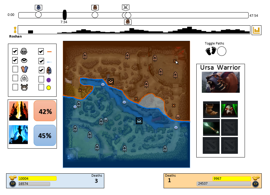
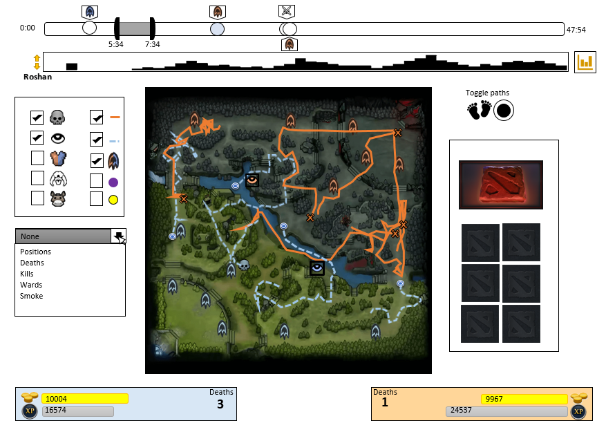
Our first design was a webpage with two pages. The first and main page consisted of a time slider representing the related DotA 2 game. The slider featured circles representing events at a particular moment of the game, such as a player death. Below the slider we placed a collection of small bar graphs, corresponding to miniature versions of the four graphs on our graph page: Roshan Kills, Wards, Player Kills and Teleports. The graphs were contained in a thin rectangle, and were displayed one-by-one using a toggle.
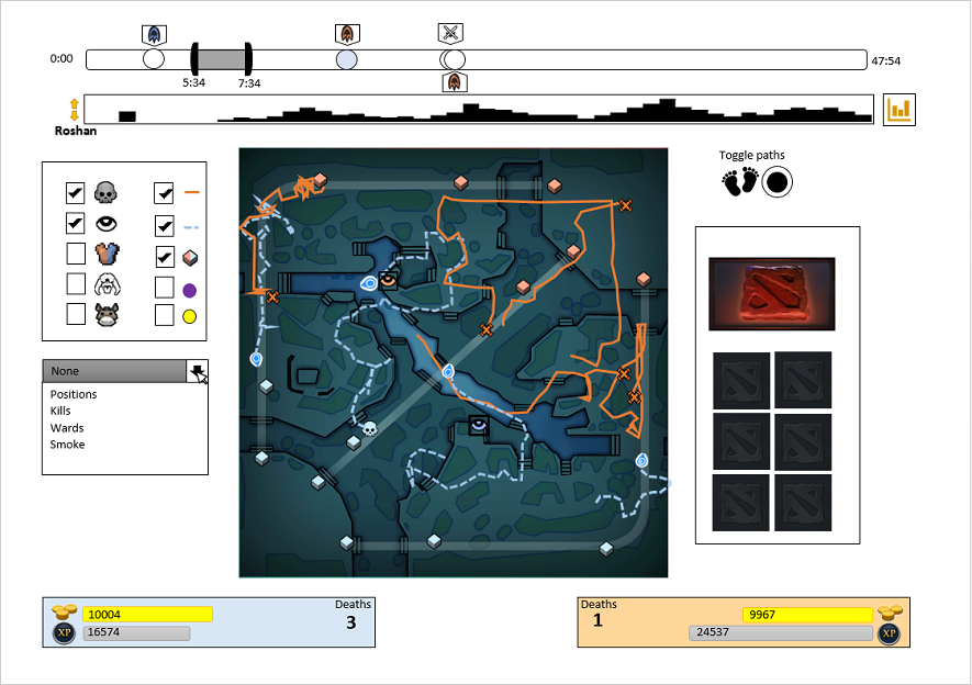
The left side of the page featured two boxes: one containing a toggle-able set of dimensions to show on our main information source, the game minimap. For example, the player could chose whether they wanted to show Roshan's presence on the map using these toggles. Below this box was one showing the two teams' map control in percentage at that instant of the game. At the center of our design was a replica of DotA 2's minimap, which displayed any of the toggled dimensions. The minimap was able to be switched between displaying teams' map control (a moment in time view), players' movements/routes on the map (a window in time view) and a heatmap. To the top right of this minimap was a "toggle paths" radio button that would allow the player to switch between map control mode or player movement modes. Below it was a box containing the selected player's Hero name and the items that player was using at that instant of a game. If a player was unselected, these fields would revert to an empty default item list and the DotA 2 logo in place of the Hero's character icon. (Players are selected by hovering the mouse over their icon or path on the minimap.) Finally, at the bottom of the page were two boxes containing each team's number of deaths, total experience points and gold earned at that instant of the game.
The second page, which was loadable by clicking on a small clipart image of a bar graph to the right of the miniature graph collection, was the expanded, full-size version of those graphs. To the left of each differently- coloured graph was the corresponding game icon/symbol, such as the game's icon for Roshan.


The feedback from our initial design shown above was mostly positive. However, our background image was too detailed and textured, which was found to distract the viewer from the data being displayed. Some of our icons were difficult to see due to their size and colour scheme.
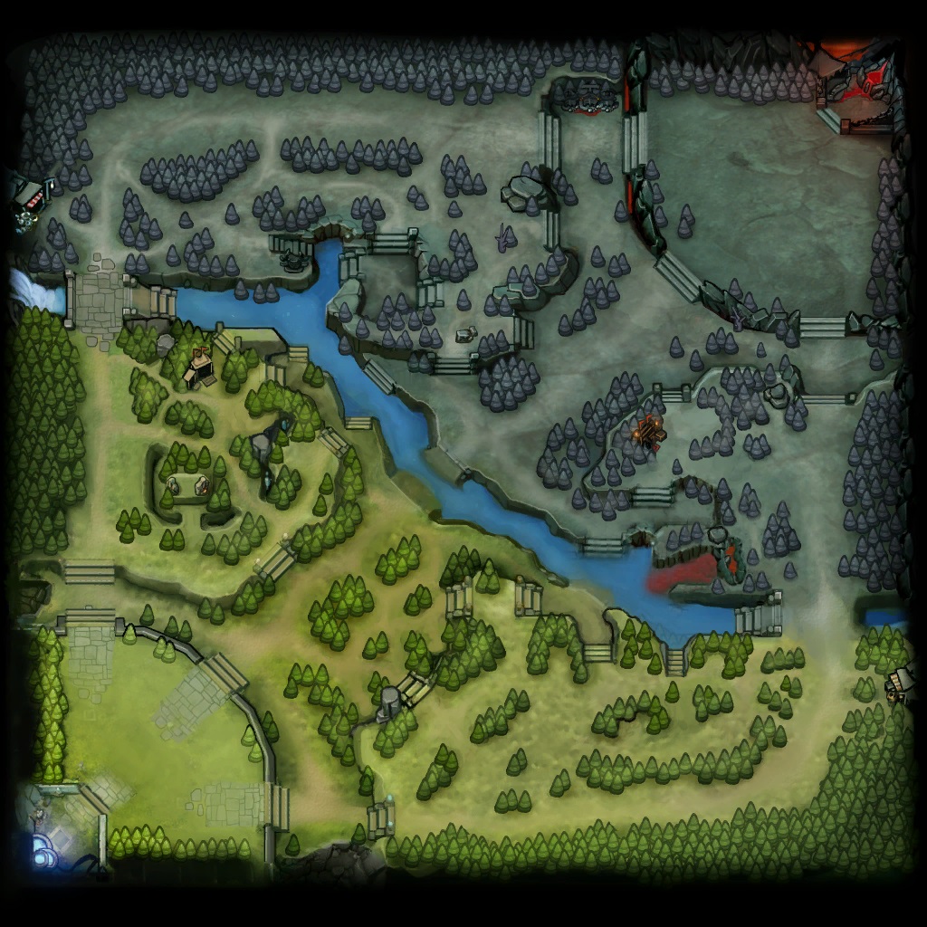
Our first design modification was the identification a more simplified map to use as the background. We had some fairly strict requirements for this. It was necessary to still have all map details relevant to positioning easily visible. Additionally, the map needed a minimum of texture and colour detail and it was essential that the map be famailiar to DotA 2 players as a representation od the DotA 2 game map. Fortunately, we found a map with all the pathing details (i.e. walkable and unwalkable areas) that used very little texture and a grayscale colour scheme. This new map is shown in the second version design displayed below.
The second design modification was making the icons more visible, while avoiding losing their meanings or causing the visualization to become too "busy". Changing the map had already helped us make progress in this regard, as having a less-busy background meant that the overall "busy-ness" of our visualization was reduced. Moreover, this design modification made the icons in our visualization stand out more. In addition to this we changed the art assets for some of the icons to more closely resemble how they would be displayed in an actual DotA 2 match. We updated the tower icons specifically to utilise depth as well to make them stand out more. We also increased the size of the player icons slightly to emphasize their importance.
While working on our second version of the design, we also started creating the interactive interface that would constitute our final design. During this process we made some changes due to design issues that became apparent in the interactive version.The majority of these were related to the graph page, which was quickly redesigned to be a pop-up in the main window, rather than an entirely separate page. We also changed the background colour of the pop-up so that it would be visually distinct from the main page. Other changes included editing what types of aggregate data we were showing and adding icons to the team gold and XP bars. We decided to remove the graph of teleports, as the DotA 2-playing members of the team felt this information was not of sufficient importance to DotA 2 players. However, we decided to add a 'Sentries' graph, as DotA 2 has two types of ward-like objects: Wards and Sentries. Given that these objects are similar, we decided to give them similar colours.

Our interactive visualization incorporates the design elements laid out in previous mock ups, as well as some changes with a fully interactive interface. Some of the more important dsign changes we made from the second iteration include: replacing the event icons on the timeline with color coded bars that give detailed event information when moused over, condensing the types of views into a drop down menu in the top right to save space and replacing the pure white background with a low saturation grey which allowed us to also remove the black bordered boxes around various visual elements. Unfortunately we were constrained in certain aspects of the interactive version, and therefore lost some elements from our ideal design. Notably the timeline was not as visually pleasing/ obvious as it would ideally be and certain icons had to be simplified for use on the game map. It was also difficult to render the hero paths with saturated/ lightened colours. Thus these are currently very bright in the interactive version.
Our interactive visualization includes the following interactive elements (top-down):
- A timeline with slider that the player can use to select a specific point in the game. This can be used with a mouse or arrow keys when selected,
- A number of graphs showing aggregate data from many previous games. These can be switched between using the arrows provided to the left.
- A graph icon to the right that brings up a pop-up showing all the graphs simultaneously and in more detail.
- A set of checkboxes allowing the user to filter which elements they wish to be displayed on the map.
- The game map where the user can select specific players to view their details on the left of the visualization.
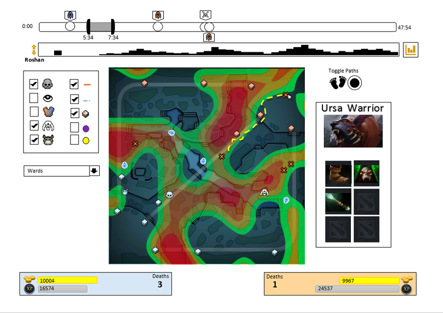
- A drop down menu allowing the user to switch between map overlay options.
- When showing the hero path overlay. the time slider splits in two. allowing the user to select a time window rather than a specific point in time.
We feel that our final design is strong in number of areas. We manage to show a very large number of data dimensions in a single graphic. This allows for many visual queries to be answered efficiently and quickly. This is in line with our goal of providing as much data to users of our interface as possible in order to give them context for possible high-level queries relating to their gameplay. Our design also allows users to view the data at multiple levels of detail starting from an overview and then allowing the user to filter information as desired. For example if the player notices certain trends in their own game they can quickly query this against aggregated data accessed via the graphs pop-up. We are also very pleased with our simplified game map as well as how clean we managed to keep the visualization overall despite the large amounts of data showed. We achieved this by using an effective variety of small icons, as well as giving the user flexibility. Users are able to filter out any dimensions/data that they feel are not necessary for their current purpose. We also use symbols and textures effectively to differentiate between essential visual elements, such as the player paths. These visual elements are also all divergent on more than one feature channel (e.g. colour and shape).
We also believe that the ability to integrate the heatmaps indicating general trends from a large number of archived games with the particular game the viewer is currently inspecting is very useful. This is particularly useful for players trying to improve their game by comparing their in-game behaviour to that commonly found in professional matches. Furthermore, it aids viewers in trying to come up with specific strategies to take advantage of these trends. We put a lot of effort into making our visualization interactive and usable, as the team is emotionally invested in the game. Our team members who are regular DotA 2 players fully intended to use our design for their personal benefit in the future. Consequently, the team was invested in creating the not only the best design we could, but the most practically useful and complete product we could create.
Unfortunately, our design is not perfect. Arguably the biggest issue that arises from our interactive version is the time it takes to load a game for analysis. This loading is a fairly lengthy process as it requires us to decompress a large amount of data into JSON. Given that we are trying to display large amounts of data for every "tick" of gameplay this is largely inevitable. However, we have endeavoured to optimise this process as much as possible. Although the user may need to wait to start using the visualization, they only needs to wait around 30 seconds.
On top of the large amounts of required data having performance implications, there is also the problem of acquiring enough data points to construct a compelling and useful visualization. This issue becomes a real concern when trying to generate heatmaps for rare events such as killing Roshan or placing a ward, because the number of games that need to be analysed in order to properly fill the heatmap (such that you do not only have one or two points visible) is exceptionally large. We have an automated process by which we can collect match replays and analyze them, aggregating the results of many matches into the data used to show the heatmaps, however the server which hosts the replays gives a hard limit on the number of downloads that are permitted per day. This rate-limiting combined with the time required to actually download and process the files means that the heatmaps shown in our final design, are made up from only 242 distinct games. From looking at the heatmaps for this data, it is clear that having complete heatmaps for all of the categories we initially specified, would likely require upwards of 1000 replays and so we have elected to only provide heatmaps for the positions of heroes around the maps.
Another more visual issue we encountered was the tendency of events displayed in the timeline slider to occlude one another. This is a natural effect of events tending to naturally clump together when one team builds up some short-term momentum and accomplishes many objectives in short succession. To combat this issue, we decided to use colour-coded bars and a key to indicate these events, instead of icons as well as alternating event indicators above and below the timeline. The timeline slider event occlusion problem persists, though is significantly reduced.
We believe that we have effectively achieved our original goal of creating a way for players to analyse their positional and other non-combat match data in a easy and meaningful way. While there remains room for improvement, we are pleased with the product we have produced in spite of some difficulties in creating the interactive interface. Since our original design was well-received and we had mostly positive feedback, we have been somewhat conservative with our changes as we did not want to lose that initial effectiveness. This success was mostly due to our analysis of related works. This analysis allowed us to identify common pitfalls in related visualizations, as well as effective techniques and design choices. However, we have incorporated changes to address the weaknesses of our first design that were highlighted. We believe we have effectively solved the majority of these issues. Consequently, we have been able to devote most of our attention to building the interactive version. This was fortunate, as we faced some unexpected difficulties on that front. Perhaps the greatest difficulty was obtaining data via the Steam API, which was trickier than we had hoped due to the way in which the API is designed and the format in which the data was stored. Another issue we faced was the sheer size of the data. This meant that we needed to devote more time to optimizing performance than we had bargained for.
We are pleased with our final product and feel that it would be useful for a wide scope of people involved with DotA 2. From beginners looking to emulate their more experienced peers to professionals looking to take advantage of current trends or to optimise their personal or team gameplay, our tool is useful for players of all skill levels. Additionally, our tool could potentially be used by match commentators at DotA 2 tournaments as an aid to post-game analysis. This opportunity is particularly interesting as it mirrors the recent trend of sports commentators to use interactive visualization tools in similar scenarios. This would also provide an opportunity for including new options to VisualizAncients as the need arises.
We believe that VisualizAncients could be improved in several ways in the future. The most obvious optimization that will take both time and extensive real-world testing is the "map presence" algorithm. This is currently a relatively simple collection of weighted averages based on team-associated objects near any point. As this feature is used both its strengths and weaknesses will become apparent, and it can be updated to take advantage of this feedback. Other areas for improvement include additional data storage and data processing optimization to decrease loading times to a minimum. This will create a way to keep the games used to provide aggregated data updated, so that new trends may be shown as they become relevant. However, it would be important to maintain the simplicity of the current visualization, particularly when adding completely new features, so as to maintain the usability and clarity of our current design.
The team worked well together. Aspects of the design, implementation and presentations were delegated amongst members, allowing for parallelized development of the implemented design. As tasks were compartmentalised and distributed, any roadblocks or problems that faced individual team members did not hinder the team as a whole. Communication amongst members was both free and frequent. An example of such communication was the discussion on the separate graphs page. After a team discussion, the team collectively decided to instead display the graphs as a pop-up. This improved our design, which was iteratively changed by contributions and feedback from all members of the team.
- Jethro Muller:
Implementation
Facilitated interactivity of visualization
Design and refinement of the main page (both iterations) - Jacques Heunis:
Data extraction, compression and management
Visual query identification
General design - Alan Berman:
Background research [related work]
Bar graph implementation
Write up - Timothy Gwynn:
Visualization mock-up
Design
Aggregate data collection
Write up
Alan Berman | Timothy Gwynn | Jacques Heunis | Jethro Muller