Introduction
Since the beginning of the Arab Spring in December 2010, a large number of people have been forced to flee their conflict-ridden homes. The United Nations High Commission is a United Nations agency mandated to protect and support refugees. We have created a visualisation to help users to process the large amount of data that has been captured over this period. To do this, we have looked at existing designs and analysed their strengths and weaknesses in order to produce a visualisation that answers our viewers visual queries as quickly as possible and provides a visually appealing medium for exploring the data.
The Problem
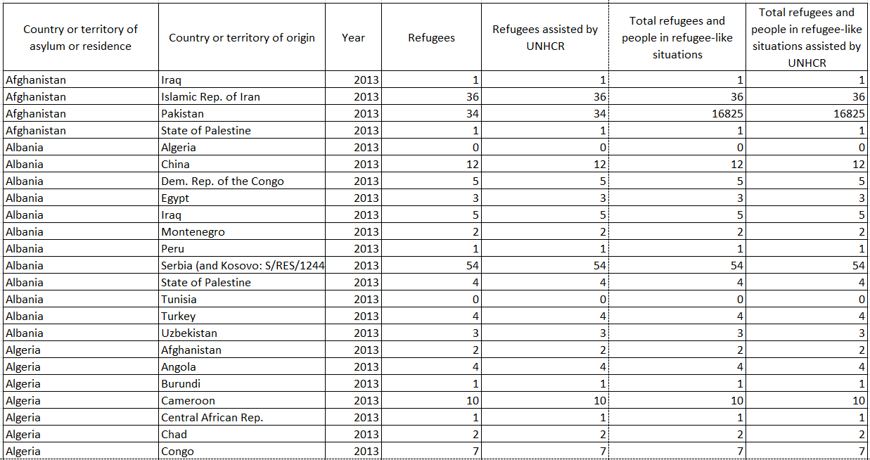
The UNHCR has collected a wealth of statistics on the movement of refugees across the globe. This data includes information about refugees’ country of origin, country of asylum and assistance from the UNHCR. The data is currently captured in an excel spreadsheet. As it stands, it runs to over 80000 rows of information because countries that have refugees from more than one origin country must be listed repetitively. The quantity of information easily overwhelms the reader. Simple visual queries such as “which country has the most refugees?” cannot be answered by the raw data.
Type of User
The large quantity of data available can be more effectively expressed in a visualisation. Potential users for this visualisation include:
Existing Work
Design One
-
Design One
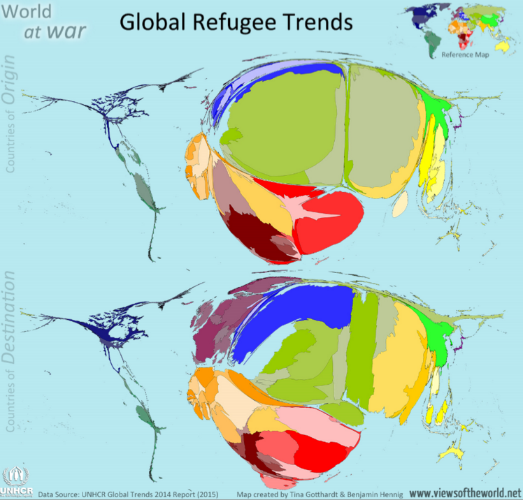
This design only seeks to serve two visual queries:
Both of these visual queries have been answered using space and colour. The bulging distortion of the two maps is meant to indicate how many refugees have arrived in or left the country. At first, it is shocking to look at a picture of an engorged and shrivelled map. It is immediately apparent that North America has not had many refugees leave or arrive. However, interrogating the data any level of detail greater than a general impression is difficult. Colour has been used to identify the countries and there is a small key map that is supposed to aid in identification. This map is ineffective because it is too small. The use of colour also fails to provide understanding when the distorted countries are of a similar shade. For example, on the countries of destination map, there is a cluster of countries that are all represented in varying shades of green. It is difficult to identify them on the key map because their relative positions are disturbed by the bulge effect that has been used.
Colour has been poorly used for the “Country of Origin” and “Country of Destination” labels. There is insufficient contrast between the grey faded text and light blue background. The grey text is slightly more effective for the “World at War” label because it is outlined with a white glow. Our eyes are better at perceiving differences in light and dark than purely chromatic differences so this contrast is effective. The combination of blue and black is often discouraged because there is insufficient luminance contrast between the two colours because our eyes do not have a lot of cones dedicated to viewing short wavelength colours (blue). In this case, where the background is light blue, black text stands out well on the blue background because the background is sufficiently light.
Overall, this design is ineffective, if not a complete graphical duck. The use of an engorged map is effective in shocking its audience but ends up hindering interrogation of the data.
Design Two
-
Design Two
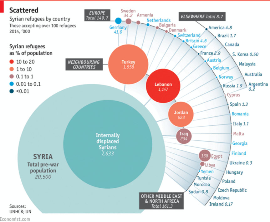
This design aims to answer the following visual queries:
When attempting to answer the first visual query, the design provides viewers with conflicting information. One would automatically assume that Lebanon has the most Syrian refugees because it is shaded with the most intense colour but closer inspection reveals that Turkey has the highest number of refugees and Lebanon actually has the highest percentage of refugees to their population. These visual queries need to be made more distinct. It is not immediately apparent that the size of circles indicates the number of refugees hosted by the asylum country. It is also very difficult to compare the sizes of circles so they are unhelpful in answering the first visual query because one ends up just consulting the numbers given inside of the circle.
The use of a colour scale to indicate percentage of an asylum country’s population that consists of Syrian Refugees is effective for the highest two categories because one intuitively associates a brighter shade of red with higher intensity. This intuitive ordering is not maintained for the bottom two categories where a lighter shade indicates a higher quantity. The second visual query would be more easily answerable if the colour scale has a more intuitive progression.
The lines on this design misleadingly seem to imply some sort of relation between the asylum countries. A line connecting two entities is generally perceived as a relationship between them. In a graphic that depicts the dispersion of people from Syria, one would assume that the lines show the paths that people have travelled to reach their asylum country. The lines distort the data because they seem to imply that refugees have travelled from Syria to Egypt to the Ukraine – an impossible route.
The use of circles to represent how many refugees are in each country is not effective. Viewers end up having to rely on the numbers provided next to the country name. This graphic fails to provide numbers for some of the listed countries. This makes answering the third visual query very difficult.
This design provides an acceptable overview of the data but fails to provide an effective platform for more detailed interrogation of the data.
Design Three
-
Design Three
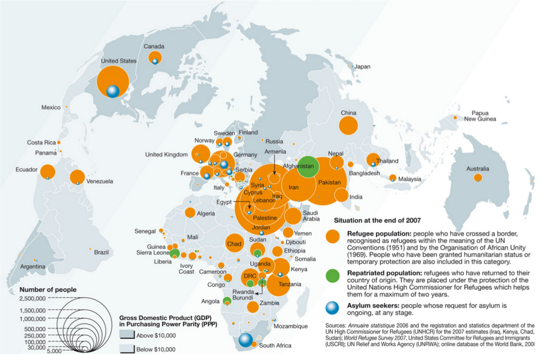
This design addresses the following visual queries:
The first visual query is answered using orange circles of differing sizes overlaid on the asylum country. The scale given on the left of the graphic is helpful in evaluating the sizes of these circles but does not sufficiently compensate for the use of a two dimensional shape to represent a one dimensional piece of data. This visual query is only differentiated from the third visual query on one feature channel (colour). These queries would be more easily answered if they were more distinct.
The use of space in this design is poor. The typical map of the world has been stretched to indicate a curved glove by distorting the edges. The majority of the data in this design lies in the centre of the map so it would make much more sense to bulge the centre (therefore spreading the data out) and pinch the edges of the map. The orange circles in the centre occlude each other in a way that does not effective because there is no implied ordering of importance, the bigger circles just have to go behind the smaller ones so that they are visible. This use of depth has no meaning.
The second visual query is differentiated by colour and depth. Differentiating on two feature channels makes this visual query pop but it still has the problem of using circles to represent a one dimensional quantity. Occlusion seems to be used to indicate that the asylum seekers are part of the refugee population in the United States, but this does not hold for South Africa. It is unclear whether the asylum seekers are considered part of the refugee population.
The two shades of grey used to determine GDP are easily identifiable. This makes the fourth visual query easy to answer. However, the diagonal stripes of shading across the graphic slightly distort these shades; this hinders interrogation of the information.
This graphic can be used to answer the desired visual queries but does not do so effectively. Queries need to be more distinct from each other and the pervasive use of circles is unhelpful.
Our Visual Queries
Our design aims to answer the following visual queries, ranked in order of importance:
Designs
Initial Design
-
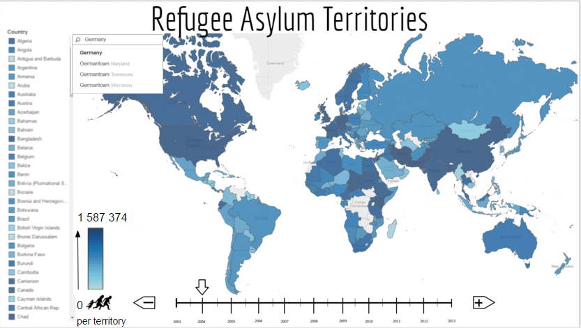
First Design Overview
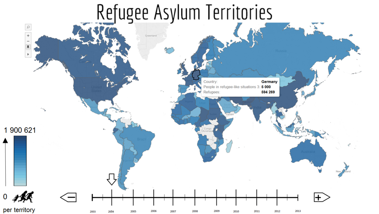
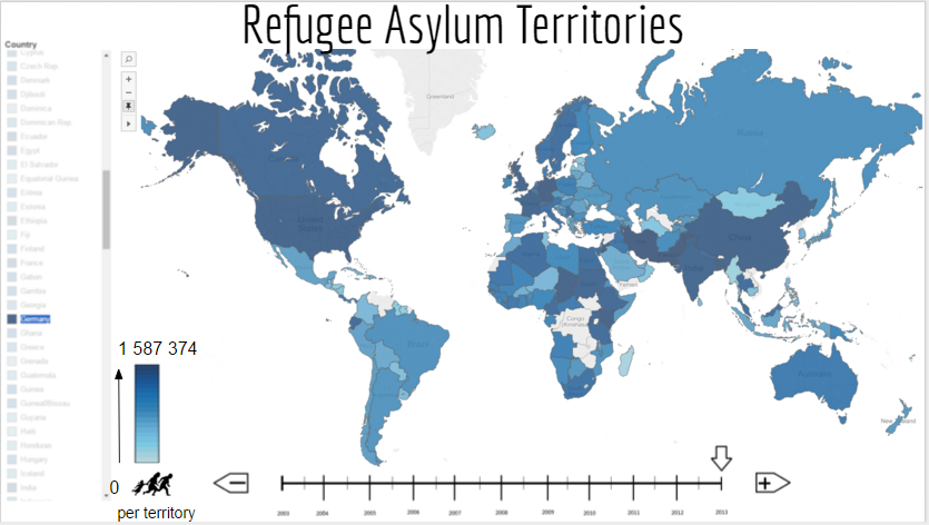
The initial display for this visualization is shown in the "First Design Overview" image above. This is the screen that the user is first presented with and it displays a high-level, general overview of the information in the database. The approximate number of refugees in each country is effectively indicated using a blue heat map. In order to incorporate the time dimension, an interactive timeline has been implemented. The user can then indicate which year the displayed information should be from. Since the heat map doesn't accurately display exact information, the user can use the cursor to hover over a country to get a popup that will display the exact refugee numbers for that country in the specified year.
The use of blue in the heatmap was because of the luminance contrast between it and the white background. This allows the user to easily find the countries that have refugees. The difference in blue shades between the countries is easily perceived and this coupled with the black outline makes it even simpler to distinguish the shapes of the individual countries. By using the familiar shape of a world map, users can immediately recognise that the information is being displayed on a global scale and that each country has its own respective data.
A possible disadvantage of using a blue heatmap is that world maps are traditionally coloured so that blue indicates water. This could lead to a clash between the country-shaped blue parts and the habit of indentifying water as the blue areas on a map. The use of blue for land is largely overridden by the familiarity of the shapes of the countries on a world map.
A timeline is also a relatively familiar shape and the selector arrow clearly indicates the currently selected year. The user can immediately recognize that the data has a time dimension and that they can specify the value.
The navigation buttons on the side are differentiated on 2 channels, the orientation of the arrow head and the symbol used. Each differentiation implies the function of that button. The - and + are universal mathematical symbols that indicate a decrease and an increase respectively. The direction in which the arrow head is facing indicates the direction in which the selector arrow will move, implying a decrease towards the left and an increase towards the right.
The mechanisms (popups, heat map, timeline) implemented in this screen help answer the first 2 queries mentioned in the previous section. It also provides the user with an intuitive way of drilling deeper into the data. The heat map is interactive and the user can click on a country in order to get more in depth information on it and even compare the data between 2 different countries.
-
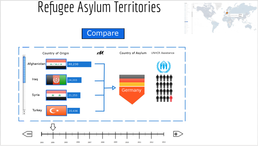
First Design Single Filter
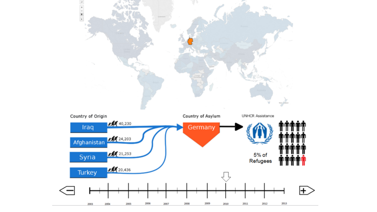
Once the user has selected a specific country by clicking on it in the interactive map, the visualization brings up graphics that present more detailed information on the selected country. This information includes showing which countries the refugees originated from and how many were from each source country as well as what percentage of the total refugees in the selected country have received UNHCR assistance which is indicated through the use of fractions represented in terms of red and black coloured silhouettes. The timeline stays at its original location on the screen in order to indicate that the user can still select a specific year, except this time the information being displayed.
The overview world map is greyed out and only the selected country is coloured in, this is to show that the information being represented is specific to the selected country. The orange on the world map corresponds to the orange of the Country of Asylum graphic. The map is greyed out to create a clear colour contrast between the selected and the unselected countries. Grey is a very neutral colour and is recognised among computer users as indicating that an interactive object is unselected or inactive. It allows the user to easily differentiate between the important and the unimportant information. The map is also scaled down a bit and moved further up the screen. This implies that the overview map is unimportant and that the user should focus on the new graphic on the center of the screen. It is used to shift the user's attention.
A disadvantage of this is that the map still takes up a reasonable portion of screen real-estate, especially considering that it is no longer a very important aspect of the display and does not need to show much detail at all.
This can be improved through the use of a mini map in the corner of the display.
The countries of origin are represented as blue rectangles with labels indicating the name of the country. Each rectangle has a line tipped with an arrow pointing to the country of asylum. The width of each of these lines is directly proportional to the fraction of total refugees that originated from that country. The total number of refugees from each country of origin is indicated next to an icon representing a family fleeing. Having all the different lines join to form one thick line is meant to imply that each line is a fraction of the total refugees in the selected country.
There are several weaknesses to this approach. One of these weaknesses is that the lines leading from each country of origin are curvy. This makes it difficult to compare the thicknesses of the different lines and thus nullifies the use of line width to indicate fractions. This might be improved by implementing straight lines instead.
Another weakness is that not very many people have an exact knowledge of the locations of countries on the globe and that it would be much more effective to have a visual representation of the source countries as well. This will allow the user to easily understand the geographical relationship between the source and asylum countries and can be easily done by colouring the source countries in the map as well as the selected country of asylum. There is also the problem of there generally being more countries of origin than what can fit on the screen. But this is easily fixed by implementing a scroll bar that will allow the user to explore all the different countries of origin within that same amount of screen space.
It would also be beneficial to add images of the countries' flags in order to help the user quickly identify which country it is.
The country of asylum is coloured in orange in order to create a chromatic contrast with the blue of the source rectangles. It is also easily distinguishable from the greyed out countries on the overview map.
The repeated use of the refugees icon is unnecessary and creates clutter on the graphic. The image is used to illustrate the fact that refugees leave the country of origin and move to the country of asylum. But it would be much more efficient to use this image once instead of for each country of origin.
It was also pointed out that the arrow between the country of asylum and the section on UNHCR assistance is somewhat unnecessary and is not used to indicate any sort of relationship. This arrow might as well be removed for the next design iteration.
The percentage of total refugees that have received UNHCR assistance in a country is represented as a ratio of red silhouettes to black silhouettes. These humanoid silhouettes provide an efficient way of representing fractions that can be easily understood. It gives an accurate visual interpretation of the percentages. For example, in the given image 5% of refugees have received UNHCR, this is equal to 1 person in 20. The graphic has much more of an impact than the percentage and the user can quickly understand the information being conveyed by identifying the red silhouette from the black ones. Silhouettes of stick figures were used simply because the values refer to a number of people (instead of just using circles or squares and colouring them in). The graphic makes use of red and black because of how easy it is to differentiate from each other. The red silhouette clearly stands out from the others. This method of displaying percentages is aso very useful when it comes to comparing values as well. Their usefulness with regards to comparisons will be further evaluated in the next part of the initial design.
A weakness of this method is that not all percentages have small enough common denominator. For example 7% would be much more difficult to show in proper fractions. This can be solved by using partially-coloured silhouettes and mixed fractions. For example 7% can be written as 1.4 out of 20.
If the user wants to compare the data for 2 countries, they can simply select a second country to compare with the first one by clicking on the desired country on the overview map. In doing so, the visualization will produce the screen shown below as "First Design Comparison".
-
First Design Comparison
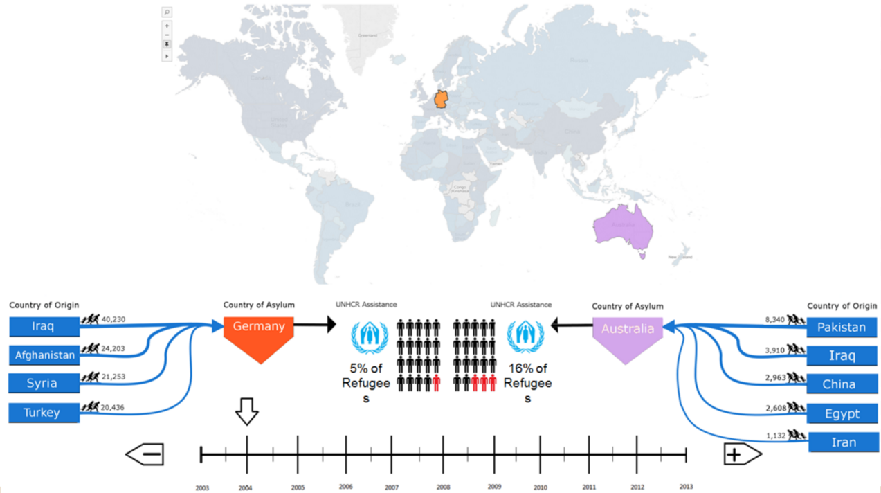
The user can compare the data from 2 countries by selecting them from the overview map. Once both desired countries have been selected, the visualization produces the screen shown as "First Design Comparison". In this screen, much the same happens as with the previous one. The overview map is greyed, scaled down and moved to the top with only the selected countries still coloured in. The only difference is that now the middle space is shared between graphics showing data from the 2 different countries. It is the same graphic used to show data for a single country, but now they are both scaled down and placed side by side towards the middle of the screen. The colours of each asylum country on the map corresponds to their colour on the graphic.
This screen has many of the same strengths and weaknesses as the previous one, so this section will only focus on the strengths and weaknesses unique to this screen.
The graphic for the second country is oriented such that it is the mirror image of the layout for the first country. This is because the symmetric appearance and use of screen space is much more aesthetically pleasing than having them both face the same direction, which gives an impression of a disrupted flow of information. Having the graphics facing each other also makes it much easier to compare the fractions of refugees that have received UNHCR assistance, all the user has to do is to compare the number of red silhouettes for each country. This may be inaccurate information with respect to the total number of refugees that have received assistance. For example, 5% of 10 000 is 500 and 16% of 200 is 32. So although the one country has assisted a larger ratio of refugees, the other has assisted a higher total of refugees. This means that it might be necessary to display the total numbers of refugees in some way on the graphic.
It was also noted that since very few people know exactly where each country is on the map, it is difficult to select a country to compare to. The map has been greyed out and there are no labels. Although the user knows which country they want to compare, they would need to know its exact location on the map off by heart, or have to find it on another world map and then try find it on the visualization. It is therefore necessary to implement another way of finding a country on the overview map that does not rely on the user's geographical knowledge. A simple way of doing this is to implement an alphabetised scrolling list of all the countries for which there is data. The user can then simply scroll to the country that they wish to select but can't locate on the map, and select it from the list, at which point all the normal processes will resume as if they had clicked on the map.
Overall, it is the group's opinion that this was a valiant first attempt at a design. Although it may not be the most effective, it provided a good platform to expand on and a direction to develop in. The suggested changes will be applied and the design will be re-evaluated as part of the second iteration.
Second Iteration
-
Second Design Overview
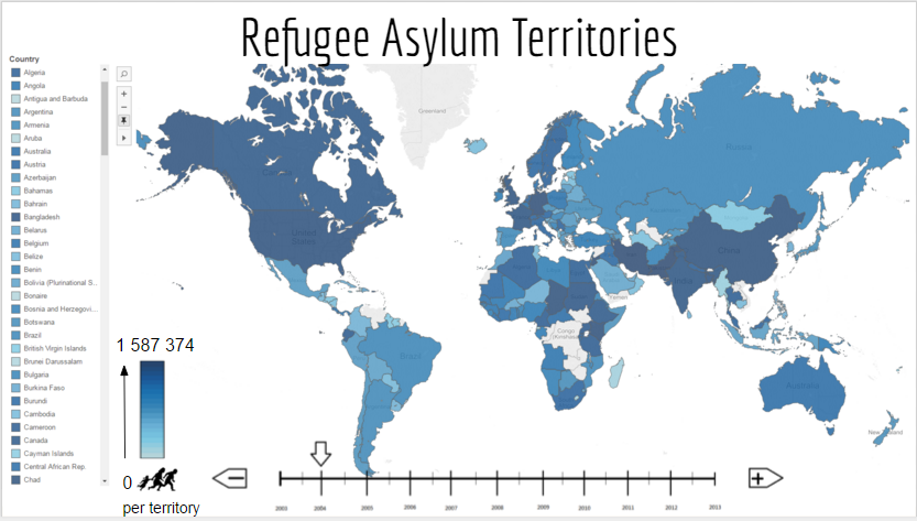
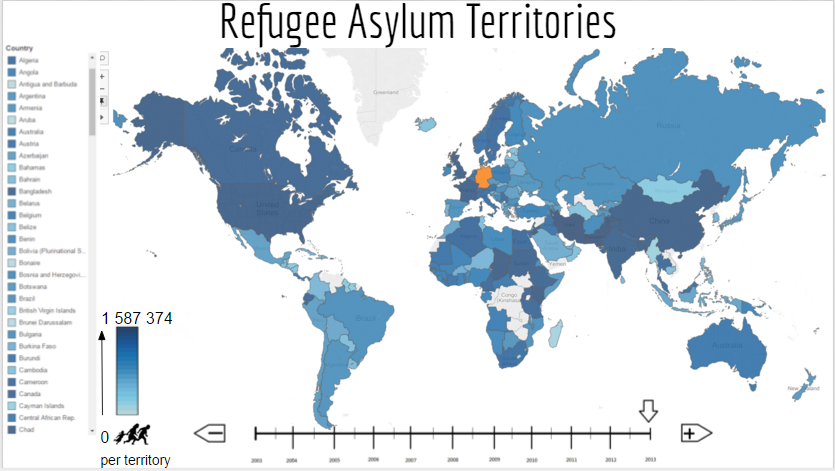
The initial display of the second design iteration is illustrated above as "Second Design Overview". This is the initial screen that the user is presented with when they start to use the visualization. It provides a general summary of the information gathered on a global scale. As can be seen, the overview still uses an interactive blue heat map with a timeline as described in the evaluation of the initial design. This is because of how effective it is in conveying this high level information and how easy it is for the user to understand it.
There are already some obvious changes in this design iteration, as can be seen in the initial screen. There is now a scrolling alphabetised list of all the countries on the left hand side of the screen. This was an important weakness in the initial design that had to be addressed.
The advantages of using blue in the heatmap outweighed the disadvantages and so the use of the colour blue persists. The design also makes use of the icon of a silhouette family fleeing to refer to refugees throughout the visualization in order to establish referencing consistency. The timeline has also been kept as is because it is effective and very simple to implement. Its function is also clearly indicated through the use of symbols and directional arrows on the accompanying buttons.
-
Second Design Country Search
This screen is still part of the initial screen that is presented to the user, except it demonstrates an added functionality. Not only is there an alphabetised scrollable list of all the countries, but the user will also be able to search for the specific country instead of having to scroll through all the options. This search is implemented as a simple input box in the top left of the screen. It takes up very little screen space and makes searching for a country much more efficient.
-
Second Design First Country Selected
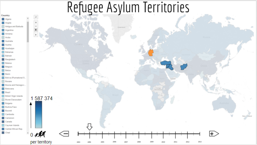
This screen appears once the user has clicked on the country that they would like to get more information on. As can be seen, the selected country of asylum is coloured in its unique colour, all the countries from which refugees in that country originated are kept a solid blue colour, while all the others are still greyed out.
A weakness of this approach is that the overview does not show the number of refugees from the different countries, it simply indicates which countries refugees have moved from. It would be useful to show what fraction of the total refugees came from which country by using another colour intensity gradient. This would make the overview map significantly more effective.
-
Second Design Country Details
This is the screen that appears when the user would like to view more in depth information about the selected country. It clearly indicates some significant changes made between the 2 design iterations.
First off, the old and inefficient overview map from the initial design has been replaced with amuch more effective mini map located in the top right of the screen. It's just big enough to show the necessary geographical location of the selected countries. It is a much more effective use of space and provides an easy access, quick reference for the user.
Instead of using the plain, labelled blue rectangles to indicate the country of origin, the second iteration implements the use of labelled flags. Recognising the image of a country's flag is often faster than having to read the label. In the case of the user not knowing the flags of the different countries, which can get difficult, each country of origin is still labelled as a last resort.
Using the countries' flags presented another aesthetics problem, the flags did not have borders. This was a problem for flags with a lot of white near the edge of the flag since it would be difficult to distinguish between the white part of the flag and the white background. An easy solution to this was to give each flag a thin outline of dark blue. Dark blue was used for the outline in order to correspond with the blue colour that was used to colour in the source countries on the mini map. Thus, establishing a consistent relationship between that blue and countries of origin. It was also a colour that was very unlikely to appear in many flags.
This iteration also includes the use of a scroll bar on the left hand side of the source countries, in order to allow the user to scroll through all the different countries of origin that do not appear in the first 4.
A significant concern from the previous design was being able to compare the fractions of total refugees that came from the different countries of origin. The use of line widths and curvy arrows proved to be ineffective and conveyed inaccurate information with respect to total numbers of refugees. This same concern applied to the number of refugees that have been given UNHCR assistance. In this design iteration, all the curvy lines and arrows have been replaced with straight lines of a consistent width to indicate refugees moving from the county of origin to the country of asylum. For each country of origin, a horizontal bar graph is used to indicate the fraction of total refugees that came from that country. Again, the same shade of blue used to fill countries of origin on the mini map is used to fill the bar graphs to maintain the association of that blue with countries of origin. The total number of refugees that came from each country is specified using a label on the respective bar graph. This allows the user to still be able to compare the fraction of refugees that came from each origin country while still being able to compare absolute numbers of refugees from different countries between different countries of asylum.
The stick figure silhouettes are still being used in order to show percentage. It may be more effective to have another way of representing total number of refugees that have received assistance. Unsure about this paragraph
mention anything at all about those stick figure men? maybe change the criticism about them not showing absolute values
A dotted blue line was also used to create a border around the graphic that presented all the selected country's data. This is to neatly group all the elements of that graphic together. All the components relating to data for the same country are grouped together.
It was suggested to use a flatwash grey background within the boundary of the dotted blue line in order to have some variation between the white backgrounds.
The refugee icon has been used much less in this iteration. Instead of using it for each country of origin, the graphical relationship between countries of origin and asylum is established once by placing the icon at the top between the countries of origin and asylum. This removes a lot of the clutter in the previous design and still conveys the same information.
It is also worth noting that a "Compare" button has been added to the design. This is the button that the user can press to indicate that they would like to compare the currently selected country's data with that of another country. Clicking on this button takes the user to the screen shown below.
a downside coulf be that it is difficult to show queries that show differences in year
ie what is the difference in number of refugees in a country between 2 years. not sure where this should appear. could be about this or the final design
-
Second Design Select Country to Compare
Clicking on the "Compare" button on the previous screen, takes the user to this screen "Second Design Select Country to Compare" which, as it's name suggests, is the screen where the user selects the country with which they want to compare the first one. The mini map is enlarged and the overview map is displayed. This screen is exactly the same in layout and functionality as "Second Design Overview" except that the originally selected country is still coloured in orange. The user simply needs to select the desired country, either by clicking on the interactive map, finding it in the scrollable list or using the search functionality.
-
Second Design Country Origins
Having selected the desired second country to compare to, the user is taken to the screen "Second Design Country Origins" which is also the same as "Second Design First Country Selected" in every way except for the fact that it now displays the countries of origin for both selected countries instead of just the one. Each country of asylum is filled with its unique colour (orange and purple). These colours were chosen because of the chromatic contrast between them. This approach presents another weakness on top of the one mentioned about indicating the number of refugees from each country. It does not differentiate between which countries of origin are associated with which country of asylum. A solution to this could be differentiating between the countries of asylum by using textures to fill in the countries of origin. So for example, all countries of origin associated with the first country of asylum will be filled using a texture of vertical stripes while the second uses horizontal stripes. This will allow the user to easily differentiate the countries the refugees in a country of asylum came from.
-
Second Design Compare Countries
As can be seen from the above image, the general layout of the comparison screen has persisted through this design iteration. Each country still gets its own graphic that represents the more in depth data and the screen space is split between them. Both graphics still face each other since this works a lot better than facing in the same direction, especially in order to compare the data and for the general aesthetic flow of the design. As can be seen, the mini map proves to be much more effective than the previous overview map.
Final Design
-
Final Design Overview

-
Final Design Country List
The overview and filtering of countries using the list and the search function have not changed from the second iteration. We believe that it is an effective method of choosing the country desired as it gives the user a multitude of options if he/she is unable to locate the country on the map or only knows the countries location and not it's name.
-
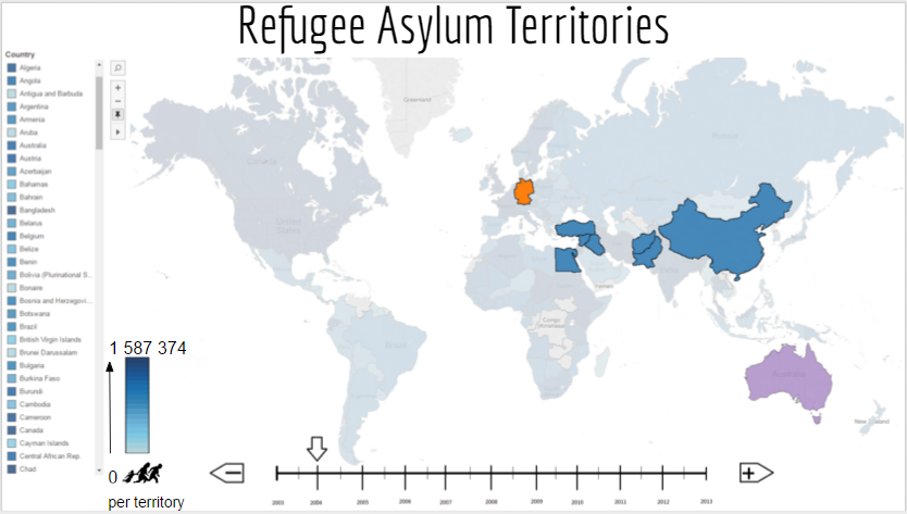
Final Design First Country Selected
A couple of improvements were made to the design shown above. In the second iteration the source countries, countries where the asylum seekers originated from, were coloured in blue. This conflicted with the original overview map and did not make the countries visually distinct. We decided on improving this by using a different primary colour, red, and made the saturation of the colour dependent on the number of refugees each country contributed to the total.
The second improvement is the use of texture. This will be discussed later in detail but aims to differentiate the source countries and link them to their desination country.
-
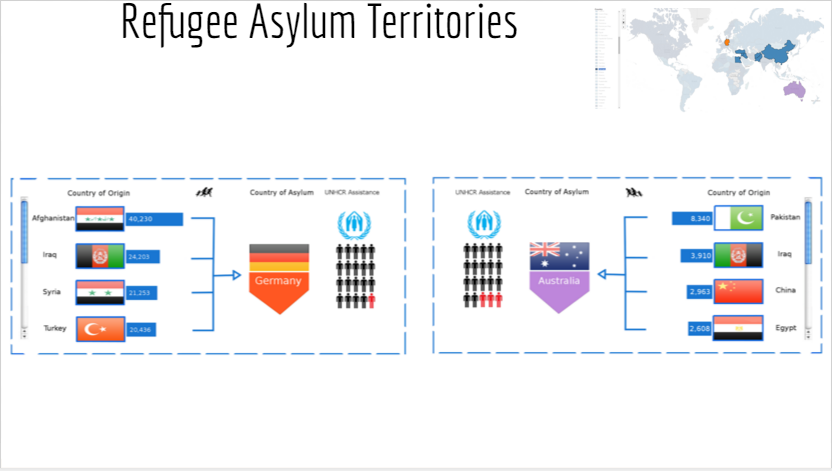
Final Design Country Details
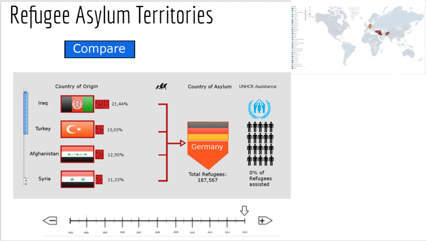
In the details screen of the first country clicked, as shown above, more major improvements were implemented. The colour of the source contries borders were adjusted to match the new colour mentioned previously and the line and bars were also changed accordingly.
The largest improvement came in adjusting the method in which we showed how many refugees came from each contributing source country. In the second iteration we attempted to display the numerical value of the total refugees coming from each source country. This provided us with challenges in both displaying the data, as often the countries had large differences in contributions, and with comparison between asylum countries which will be mentioned more in detail later. These challenges prompted us to alter the methodology to showing contributions to use percentages of a whole. The percentage of the total refugees that each source country contributes is now displayed in the same bar graph format and the percentage label has been moved outside of the bar due to a lack of space when the bars are too small. The total refugees contained in the asylum country is now shown below the asylum country in order to give the viewer a sense of the amount of refugees being refered to in the percentages.
The last improvement on this screen is the label given below the graphic indicating the number of refugees assisted by the UNHCR. This was incorrectly removed from the second iteration and we believe it provides usefull information to the view and was therefore reincluded.
-
Final Design Select Country to Compare
No improvements were made to the above design from the second iteration.
-
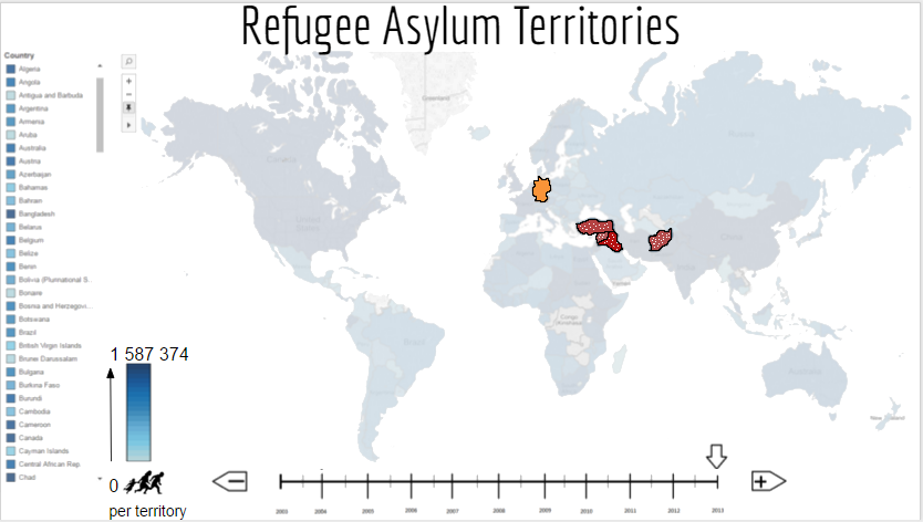
Final Design Country Origins
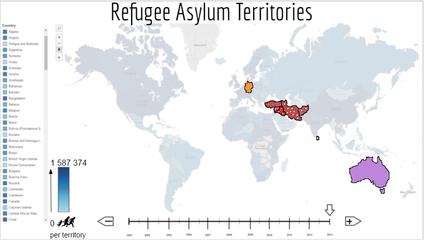
The screen above as mentioned previous, in "second iteration", appears when the viewer wishes to select another country to compare to the first he/she selected. As mentioned earlier the colours have been altered from the second iteration but the major adjustment in the design above is our attempt to resolve the overlapping regions problem encountered when the user selects two countries that have the same source countries that contribute refugees. This difficuilt design challenge forced us to explore different ways to try indicate that both asylum countries had countributions from the same source country. An attempt with colour rendered the map in our opinions too colourful and complex so we tried to use a cue that we hadnt yet used, texture.
The first texture used is white dots on the red background. This high difference in luminance allowed the dots to be visible even when the map and countries became smaller. The second texture used is white crosses. These we found were easily differentiated from the white dots and allowed the user to easily discern the relevant contributing countries. Different textures were attempted including lines and dashes however the current combination we believe to be the best. Most importantly these textures could be combined and allows the viewer to see that some source contries are overlapping.
-
Final Design Compare Countries
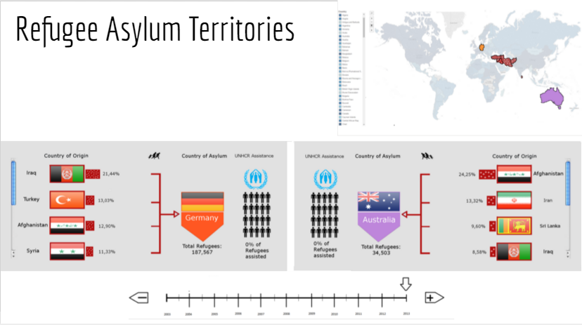
The final screen where two asylum countries are being compared is shown above. The most noticable change from the second iteration is the method used to seperate the two countries. In the previous iteration a blue dashed line was used however this proved to be visually jarring and so a grey background panel has been used to separate the two asylum countries. As mentinoned in "Final Design Country Details" the colours have been adjusted to fit and the texture has been added in order to establish which source countries belong to which asylum country on the map. These textures are included within the bars of each graph.
Conclusion
This project involved visualising a huge multidimensional dataset in order to ensure that the data can be explored, filtered and zoomed easily by the viewer. We put a large amount of focus on the design of our visualisation in order to ensure that our visual queries could be easily answered. We believe that we have achieved this and although the visualisation is far from perfect we hold the opinion that our design provides a visually appealing wway of discovering information about a very important crisis in todays society. Our only regret is that we lacked the time to fully implement our design.
Teamwork
| Name | Work Done |
|---|---|
| James Foster | Website, Report and Design |
| Carla Cohen | Report and Design |
| Ruben Putter | Report and Design |
Overall the the team worked well together and each contributed in some way to the final product. Many hours were spent on the design iterations and ideas and concepts were inputted by all members of the team. This work we believe represents a whole team effort.