Detailed Design
Visual Queries
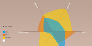
There are two types of visual queries that can be addressed by our visualizations. The first type concerns queries regarding a single face, using the symmetry visualization. This visualization provides both broad overview information regarding the ‘balance’ of a face, as well as pinpointing particular variance details of specific facial features. The most important, and also the most broad, visual query answerable by this visualization is “How symmetrical is my face?” One can instantly see the degree of symmetry in the pattern of the visualization, as well a the degree of variance between two corresponding features (made clear by the blue and white lines). The average variance displayed by the background blocks of the visualization allows you to see which side of your face has features with the greatest average distance from the center axis of your face. Additionally specific features are intuitively known, due to the symmetry shape being overlayed on a blueprint image of a human face. Each datapoint of a facial feature in the visualization corresponds spatially with the location of the features they represent in the blueprint image. This allows for quick identification when answering more specific visual queries like “How evenly spaced are my eyes?”, or querying eye position and symmetry, for example. The second type of visual query relates to observing differences between two different faces, using the facial comparison visualization. This one provides a type of ‘graph’ that represents certain ratios obtained from facial metrics calculated from the user input. The broad query answered by this visualization is “How different is my face from the other face?” The level of difference between the two faces is clearly visible due to the presence of overlaid transparent textures. Delving deeper into this visualization, another visual query answered here is “In which areas do these two faces differ?” By observing the icon and partition in which a certain point falls, the viewer can easily identify by how much a certain ratio differs in one face compared to another. For example, looking at two faces, it is clear that the ratio of face width to face height is much higher in face one, meaning that face one is more thin and long than face two. There is one more visual query that the facial comparison visualization addresses, and that is “By how much do these two faces differ?” Although there is no scale on the visualization, this is not the main focus of the query. We do not expect the viewer to be looking at exactly how much the ratio differs in the two faces, since this does not carry much meaning. Rather the viewer should be able to observe larger or smaller differences in ratios.
Description of design
The design of the visualization system has undergone 3 iterations. The initial design was evaluated after presenting it to the class. This reevaluation produced the second iteration design which was critiqued during the second class presentation. This second round of feedback allowed for the final designs to be implemented, more of a tweaking of the second iteration of design than a complete redesign.
First iteration
The first design iteration had us focusing on two key issues; a visualization that was effective at comparison based visual queries, and one that could be conceptually linked to the fact that it was visualizing aspects of a human face. A visualization supporting effect comparison was essential, as the entire Facio visualizer is comparison based- comparing two different faces and comparing two sides of the same face. We went in search of existing visualizations that could support these queries for inspiration. Initially, we considered using a heatmap-based visualization of the human face, to display where ratios differed in comparison. This was discarded though, as heatmaps are more effective for displaying intensities of data concentration, and not practically suited for our purposes. Eventually we settled on using shape-based visualizations, as shapes are clearly defined objects and differences between shapes are easily identifiable, as pattern recognition is an intrinsic skill of our visual processing system. Once we had decided on using shapes, it became a matter of how to construct shapes in such a way that allowed for comparison and how to ensure that differences between shapes get interpreted in the desired way. These considerations resulted in our initial designs that were presented in the first class presentation.

The initial designs that we used for the presentation were the following:
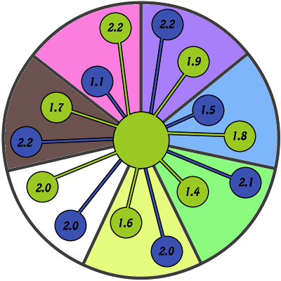
Comparison between two faces by showing the actual ratios in the bubbles at the end
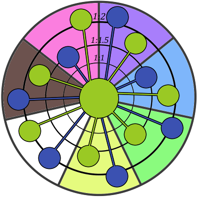
Comparison between two faces using the rounded area indications to show the actual ratio .First design
"Maybe connect the end points of the visualization, since shapes are more easily recognizable and it's easier to see the difference in areas."
Comments in class--Michell Kuttle
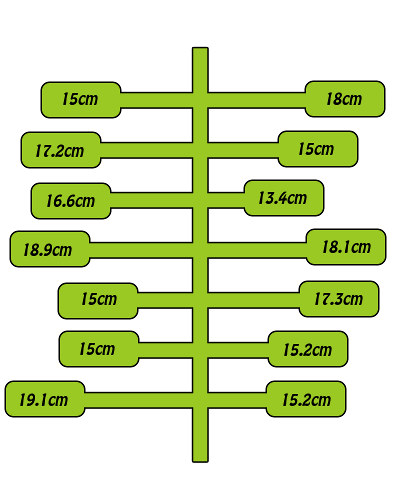
Symmetry visualization of the face using blocks to indicate ratio sizes
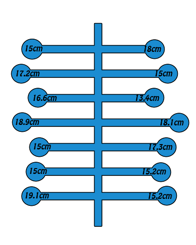
Symmetry visualization of the face using round bubles to indicate ratio sizes/p>
"The same applies to these ones, connecting the dots and filling in the inside will make it easier to see. Maybe even use thickness of line. You also need to add images indicating which value corresponds to which ratio. Because at the moment all I see are random scattered values."
Comments in class--Michell Kuttle
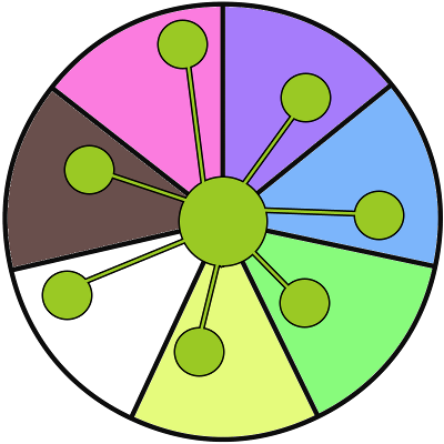
Comparison between two faces by showing the actual ratios in the bubbles at the end
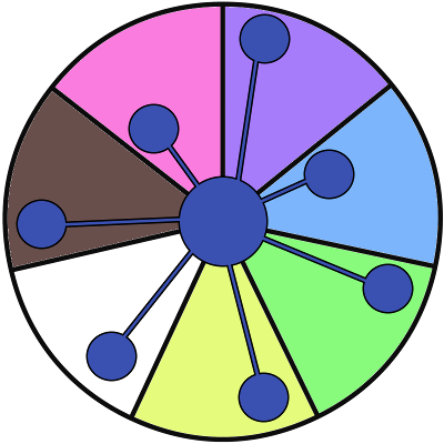
Comparison between two faces by showing the actual ratios in the bubbles at the end
Second Iteration
After the initial presentation, some significant changes were made to both designs. Most changes were aesthetic choices to help bring more contrast between comparison factors, using different channels like size, colour, shape, width, edge detection and pattern recognition. This resulted in the first code-based visualization tool, along with a custom input GUI.
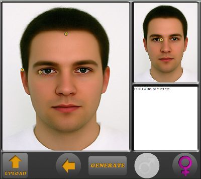
GUI used to upload the desired photo and place points that will be used to generate the visualizations
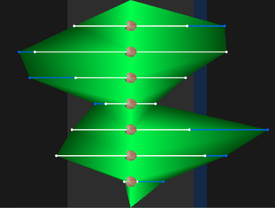
Second iteration of the symmetry visualization
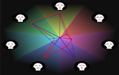
Second iteration of the ratio visualization
Third Iteration
After our second round of presentations, there were a few additional tweaks to be made to each visualization. These were more optimizations than redesigns, they included:
The result of the third iteration of design tweaks, the final symmetry visualization looks like this:
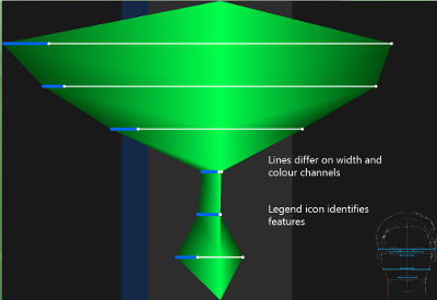
Final design for the symmetry visualization
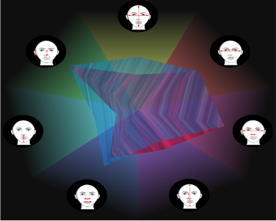
Final design for the ratio visualization
"Comparing shapes is much easier than a scattered image. Also, you need to use the methods indicated in the notes on overlapping regions. Either use different textures or fill in the difference. You should also change the icons because it's kind of unclear what ratio is being shown."
Comments in class--Michell Kuttle
On the third iteration of the comparison visualization, we changed the representing shape to be two overlaid textures. The transparency makes it very easy to see exactly where the areas of difference are located. The textures displayed should look similar to the images below, however, due to some issues with the implementation, we were unable to perfect it. The reason we chose these images is that one is made up of straight lines, and the other circles making it easier to differentiate between them even when overlaid.
