Description of Design
Our design allows the viewer to clearly view different TV shows as well as the different theories.We made use of colour and texture to make it easier for the user to group the information conceptually.
In the first view, an equal view of television shows is shown. They are arranged in a circle, alphabetically clockwise from the top. This view does not show any information about the number of theories in each show or their popularity. We decided not to encode that information as when the user is performing a query they will already know which show interests them; any other information is irrelevant. There are no titles of the shows in the initial view as the user will be able to chose the show they want by recognising the image that clearly represents a specific show.
Clicking on any one of these shows will display the different questions or plot lines that have been theorised about. The information about each plot line is hidden until the user selects the plot line. This is to reduce the chance of “spoilers” for users that are not up to date with the show. Selecting a question or plotline will highlight that particular plotline as well as give the title of that plot line and a short summary. The user can then click through to the visualisation for that plot line.The user may also click on the show to see a summary visualisation that shows all the relevant plots, including the major episodes and pieces of evidence for these plots.
In the theory visualisations, lines represent pieces of evidence which link the source (an episode) to a target (the theory). These are linked through colour and texture. Theories are listed on the right in descending order of popularity. The user can easily query how substantiated a theory is by looking the number of evidence lines that point to it as well as the thickness of the horizontal theory line. When visualising just one question with many possible theories colour differentiates the different theories, and texture is used to differentiate different versions of a theory. Colour is also used to represent different character theories in visualisations of many plots of a TV series. In this instance different colours will be used for different characters and then various shades of the same colour with be used to represent different theories for a particular character. A key of the characters’ names and the colours that represent them is also part of the visualisation, in order to help the viewer.
Clicking on a theory image or an episode will highlight the relevant evidence (and fade out everything else) and reveal a summary of the theory or episode. Clicking on an evidence line will highlight that line and will reveal the details of the piece of evidence. By fading out the other theories, we allow the viewer to still be able to see all the theories without interfering with the query being viewed. The information about about the evidence/theory is displayed in a box on the right of the list of theories, and is the same colour as the theory being queries as well as containing the relevant image of the theory. The only time this box will be more than one colour is if a character with more than one theory is being queried. Here the box will be the colour of all the theories, and when one of those theories is being viewed will the box will be that specific colour. Thus, we use colour as a strong linking element as well as to differentiate between different theories.
Research and Inspirations
Before designing any prototypes we looked at infographics of other TV shows to see what else is out there. We found a few designs that we really liked and that gave us inspiration for our designs, as well as some visualisations that were not as appealing. This helped us decide what we wanted and didn’t want to include into our visualisation.
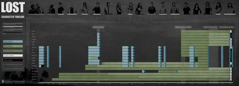
Lost Character Timeline: A desirable feature from the image below is that is one clicks on a colour in the key only the lines that represent that relationship will show up, in this instance only the yellow connections are displayed
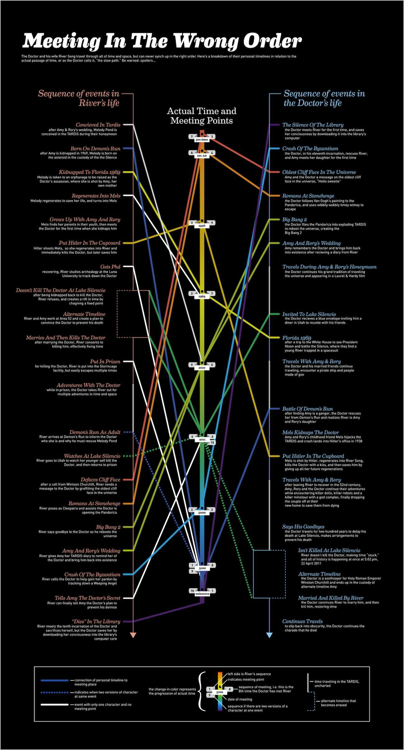
Meeting in the Wrong Order: This visualisation shows information about the meetings of two characters in the show Doctor Who. We liked the use of colour in this image as well as the cleanness of the lines which indicate links between points in the characters’ timelines.
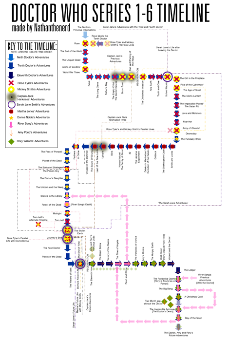
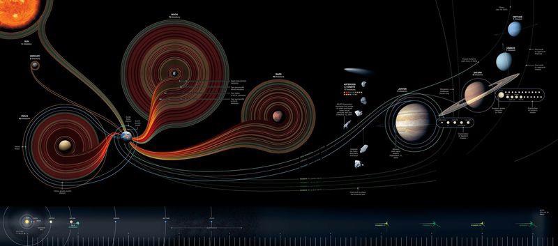
Doctor Who Series 1-6 Timeline: We found this visualisation particularly cluttered and unappealing. It shows events in Doctor Who during seasons 1 to 6. We did like the use of symbols, although there are so many symbols it is often hard to distinguish between them. 50 Years Of Space Exploration Although this visualisation is not related to TV shows we found it very visually appealing. We liked that the lines were all the same thickness and that you gained information by looking at the number of the lines grouped together around the different satellites. We used this concept in our final design.
50 Years Of Space Exploration: Although this visualisation is not related to TV shows we found it very visually appealing. We liked that the lines were all the same thickness and that you gained information by looking at the number of the lines grouped together around the different satellites. We used this concept in our final design.
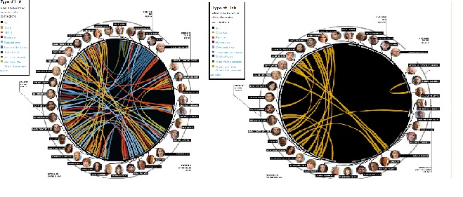
Lost Web Of Intrigue: This visualisation shows connections between characters in the TV show Lost. We liked the different colours that were used to distinguish the different types of connections. The interactivity of the visualisation also inspired us to allow users to highlight the different lines in our final visualisation.
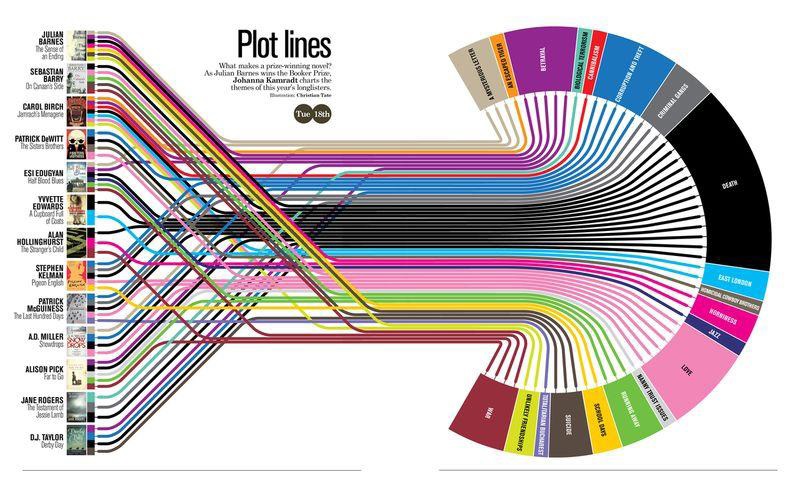
Book Plot Lines: This was possibly the biggest influence on our final design. We really liked the use of colour to group concepts. We especially enjoyed that colour palette is attractive and each colour is also relevant to the concept it represents (e.g. “Escaped Tiger” is orange). We also found the way that the lines cross over each other to be visually appealing.