Research
Before the final design was implemented, research was done into existing citation visualisations. These were found to be in a static and interactive form. Static visualisations included images which simply display the data and interactive visualisations involved interfaces which allow the data to be further explored. The following designs were analysed and their effectiveness evaluated.
Alluvial Diagram
by J.J. Sylvia IV

An alluvial diagram is a type of network flow diagram that links different dimensions of information to each other. This example applies to the Communication, Rhetoric and Digital Media field and shows which authors published papers in which years. The name of the author appears on the left hand side while the right hand side shows the year in which a paper was published. A line is used to link the two. The thickness of the line indicates how frequently an author has been cited - the thicker the line, the more citations a paper has. Different colours for the lines have been used to represent individual authors.
From this visualisation, the visual query of "Which author is the most cited and what year was their paper published in?" can quickly be determined by looking for the thickest line on the diagram. One can also easily determine how many papers were published in each year by counting the number of lines are connect to a certain year.
Drawbacks of this design are that the colours of some of the lines are similar in shade and overlap making it difficult to follow them from the author to the year. Additionally, very thin lines are difficult to see.
Citeology
by AutoDesk Research
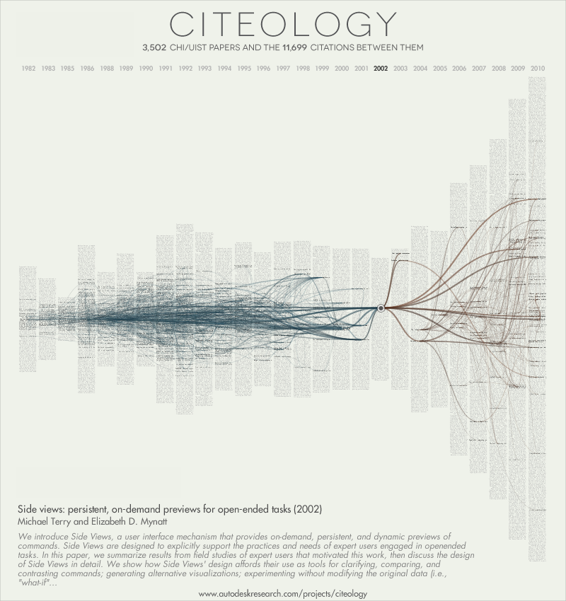
Citeology is a Java applet that takes papers from the CHI and UIST Human Computer Interaction (HCI) conferences between 1982 and 2010 and visualises citations and references of the most cited paper in each year. The papers for each year are represented as bars of text (the first few sentences of a paper's title) on a timeline starting from 1982 - 2010 where height of the bar indicates how many papers were written in that year. The mid-point of each bar represents the most cited paper from a particular year.
This visualisation is similar to the previous example of an alluvial diagram in that a network of lines links older referenced papers and newer cited by papers to the chosen paper (represented by a dot on the bar graph). Blue lines link papers referenced by the chosen paper (and the papers they, in turn, referenced) and brown lines link to papers that used the chosen paper as a source (and other papers which cited them, thereafter). Essentially, the visualisation provides insight to the "geneology" of a paper with "ancestors" (references) and "descendants" (citations).
While this visulisation allows for a quick assessment of the number of references for a paper versus number of citations and comparison of the number of papers from year to year, the diagram quickly becomes crowded - as more references of references are shown (and vice versa: citations of citations), the occlusion of lines makes it more difficult to make coherence of which papers link to which. This, in turn, makes it difficult to extract details such as the names of papers.
Microsoft Academic Research
Similar to Google Scholar, Microsoft Academic Search is an experimental academic search engine created by Microsoft Research to research the ways in which scientists, academics and students find academic content. Although the website explores concepts of data mining, entity linking and visualisation, the site has not been updated since 2013 and will likely be taken down once research goals have been met. Two visualisations concerning citations were examined.
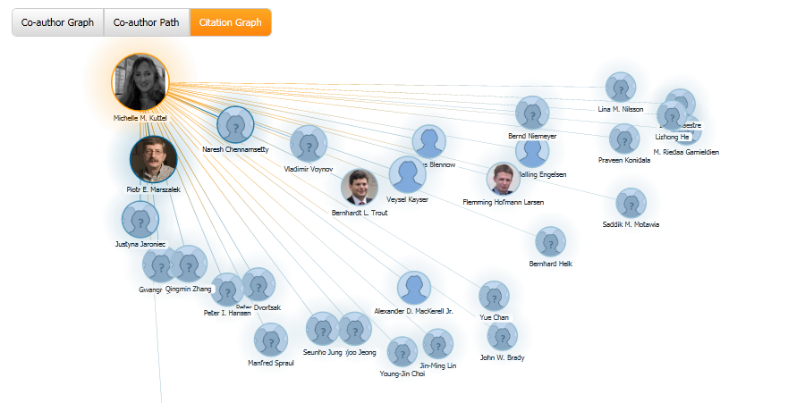
Citation Graph
Citation Graph is an interactive visualisation created by Microsoft Academic Search that shows citation relationships between authors: nodes in blue show citing authors while the single orange node shows the main author. Distance and size of the node to the main author indicates how often the citing author has cited the main author. The exact number of citations from one author to another can be seen by mousing over the edge between the two nodes.
The graph is effective at displaying exactly which author cited the main author and number of citations from author to author but not at showing the exact total number of citations to the author. Additionally, distance and size of node are not adequate means of distinguishing number of citations from the main author as nodes can be moved around via clicking-and-dragging thereby skewing this visual queue.
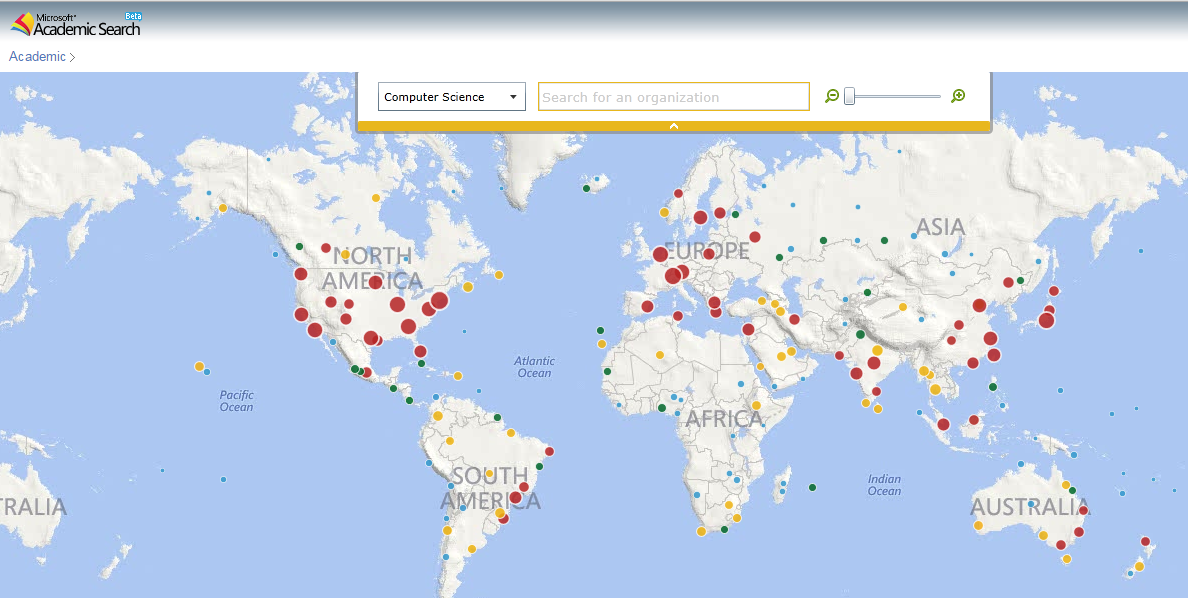
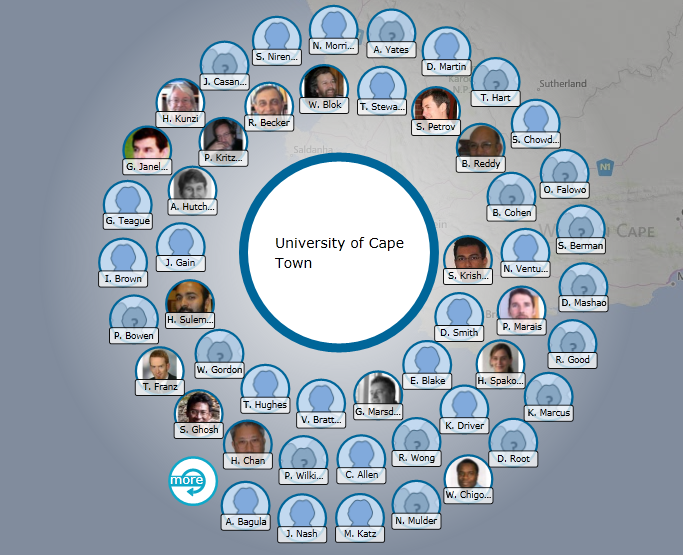
Academic Map
Created by Microsoft Academic Search, Academic Map is an interactive interface that shows the location of various institutions around the world. The size and colour of these points show the amount of authors found at a particular institution. Mousing over points shows the name of the institution, number of authors and publications. Zooming in reveals more insitutions in an area. Clicking a particular institution displays nodes of the authors clustered around the name of the institution.
Red dots represent institutions with the most authors; yellow dots, less; green, even fewer and blue the least. Difficulty arises in comparing institutions that are categorised as blue and green as circles appear similar in size even though a green insitute may have 3x the amount of authors a blue instituion may have.
Citation Map
by Yingjie Hu, Grant McKenzie, Song Gao
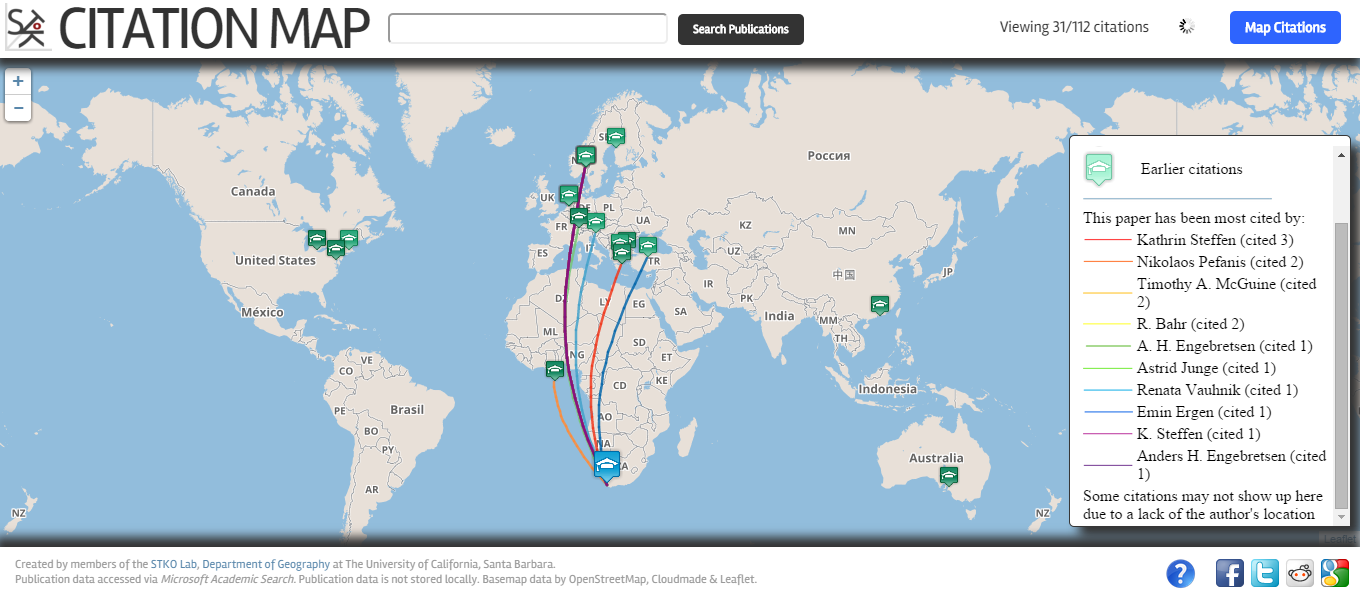
Citation Map is an interactive map that shows the geographic distribution of citing authors of a chosen paper and indicates how recent these citation were. Data shown on the map has been sourced from Microsoft Academic Search. The top ten (most) citations are indicated by different coloured flight paths from the source paper to the cited papers where a key displays the author name and number of citations by that author. Colour has been used to distinguish the source paper (blue) from citing papers (green). Different tints of green are used to indicate the recentness of paper differentiating earlier papers from more recent ones. That being said, it is sometimes difficult to distinguish the newness of a paper as the gradient scale for mid-range colours can be similar and therefore, are difficult to compare. Names of locations on the map are useful in helping to identify specific locations. Black text with white highlights providing sufficient contrast with the grey of the map to allow names to be easily read.
In terms of interactivity, users can click, pan and zoom in/out of the map. Clicking a point on the map opens up a textbox over the point which shows details of the citing author including their photo, name, institution, paper title and a partial abstract of the paper.
Navigation of the map can be done by clicking and dragging, while scrolling allows the user to zoom in/out of the map to see a more precise location of an institution as occlusion can occur if the map is densely populated in a single region.
A problem with the map is that if there are multiple papers from a single institution, map points are occluded preventing the user from clicking on papers located on the marker behind the first one.
Conclusion
After analysing various citation visualisations, we decided that an interactive implementation would be best suited for our visualisation as it would allow various dimensions of data (eg. citations, references, country, institution, discipline, time, etc.) to be shown without the visualisation getting too crowded.
From the aforementioned designs, we found Citation Map to be most similar to what we envisaged our implementation to be like. Thus we will be using some of the design principles in Citation Map (map interface, representation of earlier/later citations) as the basis of our design but add additional dimensions of data and improve on existing aspects of the Citation Map’s design.