Visual Queries
In what area has the paper been cited most?
Where has the paper been cited recently (in the last five years)?
In what discipline has the paper been cited most frequently?
Which disciplines has this paper referenced?
Initial Design
Our design is based on the Citation Map visualisation. We adapted it so that users could more easily identify:
- Displines
- Cited by vs References
- Old citations vs Recent citations
- Additional information on the paper
- Multiple papers in one location
Disciplines differ on Symbols and Colours
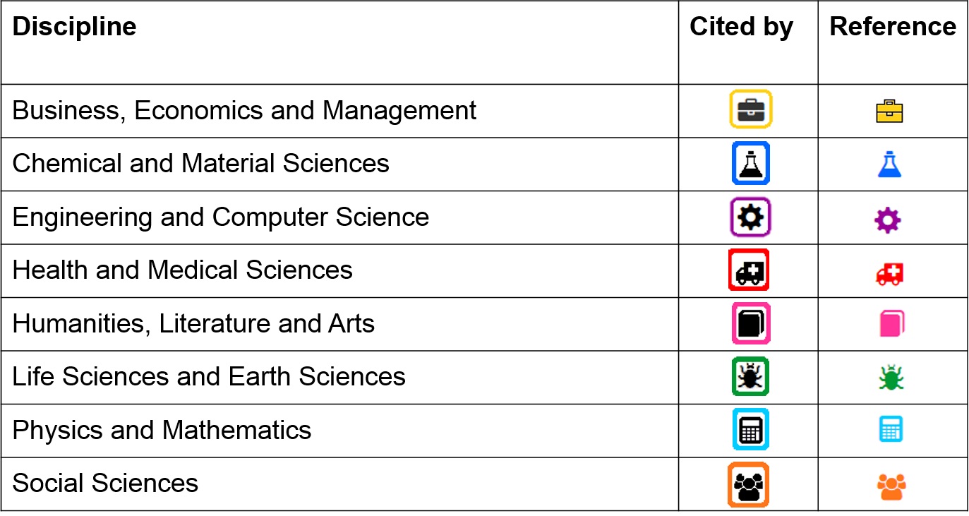
In order to ensure fast queries, the pins differ on two channels (both shape and colour). This makes it very easy to filter out the unnecessary data when performing a query. Our data is based on Google Metrics Categories. We chose a different symbol and colour for each category. Symbols and colours are linked to the "what" channel in the brain, so users should be able to easily identify which disciplines are which.
Cited by vs References differ on Border and Colour
Papers which the source paper has been cited by are indicated by a black image with a white background and a border in the colour of the discipline.
Papers which the source paper references are indicated by the symbol in the colour of the discipline.
We chose to do this because we feel that it is more important to quickly identify cited by papers and having more colours will make cited by papers stand out more. In this way, users can distinguish cited by from references on the colour channel and still be able to identify the disciplines.
New Cites vs Old Cites differ on Shade or Transparency
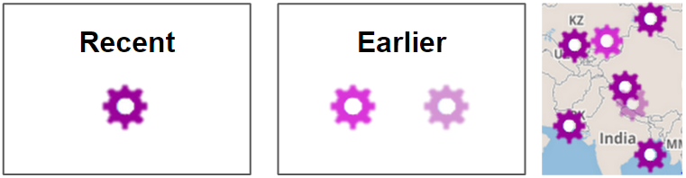
Recent papers are those which have been written in the five years before the current year or the year in which the paper was written.
We had two choices/versions for papers which were written earlier. The first option was to make the symbol slightly transparent. The second option was to make the symbol a shade lighter. Our goal was to enable the user to tell newer papers apart from older papers, but still be able to identify the paper to be in the same discipline.
Showing Extra Information
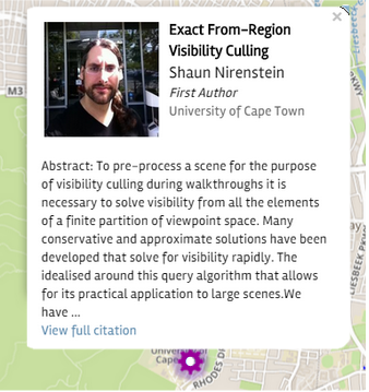
When the user clicks on a symbol, they are presented with extra information on that paper. We based the popout box on Citation Map's design, but edited it to make it easier to search.
The Title, Authors name and institution are shown at the top. A picture is also shown, if available (this is pulled from the Google Scholar profile). The picture isn’t essential in terms of information, but it adds value for the user because they can put faces to names. An excerpt of the abstract is also included to aid the user in gaining a greater understanding of the paper and there is link to the paper if the user would like to research further.
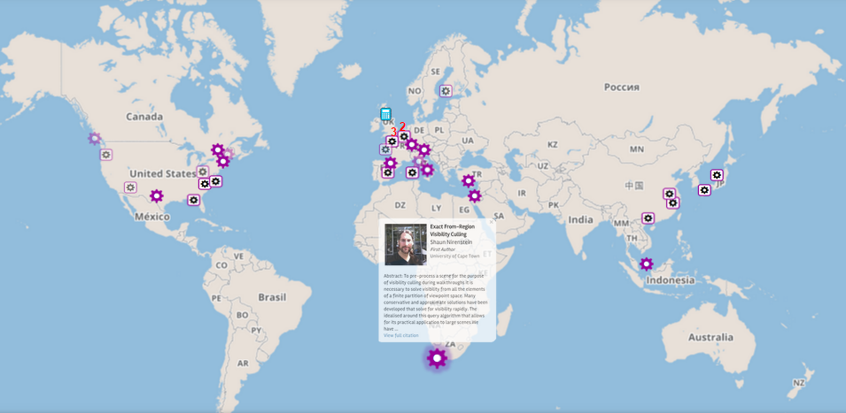
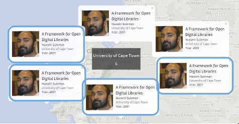
Multiple Papers in One Location
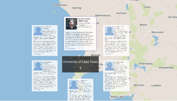
One of the challenges of the design was to show multiple papers in one location. We attempted to solve this by adding a number above locations with more than one paper indicating how many papers were written at that location. Additionaly, when a user clicks on the university it shows all of the different citations from that university. These pop up around the given institution with the relevant information being displayed, as shown in the example. This is necessary to prevent occlusion from becoming an issue and ensuring that all papers can be represented.
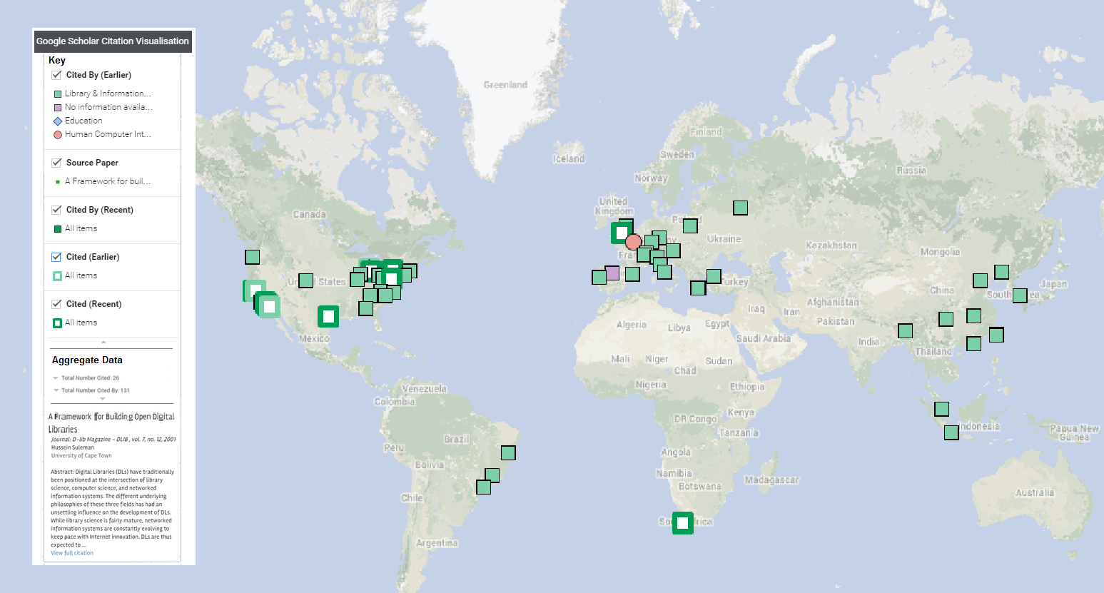
Final Design
We used Google My Maps to make a proof of concept implementation. The final design is largely based on the interactive map above, but has a few extra features that are not available in the Google application. A static image of the final design is shown below:
Implementation of Feedback and Redesign
Disciplines
It was suggested that we should categorise disciplines on the Sub-category level of Google Metrics because papers are often only cited from within their own category, but there could more likely be differences in sub-category. It was suggested that we keep the symbols to show in the "More Information" box, and use a recurring list of random geometric shapes to indicate to which sub-category a paper belongs.
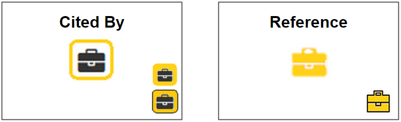
Cited by vs References
In the final design, cited by is indicated by the symbol in the colour of the category and references are indicated by the same symbol, but white and with a border in the colour of the category (example shown in interactive map above). This is the opposite of what was decided for the initial design. We made this decision after trying both options on the map and concluding that the symbol in the colour of the category stood out more and should therefore be used to refer to 'cited by' papers.
Recent Cites vs Earlier Cites
The final design used different shades of colour instead of transparency to show older citations. This was an intentional design decision because it was discovered that transparent symbols tended to fade and blend into the background. Thus, two different shades of colours were used to distinguish earlier/recent references and citations from each other. The chosen shades are different enough to be easily distinguishable from each other while still allowing the eye to group them together as they are from the same colour range.
Showing Extra Information
It was pointed out that the Extra Information pop out occludes too much of the map. It was suggested that only very basic information is shown on the pop out and that extra information is included in a sidebar.
Multiple Papers in One Location
While collecting the data, it was discovered that a single location could contain both papers which the source paper referenced and papers which the source paper was cited by. Therefore, we chose to indicate "cited by" papers with a blue border so as to distinguish "references" from "cited by" papers.
*Please note that the image shown is just an example of how multiple papers would be shown, and that it is not completely based on real data.
Sidebar
One of the major suggestions from the first presentation was to put in a sidebar for extra information, this was incorporated into our final design in order to provide necessary information which couldn’t fit cleanly onto the map.
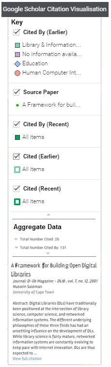
The sidebar includes information such as the key, information on the selected paper, and aggregate information such as number of papers per discipline, per university, or per author. The information will be presented in an accordion style, so that the user can hide/view information as desired.