Background
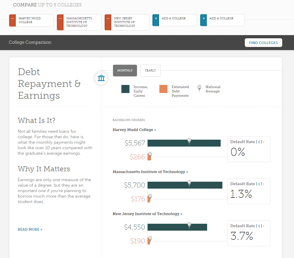
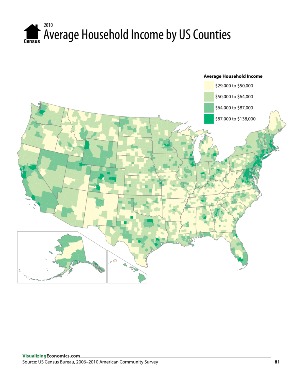
Here are some of the things which I found interesting while seeing what kind of visualisations have already been done.
Feeling quite disappointed, I went looking for more interesting variations of hte above. I came across and was pleasantly surprised by some of the maps. There were a few which incorpotated a time dimension (e.g. this one), which I found interesting, but my data only went back a few years (to 2013), so I moved on.
I then found the graph on the right. I was intrigued. They managed to use a map projection in a useful way, without reverting back to what I didn't want. They grouped data along sections of longitude, and then one again by latitude. There was also a time component, but the graph was interesting enough even without that.


