Implementation
Humble beginnings
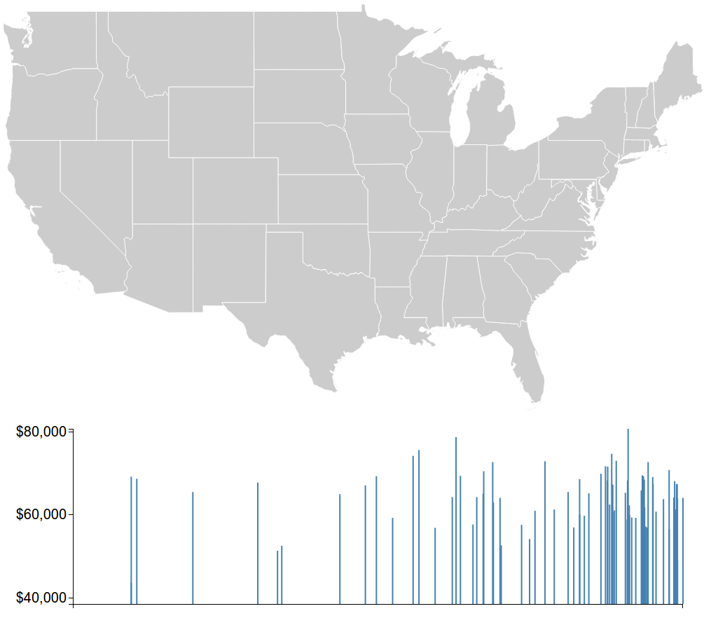
The first thing I did was head to some simple charting libraries that I've used before, but I quickly reailsed that they werent going to cut it. It was time to learn a serious-business framework. I had never used d3.js before, but I managed to follow a tutorial, then generate a bar graph with my data.
At this stage, here was no correlation to the map.
Difficulty #1: D3.js
This was a massive time-sink. I thought I could just hack away and learn as I went along. This ended up in more refactorings than I would have liked. Instead of spending the time reading the docs and finding out things like how data bindings work, I fumbled around like someone who has opened vim by mistake, and doesn't know how to quit it. The difference is that I kept asking myself questions like: "Why is that rectangle up there?" and "When did these axis ticks stop making sense?"
It was worth it in the end of course. D3 is amazing once you understand it's way of doing things, and my visualisation wouldn't have been possible without it.
Difficulty #2: Map projections
We all know the earth is a sphere, and we know spheres are 3 dimensional objects. What might not be immediately obvious though, is that something having 3 dimensions make it hard to express it in 2.
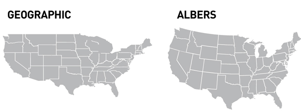
There are some awesome resources out there for plotting maps. The most popular projections are the Albers equal area conic projection and the Mercantor projection. The latter being somewhat infamous for representing areas in a very misleading way.
I initially chose to use a Mercantor projection, which maps longitude linearly. I thought I was clever, because I needed the map to line up with the bar graph.
I wasn't.
I ended up changing to an Equirectangular projection when I started plotting the dots on the map.
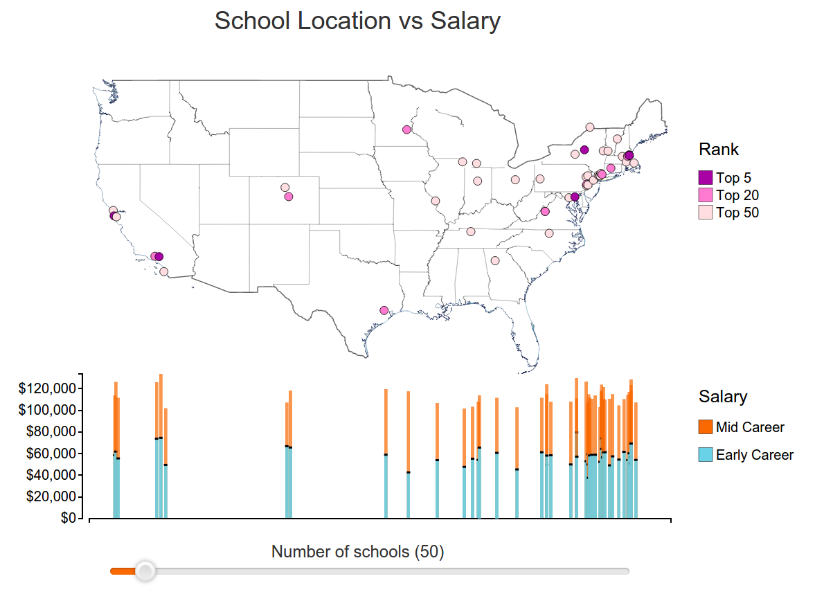
Finalizing the visualisation
Once I had added all the dots and axes and legends, I got to play around a bit. The interactivity allowed me to experiment with various visual channels, and I ended up settling on desaturating the non-selected bars, and increasing the size of the selected dot. I incorporated a colour change as well, but ended up removing that because I felt that I could achieve the same thing without compromising any of my data channels. For example, setting the selected dot to a bright red made it stand out, but you could no longer see it's rank bracket.
Considerations and future work
I tried experimenting with displaying an average on the graph, but it wasn't really showing useful information, especially because the sample size is only the top schools, and not all schools.
The colour scale on the graph could be changed to fit better with the yellow/blue on the graph.
The map itself could perhaps be shaded in. At the monent it is just an outline which is blue along the coast, and black inland, but this isn't actually useful. There might be a better way to contrast the dots against a background (which isn't just white).
The groupings for the scale on the map should be adaptive to the sample size. I experimented with a larger nuber of "buckets", but 3 seemed to show the information best. The scale at the bottom was added as an afterthought, and the color brackets don't scale well with it.