Mockup
I liked the idea of using geolocation differently, so I decided to project the data down onto the 'x' plane. I could then use this as a basis for a bar chart showing salaries. The idea here is that there's value in the groupings of the bars because it shows how top schools are clusered in the {east, west} direction.
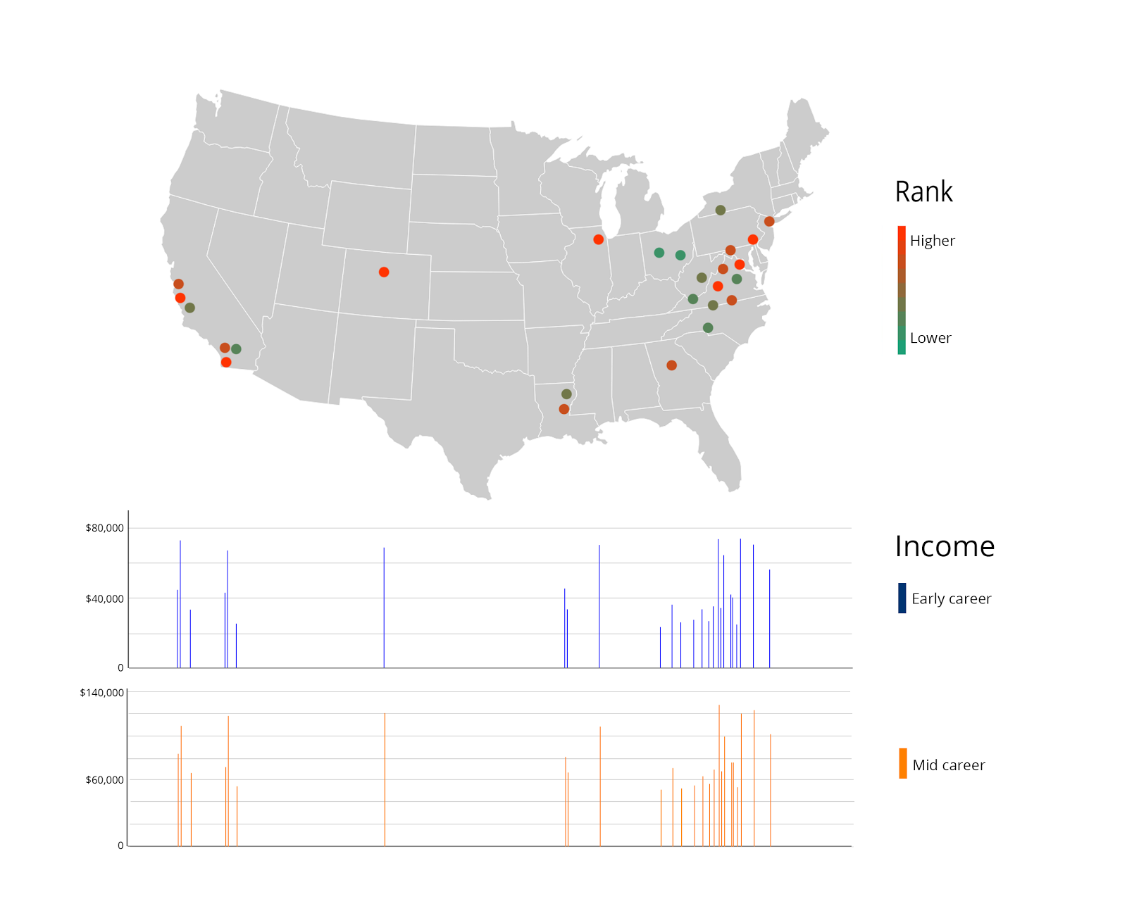
At first this may just seem like a map and a bar chart, But as you can see, each dot on the map lines up exactly with a bar. The map and graph are intimately related in this way.
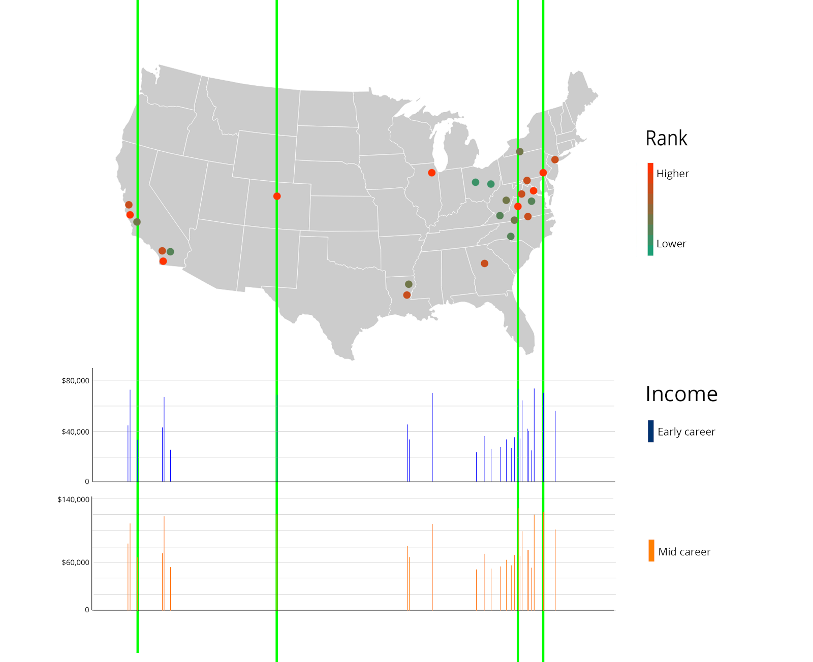
As you probably noticed, it is not always straightforward to make the connection between each bar and it's corresponding dot. My solution to this was interactivity. If the user moved their cursor over any one of the 3 elements shown on the right, all 3 would be highlighted, and the rest dimmed.
